As my individual job was to create the interior way finding for the train station, I decided on creating what I thought best suited the context.
he main thing I wanted to focus on was obviously the two tramlines - the HS2 and the HS3. I did research into the HS3, looking at the timings it would take between each of the cities, and decided to use this as a focus.
Timings:
I also looked into the HS2, and found that there are two routes for this train - one from Manchester to London, and the second from Leeds to Birmingham.
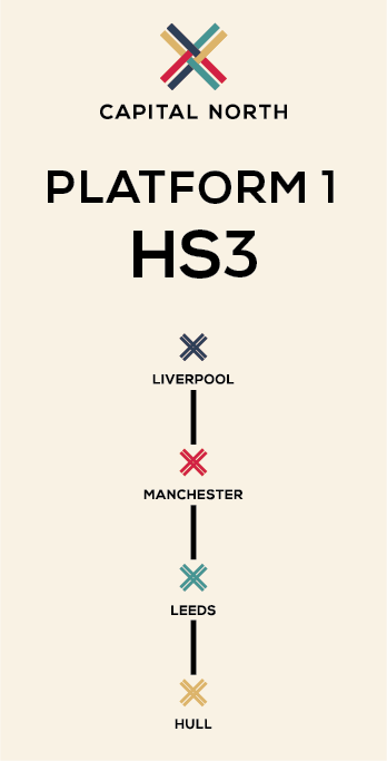
The first thing I did was create some designs to go on the platform/service board to show the stops. I decided on using the crosses to indicate the stops. I decided on using a 15% opacity of the gold as a background. It just keeps a bit more interesting than having white. It also supports the colour scheme a bit better.
I then mocked these up into a train station setting.
Following these I started working with the timings of each journey. I wanted to have a simple design which reflected the journey and cities.
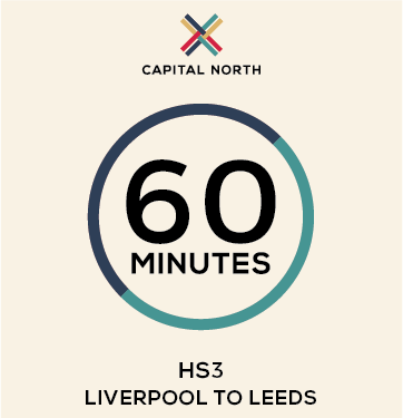
I came up with the idea of creating a circle and having two halves, one for each destination, with the timing in the middle. The circle indicates both the cities and that the journey can be both ways.
I started with creating a design for each of the one-city journey's.
I think the design works well and is effective in the simplicity. It is straight to the point. I then duplicated the same design for journeys which included three cities.
I also created one for the full journey across from Liverpool to Hull.
The only issue I have with this is that this is clearly the full journey, and that isn't illustrated clearly. I tried out a couple of different variations to show this better.
The second is definitely better aesthetically, and the point is illustrated with the colour changes. I then transferred this idea to the designs which incorporate three cities.
I then mocked it up in two different contexts to show how these simple designs can be adapted to any space and placing.
Following the success of the timing posters, I combined this and the stop posters to create some more posters which could be placed on the platform or around the station. These show all the stops and the new quick times.
I also created a full map of the train journeys and their timings to create an overarching poster design. This is something that shows the new train journey times.
Following this I created a couple of ideas from way finding in the train station. I created some arrow signage for print as well as some vinyl stickers which would be on the floor around the station to direct the passengers towards the platform. I also thought about the platform itself, with the idea that a platform will be dedicated to this train only. I mocked up the idea of having the colour and logo along the platform.
Overall I think the work I have done is good and consistent and applies the brand well. The feedback from the others was positive.


No comments:
Post a Comment