I started this brief at the beginning of the year with the intention of completing it relatively quickly, however it ended up lasting the full duration of the year, and looking back at it, I am definitely glad it did. Working on it at various points during the year gave me the ability to continue to develop designs and make them more successful and professional.
I think that the diversity of packaging and printed elements also helped in the development of the branding, and made me think about how I would apply the branding to a variety of media, for example, the glass jars and the plates. The varying sizes and shapes meant that a lot of consideration had to go into how the branding was applied and what would work well. This diversity in packaging also worked very well in the final photographs.
The simplicity of the branding allowed for successful extension across a retail environment, showing how the interior of the establishment would look if it were created. This made me think about how the branding would be applied across an interior design situation, and meant that I could incorporate more than just the logo, such as photographic imagery as well.
The changes made to the website following the completion of Brief 11 definitely improve the overall image of the brand and create a much more consistent approach to all aspects. The previous design did work well, however with the development made in Brief 11, it was inconsistent and obviously so. The changes made were simple and following the same structure, also with skills that I did not have at the beginning of the year when I previously made the website, so I feel that it looks much more professional.
I think the project was very successful and I did what I set out to do in creating collateral which spoke to a high-end audience and was luxurious and sophisticated in appearance. The most successful part of the project was the putting together of it all, where all the elements came together to show a fully rounded brand.
Showing posts with label Brief 1. Show all posts
Showing posts with label Brief 1. Show all posts
Tuesday, 19 May 2015
Monday, 18 May 2015


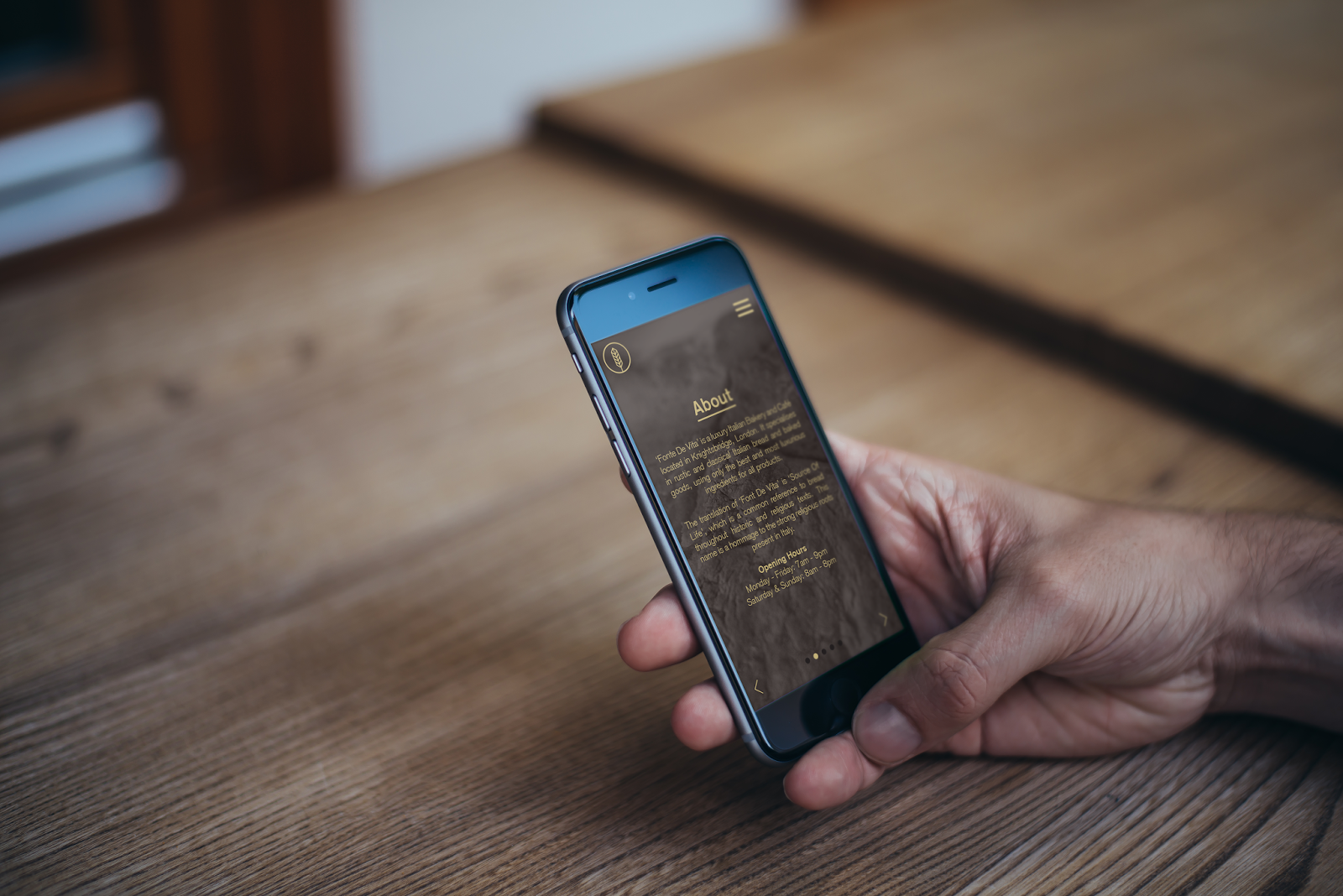
Brief 1 - Updating The Website
Following the update of the collateral and overall design of the brand, I looked back to the website design. As I now have a much clearer identity for the brand in completing its branding and the App in Brief 11, I know that this website definitely needs a revamp and changes to the design to be much more cohesive.
Previous Website:


I've gone for a completely difference approach from the previous design, with a very clear link to the App design in the layout and use of colours. I think it works much better and is much more contemporary.
Following this I mocked these screens up onto macs and added the imagery to be reflective of those used in the App and menu.
Mocked up:


Previous Website:
The first obvious thing to say about the website is that it is very dark, and while it does play to the luxurious side of the brand, it doesn't work with the brand look anymore with the wide use of gold and really dark backgrounds.
I decided that the best way to create the website was to work off the appearance of the app and how that had been put together using a lot of white space and large imagery which touched the edges of the page. The icons are also something that I can incorporate now into the design, which might make things a little more interesting.
I wanted to keep the layout following the style of the app with having text central and large imagery at the top of each page. Looking over the pages I already had, I decided to keep the same content, and add another section - News. This is something that could be updated regularly and keep customers aware of changes or the latest goings on.
Website wireframes:


I've gone for a completely difference approach from the previous design, with a very clear link to the App design in the layout and use of colours. I think it works much better and is much more contemporary.
Following this I mocked these screens up onto macs and added the imagery to be reflective of those used in the App and menu.
Mocked up:


Overall I think that the website looks much better because of the revamp to the appearance of it. The use of white creates a much more contemporary feel and makes for a brighter and friendlier appearance.
Sunday, 3 May 2015
Brief 1 - Updating Collateral
The first thing I decided to update was the menu. I was not overly convinced with the design when I first did it, and I definitely feel that there is a better approach to it.


Gold:


I also decided on creating a small pad which would be used for waiters in the cafe to write down table orders. It is another small detail but I think its something quite interesting to have as its very individual to a restaurant/cafe setting.
I kept this design very simple, deciding on just the brand emblem at the top and a number of lines for writing. I want this to follow the same design as the menu in terms of how it is bound with a screw, however this will be bound by the top corner so the pages will slide across to open. I will also perforate the corner so the pages can be pulled out easily. The cover will follow the same as the other designs in being brown with a foiled logo on the front.

The final piece of collateral that I wanted to add was a small thank you note. I think something like this is just something nice that can be added in and applies to both the bakery and cafe. It's just a little extra for the brand to thank the customer for their purchase.
I decided on just a simple black and white design which will be double sided, with the brand identity on the front and the thank you on the back. I kept the text simple and so it could apply to both sides of the brand.


Original Design:
I like the overall approach, with the image on the left hand page and the layout of the text, however it is the gold border which I am unconvinced about. I think the use of a line is a subtle element in my branding and I do want to keep that, however I do not like it done in this way. I don't think the gold colour is working either.
I decided on reworking what I liked about the page and decided on keeping it very similar, but changing the gold to a black and having only a line across the top between the heading and text. I also left aligned the heading so it flowed better with the text. This is something that I previously did on the letterhead and it worked well.
Something that I have also decided is that I will just have one menu instead of two. This is partly because I have got a really nice brown stock which I want to use across everything for consistency and I think if all gold were to be foiled on this it would work really well. With the use of foil, there obviously wouldn't be al alternative to it to be able to find gold stock which matched, so the use of just gold foil on brown will keep consistency.
I also think because the majority of the products are available at both the bakery and cafe, it seems a waste to put them in both instead of just having one, with small notes to show the reader where this product is available.
New page design:

Another thing I decided is that the binding needed to be improved. Originally I had the intention of just stapling this, however this doesn't really work to the luxury side of things. Instead I have decided on screw binding the pages together. This adds a little more detail and consideration to the design. With this I have to consider the margin. I have increased this to 2.5cm so there is a good amount of room for the screws and the text.
With the new appearance of the text page, I also looked at editing the image page. I felt it was quite dark and overpowering next to the white page. I decided on changing this from a full page image to one with margins. It adds a it more light to the page, and I think the margins add a bit of sophistication to the overall page design. It looks a lot more considered over.
Final spread:

The grey indicates the margin which will be hidden when screw are placed in it. I think that overall this design is might brighter and cleaner. It is definitely a huge improvement on the previous design, and considering the changes were only small, it shows that a bit of refinement can go a long way.
Following the success of this design, I decided to apply it to the business card.
Previous design:
Like the menu, I have decided on using brown stock and foiling gold onto it, so the gold card is not necessary. I also changed the layout to include the opening times as this is something that is important.
New business card:

Following this I made a sheet of branding to be cut out in vinyl to be put on the physical pieces that I had. These are:
- A large jar - for bread buns - a large vinyl of the brand emblem will be put on this. - black
- Two glasses - one small and one large - either the full logo or just the emblem. - black
- A glass jar - for breadsticks - the full brand identity - black
- A plate - a small emblem to be placed in the centre - black
- A bag - the full brand identity - in gold
Sheets for vinyl:
Black:

Gold:

Following this I looked over the entirety of the collateral that I had and decided that there were a couple more elements that could be included.
The first is coasters. These are obviously a small element but having branded coasters applies the brand that little bit more and shows the amount of detail.
I kept these very simple and decided to go with the circle shape like used in the emblem.
Coasts:

I also decided on creating a small pad which would be used for waiters in the cafe to write down table orders. It is another small detail but I think its something quite interesting to have as its very individual to a restaurant/cafe setting.
I kept this design very simple, deciding on just the brand emblem at the top and a number of lines for writing. I want this to follow the same design as the menu in terms of how it is bound with a screw, however this will be bound by the top corner so the pages will slide across to open. I will also perforate the corner so the pages can be pulled out easily. The cover will follow the same as the other designs in being brown with a foiled logo on the front.

The final piece of collateral that I wanted to add was a small thank you note. I think something like this is just something nice that can be added in and applies to both the bakery and cafe. It's just a little extra for the brand to thank the customer for their purchase.
I decided on just a simple black and white design which will be double sided, with the brand identity on the front and the thank you on the back. I kept the text simple and so it could apply to both sides of the brand.
Overall I am really pleased with the progress I have made on this brief now. I feel that it has all come together much more and the branding is now consistent. I think the use of gold foil will work well and definitely give it a luxury feel, especially with the brown stock I have, which is slightly textured and is thick. Combined with the screw binding I think it really improves the overall appearance of the brand and will have a much better visual look.
Saturday, 7 February 2015
Brief 1 - Revisiting the brief
After completing the App which goes along side this brief - Brief 11 - I decided to revisit this brief to look over the progress of it and how far I got with it. I haven't looked at it in about 2/3 months, and I know my design practice has changed a huge amount in that time.
Looking over what I have done up to this point, I definitely think that there is room for improvement and updating. Being able to play around with the branding on the App has really allowed to me experiment with it and decide what works well and what doesn't. This is something I intend to apply to this side of the brand, and update it all so it is all as professional and consistent as the App.
Overall I think the branding created is good in the brand guidelines, but I think the way I have applied it isn't as good as it could be. The menu's and overall collateral need updating. I need to incorporate the dark brown colour and change the layout of the menu to be a bit more contemporary and creative. I think before I was fixed on making everything simple, that it's all a bit boring visually, and it could be more interesting. I hope to do this as I take it all forward.
Obviously since creating the App, it has changed my view on the website design that I previous did. I will potentially update this if there is time, however I want to focus on the printed collateral.
Saturday, 29 November 2014
Brief 1- Packaging
After considering the packaging design for a good while, I decided the easiest thing to do was to create two different sized paper bags, like those seen in regular bakeries. This means that whatever a customer purchases, there is a bag acceptable to use. I will also consider creating boxes for products such as cakes and tarts.
Bag nets:

The smaller bag is for bags of biscuits, which come in 12. The larger bag is for bread, however obviously these would be used when appropriate.
As well as these nets, I created some stickers to be used to seal the bags. There are two kinds, the first is a simple circle with the brand identity, and the second is the full logo on a rectangle. The first would be for closing greaseproof paper/food paper that could be wrapped around products. The larger sticker is to close up the actual bag.

These will be printed on white as the gold wouldn't been seen well on a see-through sticker over the brown bag.
Brief 1 - Promotion Mock ups
Following the completion of the menus and corporate identity, I created some mock ups of what promotional material could look like. I first adapted the website design to the App, followed by mocking up some advertisements, and finally some exterior signage.


Subscribe to:
Comments (Atom)