Showing posts with label Brief 15. Show all posts
Showing posts with label Brief 15. Show all posts
Saturday, 2 May 2015

Brief 15 - Final Evaluation/Reflection
I found this brief to be particularly enjoyable and a learning experience. It has definitely been the brief which has pushed my exploration in typography and typeface design to a much more technical level, meaning I have had to be extremely precise and careful with every element of this brief.
When I created the initial typeface in January, I had been quite convinced that it was as good as it was going to get, however through learning much more about typeface design since then I found that I was confidently able to take the original typeface and edit it to create a much more sophisticated and consistent design across all characters. This resulted in a typeface which I am actually extremely happy with in the fact that all letters work together well and it can be used for body copy. Previously my typeface designs have not been quite up to the standard of being able to use for anything other than their original intention or just laid out in A - Z, however this typeface is something that can be used.
This brief has also showed me a good way to work through creating a typeface as it has shown me the right way about going about creating characters and how to create a consistent appearance instead of just thinking about how an individual character will look. Building on this and creating weight and style variations is something I enjoyed as it allowed me to push the design and consider more about the appearance than just creating one variation would.
The part of this brief which I enjoyed the least was actually turning it into a useable typeface. This is a long and tedious process in inputting all the characters before having to kern each letter and numerous pairs. However this has definitely aided my skills in this area of typeface design. I was previously quite inexperienced at this, having only done it a couple of times before to a very mediocre level. As I wanted to actually use the typeface in creating the specimen book, I knew I had to spend the time to kern properly and set up the documents properly so it could be useable.
Creating the typeface specimen publication was a bit more of a task than I initially thought it would be. I had to spent time considering how I wanted it all to be presented and what the key elements were. A big issue I found was that because I had three different styles and four weights, it created a lot of content that needed to be shown with twelve different variations. This made is tricky, however I am happy with how I edited this down to show the key points and aesthetic decisions in each variation. Overall I think that the specimen really does show the typeface off well.
The original aim of this brief was to create a useable, readable contemporary typeface, and I do feel that I have done this. I was initially very skeptical that I could manage to do it, but through hard work and a lot of time I do think the typeface is something to be proud of. This is definitely the brief where I feel I have accomplished the most as I have learnt so much through the whole process. It has given me the confidence and skills to be able to move forward and create more typefaces, and make them fully useable.
When I created the initial typeface in January, I had been quite convinced that it was as good as it was going to get, however through learning much more about typeface design since then I found that I was confidently able to take the original typeface and edit it to create a much more sophisticated and consistent design across all characters. This resulted in a typeface which I am actually extremely happy with in the fact that all letters work together well and it can be used for body copy. Previously my typeface designs have not been quite up to the standard of being able to use for anything other than their original intention or just laid out in A - Z, however this typeface is something that can be used.
This brief has also showed me a good way to work through creating a typeface as it has shown me the right way about going about creating characters and how to create a consistent appearance instead of just thinking about how an individual character will look. Building on this and creating weight and style variations is something I enjoyed as it allowed me to push the design and consider more about the appearance than just creating one variation would.
The part of this brief which I enjoyed the least was actually turning it into a useable typeface. This is a long and tedious process in inputting all the characters before having to kern each letter and numerous pairs. However this has definitely aided my skills in this area of typeface design. I was previously quite inexperienced at this, having only done it a couple of times before to a very mediocre level. As I wanted to actually use the typeface in creating the specimen book, I knew I had to spend the time to kern properly and set up the documents properly so it could be useable.
Creating the typeface specimen publication was a bit more of a task than I initially thought it would be. I had to spent time considering how I wanted it all to be presented and what the key elements were. A big issue I found was that because I had three different styles and four weights, it created a lot of content that needed to be shown with twelve different variations. This made is tricky, however I am happy with how I edited this down to show the key points and aesthetic decisions in each variation. Overall I think that the specimen really does show the typeface off well.
The original aim of this brief was to create a useable, readable contemporary typeface, and I do feel that I have done this. I was initially very skeptical that I could manage to do it, but through hard work and a lot of time I do think the typeface is something to be proud of. This is definitely the brief where I feel I have accomplished the most as I have learnt so much through the whole process. It has given me the confidence and skills to be able to move forward and create more typefaces, and make them fully useable.
Friday, 1 May 2015




Thursday, 30 April 2015
Wednesday, 29 April 2015
Brief 15 - Type Specimen Book Planning
For the specimen book, I wanted to continue with the contemporary style of the typeface and create something that follows this and is interesting in its layout of the content.
After looking over a few specimen books out there, I decided that what I really didn't want was just pages and pages of the typefaces saying the same sentences, in different point sizes, styles and weights.
In a sense, I didn't really want to create a traditional specimen book. I want it to be a publication about the typeface and showing what it can do in a variety of different ways. I also wanted to utilise the page spaces and have inserts throughout to have extra pieces of information on which perhaps applied to a double spread but there is not enough room for it to be on there comfortably.
I had a pretty good idea of the content that I wanted to include and how it would be laid out. I have decided on showing the sans serif as the base typeface, so showing all the technical information, such as the way the letters are designed/structured, and then the Slab and Rounded variations will have smaller sections which show off the variations and how they have been constructed from the Sans Serif.
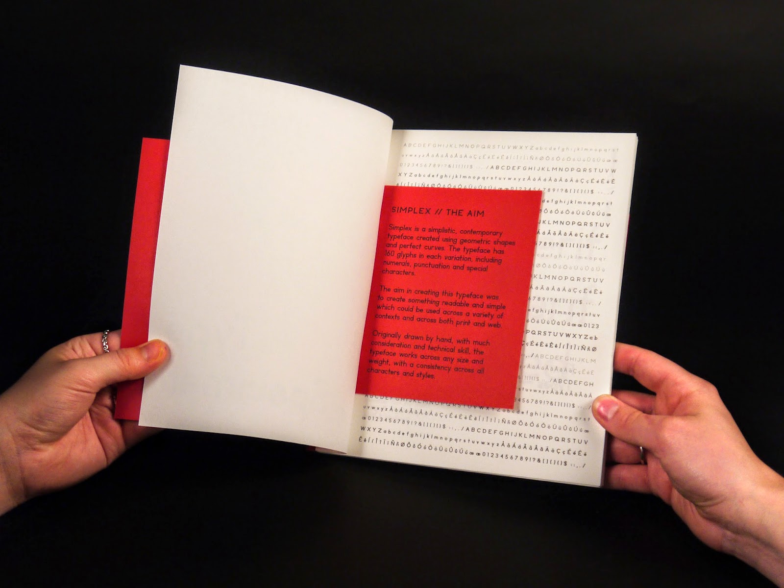
Simplex - the aim




Another thing I wanted to show was the flourish in the 'Q', so I did this in the same way as the 't' and 'g'.


After looking over a few specimen books out there, I decided that what I really didn't want was just pages and pages of the typefaces saying the same sentences, in different point sizes, styles and weights.
In a sense, I didn't really want to create a traditional specimen book. I want it to be a publication about the typeface and showing what it can do in a variety of different ways. I also wanted to utilise the page spaces and have inserts throughout to have extra pieces of information on which perhaps applied to a double spread but there is not enough room for it to be on there comfortably.
I had a pretty good idea of the content that I wanted to include and how it would be laid out. I have decided on showing the sans serif as the base typeface, so showing all the technical information, such as the way the letters are designed/structured, and then the Slab and Rounded variations will have smaller sections which show off the variations and how they have been constructed from the Sans Serif.
Simplex - the aim

First Page
I wanted to start the first page filled with all the characters and variations. This is to show the typeface as an entirety to begin with.

Consistent Spreads
There were a couple of pages which I wanted to apply to each style as these are quite general and will make a consistency through the book.
The first is a simple layout of the weights, and the opposite page with the alphabet in these weights.

The second is a page with the body copy sizes laid out. While I don't want the whole book to be like this, I do think showing how the typeface works in body copy is important, so it is an important image to have.

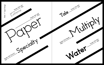
I wanted to have some more creative/visually interesting ways of presenting the typeface over spreads and while experimenting I created this page spread with the numerals.

I had previously been looking at Josef Muller-Brockmann and Jan Tschichold and decided to try text on an angle and found that it worked really well, especially with the inclusions of the lines and the lines of text saying the weight and point size.
With the success of this layout, I applied across all three variations as I thought it was definitely strong enough to be a consistency through the book. I also think it is something quite different from what is classically used in a specimen book, which is what I wanted to go for - showing the typeface working in different situations, not just line after line.


Structure
For the Sans Serif section of the publication, the majority of the content is about the structure of the typeface, so stared by creating two elements of this - the grid, and the anatomy lines for each variation

With these lines being quite small to fit on the page together, I decided on creating a larger one and having it on an insert so it can be seen a lot closer and in more detail. As the insert is double sided, I did the Light version on the front side, and the Bold on the back.


Looking at the structure, there are a few letters which are slightly different and these should be displayed. I chose to show the 't' and 'g'.
I wanted to make the variation obvious, so tried a couple of different ideas to make it obvious, before deciding on using a red circle behind the bit of the letterform which is different. This works with the red colour scheme throughout, and is bold so it makes for obvious viewing.

Another element to the structure that I needed to display was the use of perfect circles throughout. I chose four letterforms which were different in structure and overlaid circles over the top to show how these are integrated into the design.

Another thing I wanted to show was the flourish in the 'Q', so I did this in the same way as the 't' and 'g'.

Another technical aspect that I wanted to show was the difference in serif sizes in the Slab serif variation. This was a subtle difference done to create a more consistent appearance.

To display the way the Rounded variation was formed, I decided on following the same form as the way I showed the circles above, by overlying the shapes over the letterforms. I overlaid the sans version with the rounded to create a very simple visual.

Following these technical images that needed to be shown, all that is left to do is to do a range of visuals showing the typeface working in all the variations. For these, I don't want to go overboard with them as I don't think it's necessary to show hundreds of the same thing over and over again. I want to do just a few really effective examples which get the typeface across properly and completely.
Saturday, 25 April 2015
Brief 15 - Kerning
Now all of the characters have been input into Glyphs, the last thing to do is to get the kerning right. This is definitely going to be a long and tedious task, but it is necessary if I am wanting to type with it otherwise words will look disjointed.
When I input the characters, I did set the spacing on each side of every letter to 40. This is so that when it came to the kerning, I could see the spaces clearly and all the letters would be at an equal distance from one another.
I started with Sans Bold. I started by typing out words to see how the letters worked together.

The image above shows some of the clear problem areas. While the letters such as 'p' and 'i' work well, it is the letters like 'T' or 'y' which don't. This is due to the amount of white space in their letterform space.

This image shows the obvious issues with 'r' and 'v'. I was quite surprised with the bad kerning on the 'r' , but considering how far out the further point on the right is, it's understandable.
I also wrote a few words out in the slab serif versions as this is where the worst spacing would be due to the addition of the serif widths.


The issues are very clear here, especially with the 'Y' and 'V'. The 'T' doesn't look quite as bad as the sans versions due to the serifs, but it is still bad.
I also typed out in the rounded version, but found that it was identical to the sans.

To start the kerning, I found that the program does kerning partners, so I can kern every letter individually to every other letter. This is obviously good, but will be a very long winded process as there are 12 variations, and 124 characters for each.
However, through a bit of experimentation I found that I can copy and paste a full set of kerning from one variation to another. This will make it slightly easier as the Sans and Rounded versions are the same.
Kerning Letters


The list below shows how the kerning works, creating a list for every letter.


After a very long process of almost two days solid of just kerning these letters, I think I am finally at a stage where it is acceptable. While it probably isn't perfect, I think it looks pretty good and in typing out a lot of different words or character variations, I have covered quite a lot of bases.
It definitely gives me a sense of achievement to know that I am at this point where I am finishing with the last touches to a typeface, actually taking it through the process of being created and turned useable.
Subscribe to:
Posts (Atom)