Showing posts with label Brief 6. Show all posts

Tuesday, 9 December 2014

Brief 6 - Final Evaluation/Reflection

While this brief was very simple in terms of content and execution, I did find it to be enjoyable and educational for myself with the content. It is a subject which I knew quite well to begin with, and now I feel that it has taught me a lot more and has certainly helped me in considering the impacts of this content in my future briefs. Typography is always something I have enjoyed, so to finally do a brief dedicated to just this as a subject is something that I was very happy with and found to be enjoyable.

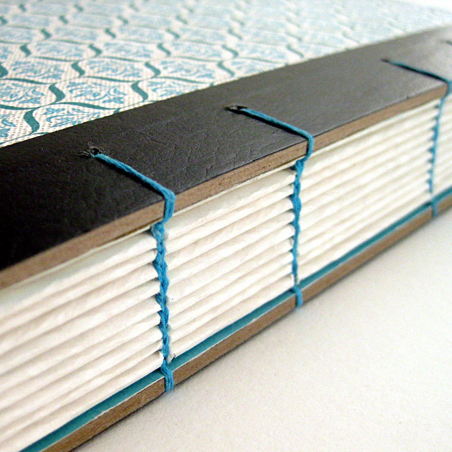
This brief has also allowed me to further my book binding skills and learn an entirely new kind of binding in coptic binding. This is a style of binding I have always wanted to learn, and while it was a bit tricky to begin with, I am now very confident in my ability to replicate this style of binding whenever I want. I think that this binding was one of the strengths to the project and gave the finished publication a uniqueness and professional appearance.

It was a short brief, and I am definitely considering taking it further in a secondary brief, potentially creating more content and more deliverables outside a publication. However as a single piece I do think it works well and consistently throughout the publication.

I think that the simple style of the layouts and imagery worked well in putting across the information in an informative and straight to the point way. While I was initially a little worried that the design would look sparse and not very professional, when printed it works well and the simple layouts help in showing exactly what each page is about and illustrates the importance well. The use of only two colours also aids this decisiveness of the content.


I enjoyed this brief and found that as I knew a lot of the content I could make informed decisions in terms of the order and layout of the information. I have always enjoyed creating publications, and now I have learnt another binding technique which I will continue to utilise in the future.

Brief 6: Design Boards

Monday, 8 December 2014

Photography Slot

Today myself, Anna, Grace and Charlie had a photography slot booked so we could each photograph our work well for the end of our individual projects. In preparation for this we had each got all of our collateral printed and made, ready to photograph.

Unfortunately some of Charlie's work didn't print right due to a different printer being used and a colour being completely different to the rest. Charlie decided that she didn't want to photograph it with this colour in as it was not how she envisioned it to be, so she did not join us in the end.

I had two projects to photograph, my client brief 'Wheatless & More' and my individual brief 'Type Principles'. I had originally intended to photograph my 'fonte de vita' brief also, however didn't want to rush this brief to finish it in time for this slot.

This was the first photography slot I had done so it was the first time I learnt how to set up the equipment. Working as a three we managed to get all the lights set up relatively quickly. As we were in the small studio we used the table to set our work out. There was already a black roll on the table, so we looked over our projects and decided if there was anything to be photographed on this.

I decided that my type principles book should definitely be photographed on this as it is white. Anna also decided for her book to be photographed on this, so we started with those two books.

Following this we moved onto using a white roll and photographed Anna's second project, Grace's project and my client project.

Some photos:

As clearly seen, the photographs taken on the black roll worked extremely well and aren't in need of much editing at all, just a bit of changing to make the pages as white as they actually are instead of the yellowish colour that they currently are.

The photos on the white clearly need a lot more work in terms of editing. This is something that is interesting to me as I took the photos on the black with my own camera, but then used the college camera for the white roll. Also on the camera screen, the images looked a lot brighter than they actually were when transferred onto my mac. The images above are just lightened, without any other editing, so it shows the difference. I took some of the closer photographs on my own camera and they turned out much better than the other photos with the college camera.

While I am happy with the final result, I think in future I will use my own camera. I think it shows that I am much more capable of taking better photographs with it as I know how to use it well and know how the photos will transfer across to my mac.

Overall the quality of the photographs is much better than creating a make-shift studio space, and I have found that it clearly heightens my works appearance. I will definitely be using the photography studio again for my work.

Doing this has also shown me that I should go to this with a plan already of how I want to photograph. I think that the Wheatless & More work needs to be photographed against a grey rather than a white. This way, all the work can be seen well against the background. The white on white clearly doesn't work so well, so I think I will re-photograph this in the future and definitely consider the background colour and layout of the work.

Brief 6: Final Photos


Thursday, 27 November 2014

Brief 6 - Binding

I looked over a few different binding methods and decided on coptic binding. This is because it is something that I haven't had a chance to do yet, and I really want to have a go at it. From what I've seen, it is quite smart when its finished, which is something that I want.


This type of binding also means I have the option to be able to use hard back cover, such as wood or thick board, and bind it easily without a lot of hassle. I just have to stitch it in while doing the book as a whole, whereas something like case binding requires a lot more work and patience.

Monday, 10 November 2014

Brief 6: Design & Layout

The whole point of this book is to be easy to read and make it easy to understand and find things in the book, so with that, the layout for each page needs to be simple and consistent throughout.

In reflection of this simplicity, I wanted to use a sans serif typeface which had a couple of different weights so I could use just that for all the headings and body copy. I wanted to do this because all of the imagery would be type based itself, so I didn't want to have too many different typefaces appearing on one page at a time.

I went through a selection of sans serif typefaces and decided on the following six as possible ones to use.


Typefaces such as Avenir Next, Brixton and Cabin have at least four variations, not including italics, so these have a wide range. Nexa, Montserrat and Young only have two variations each - bold and regular. This makes these three a bit limited in the difference in the weights.

I decided on writing all the letters of Avenir, Brixton and Cabin out to decide which one I liked.


I decided on Cabin. I like the letters and how they sit together. I have always had a bit of an issue with some of the letters in Avenir, so wouldn't feel happy using it if I thought about that every time I typed with it. Brixton is quite similar to Gill Sans, and overall I just much prefer Cabin. Cabin has four weights.


At this point I am leaning towards using Semibold and Medium for headings and body copy. While there isn't a huge difference in weight, I think that with a difference in size, these will still work well together. Having the body copy in medium also assures that it will be printed well and readable at a small size. I did have a problem in a previous project where the body copy had been thin and printed quite badly and made it hard to read.

Moving onto the colour scheme, I came across a really nice one which worked well.


I like that the colours aren't typical, they're quite off, but work well together. I do like the use of the dark grey instead of just a typical black. The blue, red and yellow are good as well. I think the green might be a bit dark, but it is something I could play around with.

I wanted to go with simple layouts which followed the same format with the text, and made everything very simple and straight forward to understand exactly what it was. I also didn't want to have a huge amount of text, just what is necessary.


Thursday, 6 November 2014

Brief 6: Initial Planning

After deciding what content I wanted in the publication, I wrote a list of everything that would need to be included under these titles. This will help me create an order for which to display the information.

Content list:

 Following this I put the main headings in the order that I think they should go in through the publication. The main thing I wanted was for the information to flow from one to another and make sense.

Content order:

At this point I am quite certain that this is the right order for the publication, however I am a little uncertain on the placing of 'legibility & readability'. While the sections above relate to the anatomy and design of the type, I do think that this section might need to be higher as it does link strongly.

I asked a couple of people for feedback on the order and explained the concept, asking their opinion on the order of the information. It was said that readability and legibility should be very near the top because it is an overlying section in this subject.

Final Content Order:
  • Typeface & Font Definition
  • Legibility & Readability Definition
  • Serif & Sans Serif
  • Classifications - Main 6 & Timeline
  • Anatomy
  • Typefamilies & Superfamilies
  • Weights
  • Serif Types 
  • Kerning
  • Word Spacing
  • Leading
  • Justifications
  • Hyphenation
  • Hierarchy
  • Typefaces - important typefaces to know
  • Typographers - important typographers to know

Wednesday, 5 November 2014

Brief 6: Book Binding Research

At this point I have decided that I definitely want to create a bound publication, so I need to look into different kinds of binding methods because I don't want to send it off to print externally. I would like to do it all myself.

Japanese Book Binding:
This is a technique which I am very familiar with and have used a fair few times. The number of pages doesn't matter so it is a very flexible type of binding. 


Screw Binding:
This is probably the easiest type of binding. I have used it before in second year, however as the screws come in certain sizes, I would have to be careful in page numbers because I don't want the publication to be loose.


Pamphlet Binding:
A very simple stitch which I have used a couple of times. I don't think this would be appropriate for a publication larger than a few sheets of folded paper.


Perfect Binding:
Perfect binding is something I have used in the past, however it is very tricky to get right as glue is involved and pages might get stuck together towards the spine of the book, which can cause issues. When it is done right it definitely looks great and works well.


Coptic Binding:
Coptic binding is something that I've not done before but would definitely like to do. It seems like there is a variety of difficulty in terms of how this can be done, with some stitchings more intricate than others.