After completing YCN Domino’s Pizza last year and finding it a very enjoyable experience I was looking forward to starting work on this brief as it was quite similar in terms of the deliverables in it being quite an open brief. This brief was essentially allowing me to do whatever I wanted as long as it promoted the Syfy brand.
I quickly decided on a concept of creating a sci-fi convention. One of the main reasons for doing this is because it meant I could brand something. This is something I didn’t do at all last year in the competition brief, and found myself a little annoyed at the fact that other people had with their briefs. With this being an open brief, it meant I had the allowance to create a convention and brand it, while keeping inside the guides of what the brief was asking.
Choosing to create a convention and do this branding was definitely the right thing to do as it meant that instead of focussing on keeping everything in line with Syfy, I could create a whole new identity and experience, while keeping within the brief and what was being asked for, which was to promote Syfy’s love and passion for the sci-fi genre in general.
I really enjoyed developing the concept and brand for the convention, and think that it is quite fun and really does answer the brief. I think the development of the branding really happened at the end of the brief when I started putting everything together and adjusting colours and layouts to fit all and be consistent.
I also think the use of stock played a big part in the end stages of development as the inclusion of the red stock added another layer to the identity and gave the collateral a bit more life. Before this was included, everything was very similar. The inclusion meant I had to edit everything I had done previously, however I definitely think this was for the better as it made the branding more versatile and showed how it would work realistically.
Overall I thoroughly enjoyed this project and am glad I chose to do this over the other competition briefs that I could have done. I think the final deliverables are strong and answer the brief, and are definitely something I am proud of.
Showing posts with label Brief 7. Show all posts
Showing posts with label Brief 7. Show all posts
Wednesday, 18 March 2015


Tuesday, 17 March 2015
Thursday, 12 March 2015
Brief 7 - Interactive App
For the final element to this project I decided on creating an App. I had wanted to include this in my original planning, however with time restraints I didn't think I'd get onto it, but I am happy that I have as I think it will really tie everything together and finish the whole project off to make it well rounded and show consideration into all sides to the convention.
The idea is that the App will work as a guide around the convention, showing all the events available, and allowing the user to create their own plan, read about the events and set reminders.
Realistically I won't be able to show the full App in the submission boards, so I only need to do the important pages which show the majority of the Apps functions.
Main Pages
Events page - A list of all the events
Planner page - the users individual planner for both of the days
Single event page - A brief description of the event & all timings for this event
With the App I wanted to follow the same design that I had been for the Event Programme in having black with white text. I also wanted to integrate the red colour into the navigation bar as I think this contrasts well against the black.
Following the Event Guide, I want the Event imagery to be in the purple tint. The exhibition imagery would be full colour.
The main idea is that the App will be easy to use, so there will be a top navigation bar with the page heading, a back button and a menu button. The bottom navigation bar will be split into the two main sections - Events & Planner - allowing the user to flick between the two as they please.
Each individual even will have a plus button so the user can easily add it to their planner. In contrast to this, on the planner, each event will have a cross button so the user is able to remove it.
Initial idea:
Following what was stated above, I created three pages to show off the basic layout that I wanted to move forward with. I created two variations of the Event page, one where the user can click between Saturday and Sunday, and the second where they just scroll down to see Saturday events first, and Sunday events below.

At this point the overall layout is something I am feeling quite positive about, however I am a bit unsure on the execution that I have got right now. I wanted the two tabs at the bottom to differentiate from the tabs on the page, but have found it quite hard to do so. I also dislike the use of the red line on the Events page, however without it, there wouldn't rally be any clear indication to the section below. With this, I have decided to move forward with the scrolling idea instead as I think it works better in this style of design.
I then mocked these up to include the imagery and onto an iPhone view.


While I think it does look better mocked up, I am still unsure of the design and feel that it is very dark and doesn't look as good as it could. I feel that the black on white looks a bit amateurish and doesn't look as professional as it could even though it follows the previous designs created for print. This is mainly down to the colour usage.
I then decided to scrap this use of white on black and move forward with using white as a background colour instead as it is lighter and will be a bit easier for me to work with in terms of the way the colours work together. I also want to simplify the icon buttons as well.
Moving forward with the white instead of black, I also decided on incorporating two grey colours, one dark and one lighter. The darker colour will be used instead of black so won't be as harsh against the white. The lighter grey would be used for the tabs as the unselected tab.
I started by redesigning the Events & Planner pages. The selected bottom tab is red, with the unselected in the light grey as said previously. For the days on the Planner, the selected will be in the dark grey, with the unselected being in the light grey. This differentiates it from the bottom tabs which are fixed, and differentiates it from the top navigation bar as well. I also simplified down the icon buttons, removing all unnecessary detail.


I find that this lighter design seems so much simpler and professional, especially as it looks a lot more fluid and softer than the harshness of the white on black. The use of the light grey lines between options works really well in creating a subtle divider.
Following this design, I created an individual Events page - deciding to continue to use the two day tabs instead of scrolling through them all. I also created a variation to show what would happen when the plus is clicked.


I think the much lighter design works much better for this page as well, and the sections of the page are very clear to the user.
I then created a page to show what the exhibition/gaming pages would look like. These will be different as there aren't set times for these and they run for the entirety of the convention. The layout of these are slightly different, with the option to add this at the top of the page and all the information below it. For exhibition pages, there would also be a small selection of imagery for the user to flick through to decide if it is something they want to see. The user will select the plus sign and be able to choose the time in which they want to go to it.

Following this, I created the tab that would appear when the menu button is selected. The content for this is something I considered carefully and for a long time, figuring out what the user would actually want and need at the event.
I decided on three main features and a couple of smaller features for the user.
The first main feature is the ability to set reminders. This is so that the user can create an alarm for certain events on their planner to tell them when it is time to go.
The second feature is a digitised floor plan map. The idea is that the user is able to flick through the floor plan and be able to see where they need to go.
The third feature is a live feed for the user. Some of the events will have limited access, so the live feed allows the user to still experience as much of the convention as they can if they have a period of time without an event.
The smaller features is the clock so they can see the time. Along with this there is the current and next events so the user knows where they need to be at the current time or for the next event.
Another small feature is the ability for the user to have their own profile image. This adds a bit of personalisation to the App.
To differentiate from the red navigation bar, I decided on the dark grey as the top bar for the menu tab. As well as this, a dark filter has been placed over the page below to fully show the tab being opened.

Following this I created the log in page for the App. I decided on the background being the imagery used on the posters, with the logos at the top and two simple boxes to fill in at the bottom.

On the completion of this page, I mocked all of the pages up onto iPhones to include the imagery.


Overall I am really pleased with the outcome of the App and think that it is definitely a stronger element to the brief and really ties everything off nicely. While I was initially a little concerned that the change from black to white would differentiate the designs from the others, I do think that the approach worked well in creating a professional looking App which is easy to navigate and looks decent too. I think with the imagery in, it does link more to the rest of the designs so I think it still works with all of the other work and does show the versatility with the direction of designs for the brief as a whole.
Saturday, 7 March 2015
Brief 7 - Website Development
As I had all the printed collateral completed, my attention on this brief has turned to the digital side, starting with the website. While I have some initial designs for this, I did comment previously that they needed some refinement and changes made to improve them.
Now the branding has been defined completely and overall appearance of the collateral and convention is very clear to me, I felt able to make the changes to the website to reflect this.
I started by deciding to change the navigation bar placement. Initially I had it along the left hand side, however I do now feel that a bar along the top would be better suited to the content of the website. I also decided that I didn't need the venue and date in the header at all times and that this would only appear on the pages necessary.
With these changes, I started on refining the events page of the website. With the navigation bar now along the top, the content boxes can now full the entire width of the page. I continued with the idea of some boxes being larger than others, adapting these to fit in with the new grid and only expanding width ways instead of height as well. I also decided on changing all the text to white to contrast against the purple imagery, which all boxes would be after the use of block colours didn't work well.
New grid:

I think this design works much better, especially the navigation bar. Following this I moved onto creating the initial page to the website.
Since I created the first poster I had a very clear idea of how this page would be, with the same image spanning the width of the page and all the content around it. With this in mind, I created a simple design which would fit with this. I also included a large button for users to be able to click to purchase tickets immediately.

I also created one the general pages - About - in case I wanted to show this in the presentation boards. While it isn't such a large page, it really helped me in being able to write down the concept and reasoning for the convention in the first place and really come up with a defined concept.

I then mocked the three of these pages up to include the imagery.


Overall I am really pleased with the pages and think they work really well together and individually. I think that they definitely fit in with the printed collateral and reflect the convention well as well as being easy to use and navigate. While there are obviously other pages of the website, at this point, the creation of these pages aren't important as the reason for the website is put across in these three pages, and it is unlikely that I will use any other page apart from these three in the submission boards for the brief.
Friday, 6 March 2015
Brief 7 - Collateral Photography
Today I brought all my printed collateral together and photographed it to be included in my submission boards for the brief. I decided on photographing against the chipboard in the studio as it has a contrast against both the black and red.
Photos


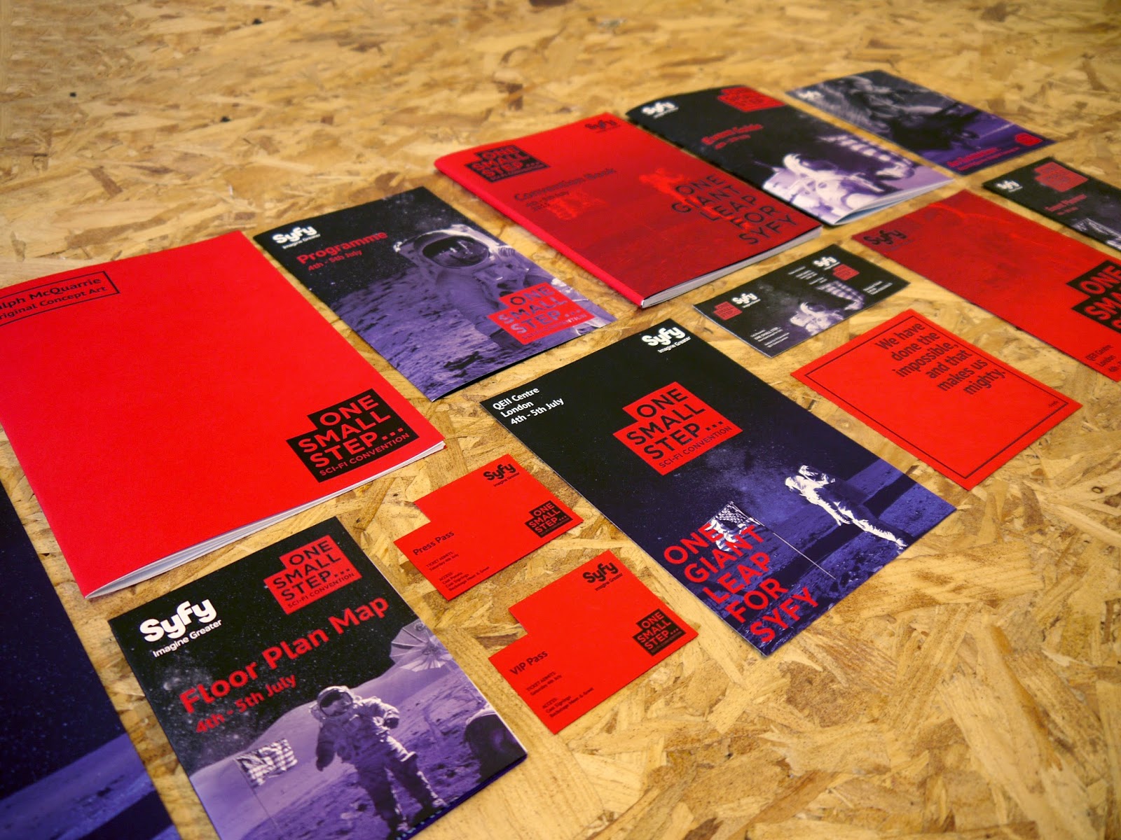


Overall I am very pleased with the photographs taken. Generally there is a bit of editing needing doing in the lighting of some of the images, however I think the general layout and photography of the collateral is strong and hopefully this will be improved when the editing is done. Some elements have photographed much better than initially thought, like the last image for example. That was a surprise, which has worked out really well and could be a leading image for the project.
Subscribe to:
Comments (Atom)