Showing posts with label Brief 14. Show all posts

Wednesday, 20 May 2015

Brief 14 - Advertising

As I do not have much time left, I decided on doing a very quick look into the possible advertising for the App.

In these, I wanted to incorporate the same elements as in the App, and be very simple as it goes with the brand idea of planning a trip easy and simply.

I had quite a clear idea of the design that I wanted to go with, having half colour, half photographic imagery, the App over the top with a bit of text, and along the bottom the branding.

The idea of the branding across the bottom is to have the brand logo and then a line of city names, with the chosen city in red, as explored in the branding when I was doing this.

For the case of this advertisement, I will be doing New York, as the App is mocked up to support this.


I decided on the small line of 'plan your trip easy' as it's quick and simple, and gets the point across. I was unsure of the App image to use, but I think the list of activities gets the point across of planning a trip. I tried both red and green for the bottom half, and found that the rest just sat much better for this particular design, however I do want to incorporate the green into the advertising somewhere.

I think the bottom branding works really well. It's simple and effective. The idea is that if this were a digital ad, the city list would move across and different cities would go red to indicate the fact that this can apply to any city.

I also added the App Store icon to the top right to give it a bit more of a realistic feel. I think it works really well and actually sits really nicely against the photographic imagery.

I mocked this up into two possible situations.


Following this I wanted to create an advertisement to a different format, so decided on a red bus mock up. It has quite an interesting space  to fill, so it will really make me think about the placing of all the elements. There is a low dip in one side which will fit a mocked up phone perfectly, so I have to work around this.

I also decided that I'd mock up a different city for this, choosing Melbourne. I also think this is a good place to incorporate the green colour as it will be going on a red bus.


I initially found the layout a bit tricky to get right, but found that the final layout I had worked really well. With the placing of the phone definite from the beginning, it was jus a case or working all the information around it. I think the green really works in this too.

For a final advertisement I found a mock up which had two sides, so I thought it would be good to do two ads that work together - one side red and the other side green.

On the first side it would be what I've used in the other ads - the 'plan your trip easy', and on the second side it would be something else about the app.

I wasn't quite sure what to do for this, but decided on showing the Map and having 'map your day easy'. It works with the other line and is four words again, so will fill the exact same space.


I really like the way this advertisement turned out. I think that it flows nicely and incorporates elements from both of the previous advertisements - the branding element from the poster - and the imagery to the side of the phone from the bus. I think the symmetry of it works really well and is simple and execution and shows quite a lot of what the App can do.


I'm pleased with the way the advertising looks. I think that if I had more time I could explore this more thoroughly, but I think that I have done is good and definitely puts the App in the best light possible. I think the use of the colours works really well and the good photography pushes the professionalism side of it.

Thursday, 14 May 2015

Brief 14 - Evaluation/Reflection

The aim of this brief changed a fair few times from the original writing, however I think that the final outcome has proven that I made the right decision in creating an App design instead of going down the route of branding and collateral.

My interest in App design has increased greatly throughout the year, and I felt confident enough to be able to do a full App brief. My skills have improved a huge amount and I think that I was able to apply these to this outcome to create a successful and professional looking App.

I think the strongest part to this App is the overall layout and use of colour to indicate buttons or separate sections. The use of photographic imagery with flat design created a strong visual aesthetic and gave each page depth. Particularly, I think the illustrated iconography worked really well across the App as they were simple, but detailed enough to be bespoke.

Choosing a subject like travel was a good thing to do as it is not a subject I have created work around before. It gave me a new subject area to look into and think about how the App would work in the situation where it would be needed, and what features are necessary for it to be successful and useful, not just look nice.

The main thing that this brief has done is make me think about the necessary elements to an App and how necessary an App actually in for a task. An App should be created to be helpful and useful, not just because it can be created and be there. There must be a purpose to it. Another important thing that I have had to consider through this brief is the appearance and usability. Something may look good, but if it takes a long time for the user to reach a certain part of the App, they are never going to keep it. Creating a simple interface and navigation which links well and as minimal as possible is what is important, and this has been shown in the simplicity of the App’s navigation.

Overall I enjoyed this brief and would have liked to extend it out to more formats and avenues, but with time restraints this was not possible. However, what I have done up to this point has been successful and I think it is a strong design with a good purpose.

Saturday, 9 May 2015

Brief 14 - Mocking Up

Login/Sign Up


Add A Visit


Visit Pages

 Activity Pages


 My Planner/Route Map Pages

Thursday, 7 May 2015

Brief 14 - Additional Screens

Following the completion of the initial digital wireframes, I started to work on the other pages that were needed for the App to make it a much more considered project.

One of the things that I had been thinking about recently was what the City home page would look like to the user if they clicked on it, but it wasn't time for their holiday yet and they just wanted to book some events in advance.

I think that this is a page that I should definitely include, so I thought about how this could work and what information would need to be there, and what did not.

The first thing I decided was that the content would have to be quite visible and stand out to the user so they would see it immediately. Because of this decision, I decided that it should be on a coloured block.

The information that wouldn't need to be there is the 'Day', 'Date' and 'Temperature'. This leaves space below the image to place the new information


The addition of this information is simple, but I think it is effective, and the green should stand out from the imagery that will be above it.

Following this I did the same for the individual event page, as for what would appear on an event when they had booked it, but it was not yet time for it.

For this, I decided on really simplifying the page down, because the user wouldn't need to see all of the information unless they really wanted to.


I decided that this would be a page where they could see the date, time and do four things - View the full event, View the location on the map, Set a reminder & Edit the visit.

The date replaces the location name, and stays in the dark grey, as to follow on from the colour of the My Planner heading. The planned time works over the green, as done in the previous page. The three icons work across where the Event information previously was, and a bar at the bottom can be clicked for the user to edit the information. I decided on keeping the Edit separate as it different from the other three options on this page.


I then moved onto creating the calendar for what comes up when an activity is selected to be added to the planner, or when the user is creating their trip.


Keeping to the overall aesthetic of the App, I went with a really simple and flat design. I incorporated a lighter green into this design as well because the other colours were too bold I felt, and the only bold parts on the page I wanted were the heading and the 'Add' button at the bottom.

Overall I think that this design works really, really well, and is definitely one of the best designs for the App. I love the way the actual calendar and time slots worked out. I was initially a bit unsure how to do the 'minutes' side, but working it in fives fit perfectly to the 'hour' numbers.

In terms of the 'Add a new trip' page, I realised that something important that was needed was the party number so this can be input automatically when choosing an activity. I added this section in.


The last thing to do on these pages was to decide how the numbers would appear when chosen. Taking inspiration from the visual list on the Mapped Route page, I decided on using red circles with white numbers.


This red works really well and definitely finishes the designs off. I feel that this is definitely one of the strongest visual designs in the App and it works really well in creating a simple way for users to choose a time and date.

I then overlaid these over the pages where they would appear.


Following this, I created the Sign Up page in the same format because of how successful it was.


Overall I think it works well, and I like the use of the red like in the calendar. When overlaying this over the Login page, I found that it was slightly smaller than the two buttons.


To sort this, I moved both of these buttons up to line up with the bottom of the Sign Up form, and decreased their widths slightly as well.


The last page that I needed to create was that for what would appear when a user clicked on the 'View on Map' button. This was relatively simple to do as I had already created a style of visual for the Map. All I had to do was apply it to the content I had, which was the Statue Of Liberty.


I added the address in a box in the top left so the user can see that if they need to. I think it adds a bit more to the page as well by being there and informing them of this. I also added a marker point to show the exact spot of the activity - keeping the same design as previously used on the Map Route, but just changing the text to work with this. I also changed the heading so it was clear exactly what the user is looking at.


Overall I am pleased with these additional pages and I think that they do finish the App off very well and cover all the bases. I'm excited to mock all of these pages up and displaying them in the way they would be seen.

Wednesday, 6 May 2015

Brief 14 - Completed Digital Wireframes

Following the creation of the iconography, I implemented these into the designs, and also worked on incorporating the green and red a bit more into the design instead of having all the buttons grey.

Login/sign up

This page hasn't changed at all, apart from the green and red being included for the two buttons.

Create a trip


I added the plus sign icon into place. I also decided on having the header bar in a slightly off white as to create a contrast from the white of the page. I think it works relatively well beneath the logo and red menu icon.

I also created an extra page to show what would happen when the menu button is pressed. It cuts off at the top as above this is where the iPhone information would be - the time/battery charge etc. It looked a bit strange covering this in a mock up I did, so I decided on just cutting it off below.

City homepage


Here I have added all the icons into their places. I think they work really well and the spacing between each icon is good. I wasn't too sure on the sizing that I should go with, but this seems to work well and all the icons are easily visible which is what I wanted. I also put in some mocked up information for a trip to New York City.

Category/My Planner page


These pages have not changed much apart from mock up text being put in place to follow the idea of it being a trip to New York City.

For the Planner page, I looked on a map and found a few activities that were close by so it would work well and simply for the map side to this app. I also changed the 'map my route' button to green.

Activity Page


This page has had quite a bit done to it. The main thing that I wanted to do was show that it was a different section of the App to the Category pages, so changed the header bar to red instead of grey. It is a clear contrast. I also added the icons to the middle right buttons, as well as the Category icon to the image space. I put in mock up text again for the activity name and opening times, with the intention of getting some more text to fill the description area soon.

Map My Route Pages

As said on the previous post, I wanted two different map pages which the user can flick between.


The first is the simple visual list. I decided on using bright red markers with numbers for the points the user has to visit. This makes it very clear that these are the main points. I also had to think about secondary markers. This is because to get to the Statue of liberty, the user must walk to the docks, then get a boat across. This was a good activity to include as it means I can show all the information and variation for if this happens.

Next to each point is all the information they need about the activity as well as a marker which indicates where the user currently is, using location services on the phone.

As stated previously, the different coloured lines indicate different modes of transport. The green represents on land/walking. The blue indicates water travel.

The final thing I did to this page was add the small map icon to the heading bar. This is what the user will click to view the map view.


For the second map page, it is to be a flat style map of the city, showing the route between the activities.

As I am only showing these four activities, I screenshot this area on google maps.


I then went about tracing around it in the style of the App. I stuck to the brand colours as much as possible, using lighter tones for the green due to the route colours being those of the brand colours. I also needed to get another blue because of this reason, so went for a lighter blue which worked with the brand colours. I included the orange for the main roads as google maps had, because displaying accurately is important.


Point 3 is the Statue of Liberty. This is a way away from these three activities, and the map would have had to be quite zoomed out to view it as well. Because of this, I decided that I would zoom in to the other three and say that this is the set zoom for the route mapping, so all the destinations and routes can be seen clearly.

Like the list route, I used the same numbered markers for all of the destinations. The final thing I did was add a small marker to indicate where the user was, which would move as the user does.


Now that these wireframes are all complete I have to say that I think they are all looking quite good and I am excited to create the actual mock ups and use the photographic imagery in these. At this point I think that it is looking strong and consistent.

Tuesday, 5 May 2015

Brief 14 - Iconography

For the categories I wanted each to have their own individual icons. I really want these to be consistent and be simple, but detailed.

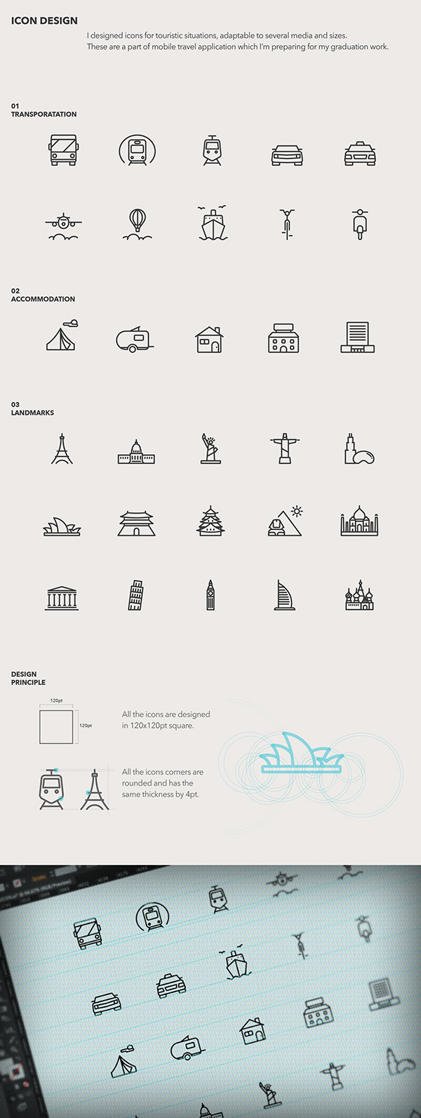
I looked into some icon designs which were similar to the style that I wanted to move forward with.


I chose these three to follow the same style of aesthetic as the three above because they are simple, but clear and easy to understand.

I wanted to create simple, but individual icons with a bit more detail on, like the top icons. I really like that the icons can be small and still have detail to them.

The main icons that I need to create are the ones for the City home page for the following:
  • About
  • City Map/View Map
  • Sight Seeing
  • Food
  • Culture
  • Entertainment
  • Sports
  • Popular
I had a few ideas for these already. But I won't be sure until I start creating these.

About - A outlined version of the logo
Map - an unfolded map with points and lines joining them together
Sight seeing - A camera, binoculars, a small icon of a famous sight e.g. statue of liberty
Food - plate & knife and fork, ice-cream cone, dinner bib, reserved sign
Culture - Tickets, a small icon of a famous cultural spot e.g. Sydney Opera House
Entertainment - Tv, microphone & stars, drama masks, tickets
Sports - basketball hoop, baseball bat & ball, tennis racket
Popular - star, thumbs up, bar getting larger at the top


I think that hardest icon to think about was the 'Culture' section. It's very hard to sum up culture in one icon, which is why I had so very little ideas for it.

I feel that its stereotypical to go for the Statue of Liberty for sight seeing, so I want to go with something that can be more general and apply to everything, so the camera or binoculars

Final Icons


I kept a very simple aesthetic for them, the most complicated being the culture icon. It is more complicated, but I still think it works well, especially because of the detail on the Sports and City Map icons.

Overall I'm happy with the icons I've created. I think that they are consistent and are visually simple and self explanatory, while not being too obvious/generic. I'm not too sure about the Entertainment icon of the tickets, but I think that it works over a wider category and applies to more than a microphone or tv set would.