Initially I was quite apprehensive about this brief as it was group work and a live brief. The previous live brief I did, I didn’t enjoy much at all due to the subject I was given, however I decided to keep an open mind about this as it was quite an open brief in terms of what the deliverables are and seemed like an interesting subject to work wih.
I wanted to work with people I hadn’t before, and I went through with this in the group I worked in. I found that this was a really good experience as it was good to see other people’s ideas and concept approaches. I think that we worked well together as a group as we had a variety of skills and each could put in our own individual contribution.
The final outcomes we produced were very different to how the brief started and to how I usually work, but I was very happy with this as this brief gave me a chance to really push my skills in vector illustrations and mocking up designs from scratch instead of using a downloadable file from the internet. This brief pushed my technical skills to a more professional level in this aspect.
The biggest surprise for me in this brief was my ability to create some strong and consistent illustrations. I had initially said I didn’t want to do the illustrations as I had not ever really worked in this style before and wouldn’t want to pull the standard of the project down, however when time became an issue and I helped in this, I found that it was much easier than I thought and I was much better at it than I thought, creating some illustrations that I was proud of and matched up to the standard of the others created.
Something I think we found hard as a group was creating a solid concept. Every time we thought we had one, we found the holes in it and ended up back where we started. However, when we finally did reach a certain and solid concept, it was strong and was definitely worth all of the hard work for. Once this was sorted I think we found it quite easy to create designs for it and expand this over the collateral that was asked for.
In terms of our outcomes, I think what we did was good and was very different to all the other groups, something that I think we were happy and proud to do. While we necessarily didn’t have enough time to fully explore what we could have done and push this far, I do think we did a good job and can be proud of what we did.
In reflection, I can say that I did enjoy the brief in terms of the design work. I think we can all agree that we found it hard up until that point, but keeping in constant communication and making time for meetings really aided in the development of this brief, which did result in a strong concept and strong visuals.
Showing posts with label Brief 12. Show all posts
Showing posts with label Brief 12. Show all posts
Friday, 6 March 2015
Tuesday, 3 March 2015
Saturday, 28 February 2015
Friday, 27 February 2015
Brief 12 - Train Exterior Development
Following the finishing of our posters and the train livery work that I did individually, I decided on mocking up the train side and doors as this was an idea we had discussed but hadn't got round to doing yet. As I had completed my individual work, I took it upon myself to do this as I felt it was definitely worth including.
The idea behind the doors is that when they are open, the message is unclear, but when they are closed, the message becomes clear - linking to the idea of better together to create that strength and unity.
I found a couple of images of very similar trains, one with the doors open and the second with them closed.


From the work we had done for the posters, I took these designs and adapted them to create a bespoke design for the train, once again showing the versatility of our designs.
Finished mock ups:


I am really pleased with these mock ups because they are quite realistic. Creating these really pushed my skills in mocking up designs in photoshop. Putting a design onto a train isn't something I've ever done, but I definitely think I did a good job and it definitely helped develop my skills in this.
Brief 12 - Finished Posters
Once all the illustrations were finished, we discussed the direction of the posters and agreed on the concept of the landscape with small icons falling down onto each of the cities. This is to represent that the joining of the cities will fill each city with the benefits of travel, culture, opportunities and innovation. Instead of having text explaining this, we decided on a pictorial response as it is something a bit different and links in well with the style of illustration we had chosen.
Completed Landscape

Brief 12 - Alternative Poster Development
While Sam put together the main posters for our deliverables, Ewan and myself worked on alternative posers to broaden the printed promotional material and to show how versatile the design is.
Something that we didn't put in the four posters was the four statements that we had previously come up with relating to the four areas which improve in the joining together of the cities. I wanted to use these because I felt that they showed another side to the concept and shows that we have thought about the benefits. While these are four small statements, I do feel they are worth including.
Much like the main poster series, I followed the format of a landscape built by the four together. The overall design was the same as the main posters, however instead of the falling icons, I went with the four statements.

Following this I decided on a couple of changes. The first was to use one long train instead of four small ones. I find it looks a bit odd when they're placed next to each other. Another thing I decided on changing was the size of the bottom colour. I think that it's too big for the amount of text there, and the focus of these posters should be on the statements. Another thing I liked about our previous poser development was having the text in a colour a tone lighter or darker than the colour. I think it worked really well, however this was a split opinion in the group so wasn't used in the four main posters.

I think this works much better than the previous design as its more fluid and the focus is on the four statements.
Following this I created a couple of other variations which would work as one long poster instead of four separate.


I then took these ideas and mocked them up into different situations to show how they can be applied.


Thursday, 26 February 2015
Brief 12 - Illustrations
When it was found that the illustrations were taking much longer than anticipated, I agreed to create the illustrations for Manchester.
The idea we had for the illustrations was to do them in the three other colours from the branding. As Manchester's colour is red, all the illustrations would be in the blue, turquoise and gold. It was also agreed that it would be well known and iconic buildings.
The three buildings I decided on doing are:
- Manchester Town Hall
- Manchester Library
- Manchester Art Gallery
Town Hall:

Library:

Gallery:

The gallery is quite long so I decided on cutting it down so it would be more manageable on the posters.
Cut down gallery:

The feedback on these illustrations was very positive and they will be used in the poster design.
Following this I agreed to take one of Ewan's designs and make it a bit more detailed as the illustrations done by me and Sam were similar in this. Ewan's designs worked really well as supporting imagery, as he had created housing and a landscape mountain/hill range, however the cathedral was quite different to the the style in which me and Sam had done it, so for consistency purposes, and just for use on the posters, I added to it.

I then tried a few colour variations. As the cathedral is in Liverpool, the red must be used instead of the navy blue. This made the design quite striking and hard to look at in some combinations.

We decided on the bottom left design as it had the least amount of red, so was easier to look at. We have found that the red in the illustrations is very bold and makes the designs quite hard to look at so will use it in a minimal.
Overall I am quite surprised at the illustrations I have done. I didn't expect to create illustrations as well as I have. I have never done anything like this before so I was unsure that I would do them well, which is why I didn't want to do them in the first place, however now I am glad I have done some and I hope to experiment further with this in the future.
Tuesday, 24 February 2015
Brief 12 - Train Station Interior Development
As my individual job was to create the interior way finding for the train station, I decided on creating what I thought best suited the context.
he main thing I wanted to focus on was obviously the two tramlines - the HS2 and the HS3. I did research into the HS3, looking at the timings it would take between each of the cities, and decided to use this as a focus.
Timings:

I also looked into the HS2, and found that there are two routes for this train - one from Manchester to London, and the second from Leeds to Birmingham.
The first thing I did was create some designs to go on the platform/service board to show the stops. I decided on using the crosses to indicate the stops. I decided on using a 15% opacity of the gold as a background. It just keeps a bit more interesting than having white. It also supports the colour scheme a bit better.
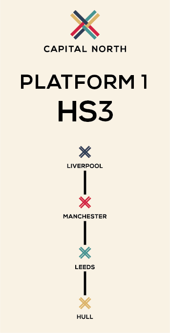


I then mocked these up into a train station setting.


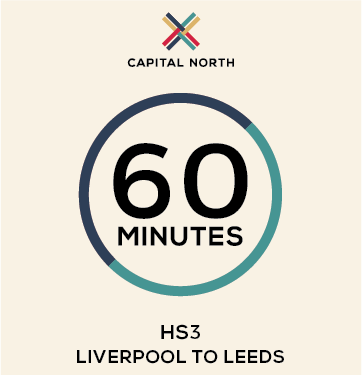
Following these I started working with the timings of each journey. I wanted to have a simple design which reflected the journey and cities.
I came up with the idea of creating a circle and having two halves, one for each destination, with the timing in the middle. The circle indicates both the cities and that the journey can be both ways.
I started with creating a design for each of the one-city journey's.


I think the design works well and is effective in the simplicity. It is straight to the point. I then duplicated the same design for journeys which included three cities.

I also created one for the full journey across from Liverpool to Hull.

The only issue I have with this is that this is clearly the full journey, and that isn't illustrated clearly. I tried out a couple of different variations to show this better.


The second is definitely better aesthetically, and the point is illustrated with the colour changes. I then transferred this idea to the designs which incorporate three cities.


I then mocked it up in two different contexts to show how these simple designs can be adapted to any space and placing.


Following the success of the timing posters, I combined this and the stop posters to create some more posters which could be placed on the platform or around the station. These show all the stops and the new quick times.


I also created a full map of the train journeys and their timings to create an overarching poster design. This is something that shows the new train journey times.


Following this I created a couple of ideas from way finding in the train station. I created some arrow signage for print as well as some vinyl stickers which would be on the floor around the station to direct the passengers towards the platform. I also thought about the platform itself, with the idea that a platform will be dedicated to this train only. I mocked up the idea of having the colour and logo along the platform.


Overall I think the work I have done is good and consistent and applies the brand well. The feedback from the others was positive.
Brief 12 - Meeting
Today we had a meeting to move forward with our concept and start working on the posters and other design work that we want to do.
We decided on a definite concept, using a jigsaw as inspiration - putting together the pieces. This references the idea of each city being individual, and that putting them together creates a strength, unity and clarity.
The logo links to this strongly as it is four coloured arrows weaved together. However we did agree that Ewans version of the logo was possibly stronger in the link as it was a bit more obviously weaved with twice the amount of lines.

He had also created two possible patterns which could be used, which is something we are strongly considering using in the branding as it can be used both subtly and prominently.


Posters
We discussed our initial thoughts for the posters, and liked the idea of having the four of them aesthetically connected and flowing. The main idea we had was that of having 'capital north' written over the edges so the posters would piece together to show the text fully.
The thing that we are having difficulty with is the actual written content. Creating consistent and strong content across all posters is hard as we don't know what to make the focus.
We all tried variations of the fitting together the posters and quickly agreed that it wasn't working as well as we'd hoped so another direction was needed.
We spoke about the content and looked over the brief again to discuss the points raised in it. I suggested that we keep the content simple, connected and easy to understand across all of the posters.
It was at this point that we discussed the aesthetics we wanted to use across the posters, deciding that the main aspect we wanted to use was the connection of them and how each poster can work on their own, but be put together to create the bigger picture - linking to the concept and idea of a jigsaw.
We decided on the idea of a landscape, so we would create illustrations for each city - making it individual to each city - and then the whole image would be made up of all the illustrations to show the unity. These would be lined up as the way they go across he country - Liverpool, Manchester, Leeds and Hull.
For each city we decided on a topic. While these wouldn't necessarily be linked specifically to that city, as they are general points they definitely can be - and when all the posters are together it shows the main benefits of Capital North.
Chosen Topics:
- Travel
- Innovation
- Opportunities
- Culture
To keep a simple execution of these, we looked into words that were similar - such as 'experience' and 'enjoy' etc. We wanted a different word for each.
We decided on the following:
- Experience Travel
- Discover Innovation
- Unearth Opportunities
- Explore Culture
Initial mocked up idea:

I quite like the way this is going, however it obviously needs work and we won't get a full visual until the illustrations are done.
Following this we discussed the other collateral that we wanted to do. We previously decided on 'Train Livery' and 'Environmental'. We have agreed that these are still the ones best fitting to our concept.
We then split off the sections for us each to progress with individually. Sam and Ewan will create the illustrations, poster ideas and possible train livery. Ant will do way finding around the city, staff uniforms and work on creating an animated logo design.
My job is to create the way finding/livery for a train station. With this I already have a few initial ideas in platform posters and general designs to go around the station.
Brief 12 - Project Rationale
This brief is a collaboration to create an identity for the Northern Powerhouse ‘Capital North’.
The concept is to show the unity between the four cities and how this unity strengthens each individual city, as well as the four of them together as an entity. Each city will be treated as individual, showing that each city has its own importance and place, and that it gives something to the combining of the four cities. Showing this importance and individuality shows that each city is as important as the other three and is fundamental in the creation of this Northern Powerhouse.
Building on this, the idea of a jigsaw is an influence in how the pieces come together to create the picture - linking to the idea of the four cities come together to create the bigger picture and create something that is clear and stronger as one.
Thursday, 19 February 2015
Brief 12 - Meeting
Today we had a short meeting to see how we had progressed with this brief.
Ewan had come up with a slightly different colour scheme to that which I had done in the logo design, and we all agreed that it worked better including a dark blue instead of a purple.
We also changed the type to bold, with the idea that light type would be used underneath when naming the four cities.

The colours:
Navy Blue - Liverpool
Red - Manchester
Turquoise - Leeds
Gold - Hull
Happy with the logo, we started to discuss our initial poster ideas. This is something which we to keep consistent in the design, but different in the content. With this, we decided on each looking up the bad things about each of the cities and would use the posters to comment on how these would improve in the creation of Capital North - focussing on the positive side of it rather than the negative.
For example, if one city had a higher unemployment rate, we would say that with Capital North, employment would increase.
We also agreed on creating some poster variations in terms of the design. We wanted a consistent design, which was simple with imagery and text, and included the colour related to the city.
Monday, 16 February 2015
Brief 12 - Meeting
Today we had a group meeting to discuss our own individual progress in creating an identity for this brief.
I shared my variations and the main concept that I had created, showing the PDF of the design and applications on this logo.
My concept was that the weaved lines visually represent strength and being stronger together. The four colours are representative of each of the cities - showing how each city has its own individuality in the group and each brings something.
Overall the feedback was positive, and eventually it was decided that we would move forward with my design.
We each took the logo and did our own variations. I changed the colours so they were block colours, as requested by Sam, and straightened the logo out completely so it was a perfect square, with a perfect square in the middle.
Instead of the 'stronger together' below the name, it was agreed that instead, each city would be named, and this would occur when placed on material in this particular city.
We are each now going to spend some time deciding on a colour scheme. Ant is also going to experiment with the idea of making the logo animated.
Sunday, 15 February 2015
Brief 12 - Concept Ideas
Following the session on Wednesday, we each are developing our own initial and new ideas for this brief. While we have a strong concept, we are currently unsure on the visuals to move forward with as it is something very hard to visualise.
I started by working with the idea of strength and playing with the 'stronger together' concept - perhaps having this as a tagline for the identity.
I came up with a few initial ideas. I decided on sticking to using four colours as I think this is something important. I think it shows that each city is important and brings something individual and different to the unity.
Idea 1
With the idea of strength in numbers, I thought about what represents this and decided on the visuals of mountains. While it's not entirely original, the visual identity below is simple and easy to work with.

Idea 2
Working off of idea 1, I developed it further by mirroring the 'mountains'. This is a more visual representation of 4 becoming 1 and unity. I used the colour green to show positivity.

Idea 3
On a more abstract logo idea, this moved with the idea of unity. Taking inspiration from weaving, this design locks together the four colours to represent the four cities. The interlocking showing strength and unity, with each line going at a 90 degree angle out to create a stronger tie.

Idea 4
A much more simple visual in using a circle with four simple waves moving across it to represent unity and wholeness.

Conclusion
With four ideas, I decided to choose one and move forward with it. I decided on idea 3 as this one is the one I feel is the stronger and more original design. It is something that I think it quite individual and works with the concept strongly.
I created four text variations for it, including the tagline of 'stronger together' as I think this really works well with the visual and makes the entire design obviously understandable.

I decided that the top left typography worked best. While I have been against all uppercase, I do feel it is the type that works best with the imagery. The bolder weight works much better as a small tag line than as the identity name as well.
Following this decision, I generated a few different visuals to show the others how this could possibly be applied. I created a short PDF of these ideas.
Application PDF
Overall I think that the identity is pretty good, and I hope to receive positive feedback from the rest of the group, however I do know that they are all doing their own ideas and may feel more strongly about those than mine. I do think that my design works well with the concept and is quite original.
Subscribe to:
Posts (Atom)