From the research that I have done, it seems that the majority of similar retailers have gone down the rustic Italian route, which is the more obvious route to use to attract customers. However I am more compelled to go down a much more minimalist and stylised route as I think this is perhaps a bit more reflective of the research I undertook. It will also be better suited to what I am considering to be a one-store high-end bakery/cafe.
The romans were the ones who pushed bread making and developed the skill to become masters, even creating their own guild of bakers with specialist pastry chefs. This means their methods of baking were incredibly refined as it took specialists to create the bread to the highest standard. Implying luxury.
Another factor is that the classic Italian rustic bread that is made across the country is a very simple mix of flour, yeast, water and salt. This is what has been popular across the country for a number of years, so clearly shows that sometimes less is more, much like design.
Something else that I picked up on research is that Italy has a certain stereotype, like all countries, of a certain style of design. The majority of businesses with an Italian influence/base have gone down the rustic route, however there are very modern designs and businesses in Italy which are certainly much more modern or contemporary than this stereotype. Eg. Ferarri, Fendi, Moschino, Gucci, D&G, Natuzzi. These are all brands that are very well known, and very up to date/modern due to the industries they are in, showing that Italy is not all rustic and old fashioned.
I started to do some research into design which was much more down this route, with simple branding and collateral, all of which have subtle elements which are used to make the brand stand out and be modern and simple, but individual and interesting at the same time.
Mamva
https://www.behance.net/gallery/18834581/Mamva
MAMVA is a popular health-food restaurant located in San Pedro Garza García, Mexico that serves fresh smoothies, juices, salads and paninis. Drawing from the idea that eating healthy is the best medicine, the snake is featured thanks to its status as a symbol of health and medicine since ancient times.
Overall the branding and layout of everything is very simple, straight forward and quite constrained, however this makes for a sophisticated, professional and consistent looking finish across all outcomes. The use of the bright green - used as a reference to the healthy side of the business - accents the design and adds a contemporary flare to the design.
Puro
This branding is very simple with the use of two icons to represent the two types of water. This is an alternative to using a variety of different colours to reference the different products. The black and white branding creates a very strong visual and shows that colour isn't a necessity to catch attention.
Botanica
This branding is a bit more rustic than modern, but I liked the simplicity of the logo design and that it can be versatile in how it can be used and what media it can be put across. It is a simple typographic logo and has supporting imagery which can be changed for each product/print that it is put across.
VIVIANA
Viviana is a brand for highly nutritional food products made with natural ingredients, antioxidants and super-foods located in Monterrey, Mexico. The brand name comes from the spanish word vivir and vida, meaning living and life. These words make direct reference to the product's natural and purifying properties.
I like this packaging because it is very simple, but very image driven as well. The bold and colourful images on the front of the bottles are what catches your attention immediately, and makes it known that there are different products in the range. Once again the logo is a simple type logo, but it is edited to be individual and not just a typeface written. The use of white is also interesting to me as overall the layouts are simple and quite understated but because of the bold colours, this works incredibly well to create a professional and clean finish.
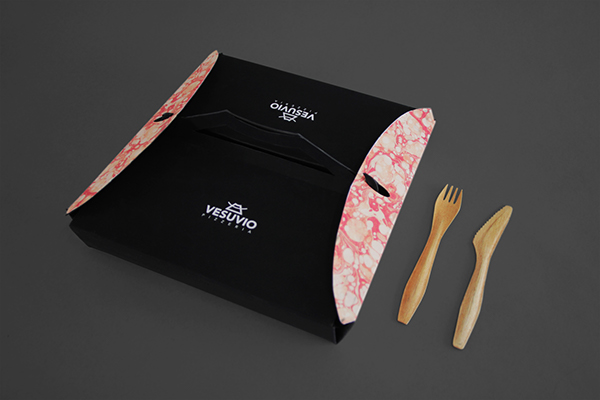
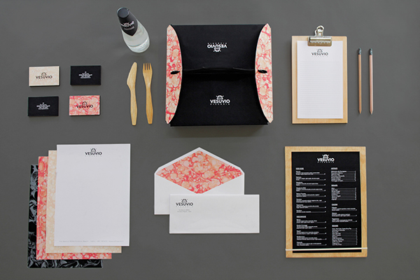
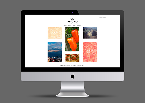
Vesuvio Pizzeria
I'm not particularly interested in the overall branding of this, but I like the concept behind the branding. It is packaging/print for a pizzeria. As pizza's originated in Italy, taking influence from Vesuvius is a very in sync idea. The logo design is simple with text and image, all flat and in one colour only, which works well to balance the marbled pattern which is representative of lava. I also like the very clean design of the website, however I'm not too convinced on the way this website works with the printed collateral.
Stella Borealis
The name Stella Borealis is inspired by the Polar star (Stella Polaris) and the Northern lights (Aurora Borealis). Translated from latin, Stella means "star" and Borealis means "north".
This packaging is very minimal, but is representative of the product and concept. It definitely goes by less is more, as it is minimal, but looks luxurious and modern. I like this because of the fact that it is clearly a considered design which goes by the concept and is understated.
Sacco
This design looks a lot more rustic than modern because of the stock used for printing, however the actual designs across the media is simple and minimal. The use of photographic images in this way isn't something that is seen often on packaging. I think this branding is simple as the stock was considered at the same time as designing.
Notum
Notum is latin for ”known”, and is a tour operator as well as a consultancy company within the travel business in Norway. They focus on having a local insight and knowledge to all the small paths and unique sights in the vast nature in Norway – they want to deliver an extraordinary view worthy of a "postcard moment". The identity builds on this, taking inspiration from a postcard stamp as logo together with photographs of Norwegian nature. The logo mark itself is a tree branching out to smaller paths and destinations.
I like this branding because of how concept driven it is. The designer took the elements that the client wanted to be put across and created a very simple logo which had these all in. While I'm not particularly keen on the design itself, the application of the concept to the design, and how this logo works across different media is interesting and shows that a simple logo design can be used effectively and be interesting.
Deseco Biscuits Packaging
This biscuit range is by a classic Italian biscuit company, and shows that not all of Italian food design is rustic. The packaging is created in a contemporary and clean design, with bold colours and individual elements to each product, while keeping uniform across all product ranges to show consistency and that these products are all by the same business. The use of white keeps the packaging look sophisticated, but also current and high-end. On these packagings there is also two logos, one printed in black and another foiled across the bend. The foiling adds a bit of a luxury element to the design.
Ylajali
Branding and webdesign for the Norwegian gourmet restaurant.
This branding is very minimal and simple and works incredibly well across both printed material and the website. Having the logo in the golden colour to contrast against the black and white stock is an interesting idea. The logo is simple, but stands out because of this. A lot of minimal logos are in black or white so it's good to see one which involves a bit of colour, but uses the stock as the monotone element to the branding.
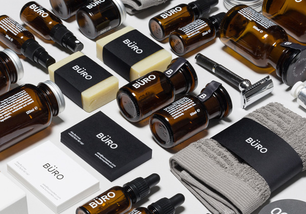
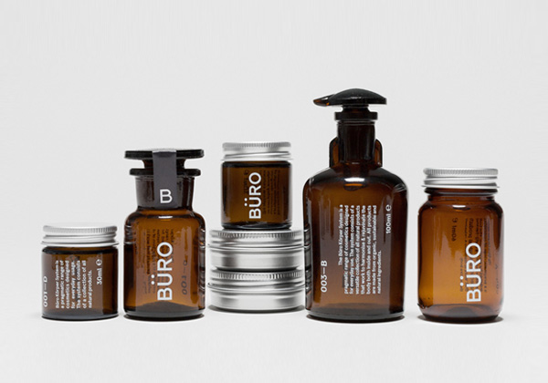
Büro
Büro is a mens cosmetics range made from all natural, sustainable ingredients, designed to be used on a daily basis and tailored to the individual needs of the user.
This branding is very simple, and with a simple branding there is a lot of different applications for it. That is shown across the range of media the logo is put across. Once again this branding is simply black and white, using the colour of the products/stock as a contrast.
Capricho
This branding is very subtle and minimal. It adapts to the media that it is put across, changing to either black or white to contrast against the media colour. I like this branding because it is black and white, with the brown stock as a contrast to it.
Sous Chef
Sous Chef are the go-to people for the serious home chef. An ecommerce company, they sell specialist ingredients, gadgets and other kitchen items usually sold in bulk to caterers. We gave them a sharp, clean, functional design with pro appeal for the amateur chef. As well as branding and packaging, we also designed the website layout and corporate stationery.
This branding is a bit more contemporary than modern, however there are simple and minimal elements to the design. It is all black and white, and uses simple layouts across all of the branding.
After looking into these designs I am confident that this is the correct route for me to go down. Bread making might be quite a rustic skill, but I think that because the romans were the ones who created a high-end market for it, this should be reflective in the branding, as well as the idea of less is more, which is often true in bread making when it comes to the ingredients used.






No comments:
Post a Comment