Following the creation of the iconography, I implemented these into the designs, and also worked on incorporating the green and red a bit more into the design instead of having all the buttons grey.
Login/sign up
This page hasn't changed at all, apart from the green and red being included for the two buttons.
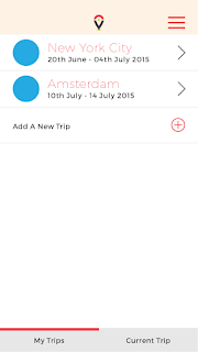
Create a trip
I added the plus sign icon into place. I also decided on having the header bar in a slightly off white as to create a contrast from the white of the page. I think it works relatively well beneath the logo and red menu icon.
I also created an extra page to show what would happen when the menu button is pressed. It cuts off at the top as above this is where the iPhone information would be - the time/battery charge etc. It looked a bit strange covering this in a mock up I did, so I decided on just cutting it off below.
City homepage
Here I have added all the icons into their places. I think they work really well and the spacing between each icon is good. I wasn't too sure on the sizing that I should go with, but this seems to work well and all the icons are easily visible which is what I wanted. I also put in some mocked up information for a trip to New York City.
Category/My Planner page
These pages have not changed much apart from mock up text being put in place to follow the idea of it being a trip to New York City.
For the Planner page, I looked on a map and found a few activities that were close by so it would work well and simply for the map side to this app. I also changed the 'map my route' button to green.
Activity Page
This page has had quite a bit done to it. The main thing that I wanted to do was show that it was a different section of the App to the Category pages, so changed the header bar to red instead of grey. It is a clear contrast. I also added the icons to the middle right buttons, as well as the Category icon to the image space. I put in mock up text again for the activity name and opening times, with the intention of getting some more text to fill the description area soon.
Map My Route Pages
As said on the previous post, I wanted two different map pages which the user can flick between.
The first is the simple visual list. I decided on using bright red markers with numbers for the points the user has to visit. This makes it very clear that these are the main points. I also had to think about secondary markers. This is because to get to the Statue of liberty, the user must walk to the docks, then get a boat across. This was a good activity to include as it means I can show all the information and variation for if this happens.
Next to each point is all the information they need about the activity as well as a marker which indicates where the user currently is, using location services on the phone.
As stated previously, the different coloured lines indicate different modes of transport. The green represents on land/walking. The blue indicates water travel.
The final thing I did to this page was add the small map icon to the heading bar. This is what the user will click to view the map view.
For the second map page, it is to be a flat style map of the city, showing the route between the activities.
As I am only showing these four activities, I screenshot this area on google maps.
I then went about tracing around it in the style of the App. I stuck to the brand colours as much as possible, using lighter tones for the green due to the route colours being those of the brand colours. I also needed to get another blue because of this reason, so went for a lighter blue which worked with the brand colours. I included the orange for the main roads as google maps had, because displaying accurately is important.
Point 3 is the Statue of Liberty. This is a way away from these three activities, and the map would have had to be quite zoomed out to view it as well. Because of this, I decided that I would zoom in to the other three and say that this is the set zoom for the route mapping, so all the destinations and routes can be seen clearly.
Like the list route, I used the same numbered markers for all of the destinations. The final thing I did was add a small marker to indicate where the user was, which would move as the user does.
Now that these wireframes are all complete I have to say that I think they are all looking quite good and I am excited to create the actual mock ups and use the photographic imagery in these. At this point I think that it is looking strong and consistent.


No comments:
Post a Comment