Friday 31 October 2014

Brief 3: Day 1

Type style:

Progress:

Finished typography:

Overall I enjoyed creating the typography, however I learnt a few things that did surprise me. The first is that amount of concentration needed to do this. Even though the overall design was basic, still making it consistent was a lot of work. Another is that I have to think about kerning and leading immediately instead of being able to change it afterwards. I found it quite hard to keep all the type even as well. Some of the letters are thicker than others so that's a bit annoying.

I also think that the spacing between words is something that I'm going to have to work on. When drawing the grid as I went, the spacing seemed more than enough, and it works well for the first line, however it's clearly too small for the other three lines.

Brief 3 - Rationale

After doing the initial research and making decisions for this brief, I decided that writing a project rationale is a good way of keeping the brief on track and keeping a record of what I want to achieve by doing the brief, and why I am doing it.

Rationale

The main aim of this brief is to develop my skills in hand drawn typography and experiment with the possibilities of this skill through a constant brief over the course of thirty days. Developing my skills in this area will be beneficial to my future practice in both initial visuals and design development of briefs. This skill will also improve the way in which I use typography and develop typefaces as I will be getting a deeper understanding into how each letter works, and how they work with other letters.

Throughout this brief I want to experiment in a variety of different typographic styles and focus in on which styles I really enjoy doing and can do well. To start the project, the easier styles will be focussed on, with a progression to the harder and more complex styles depending on how my skills do progress. This will allow me to improve my skills as well as do it at a realistic pace by building on the complexity of the type.

As the main aim is to improve my skills in hand drawn type, the phrase to be used will stay consistent throughout the brief - the quick brown fox jumped over the lazy dog. This will stay consisent, however may be used in variation depending on the style of type and tme restraints.

This brief is to be done consistent over thirty days, meaning I must keep a srong time management through these thirty days to allow myself time to be able to complete the brief in the time frame and to a good standard. This brief will be done around other briefs so strong time management is key to the success of this brief

Brief 3: Quote Preparation

In preparation for this brief I had another look for hand drawn type online and in books and came across this one project which uses the same quote across a variety of different styles of hand drawn type.

Link:
https://www.behance.net/gallery/14236961/The-quick-brown-fox-collection-Hand-lettering


I think that this is a good idea to use the same quote but change the style of type. Using the same quote clearly shows the change in the type, and shows how the tone of voice can be changed depending on the style of type drawn.

After seeing this I have decided that I will use this as the first quote and have the intention to use this as the quote for every day's work after this, however I think that perhaps when it gets to some of the more complex styles I may take just two or three words instead of the full quote but I will decide that when it comes to it.

Thursday 30 October 2014

Brief 5 - Icons

The client has asked that I create a number of icons to complete the branding.

During the time where I was creating the logo, the client did express interest in having a couple of icons in the logo, which I did create, however they went for the design with just the burger. It was the stronger design but I thought it was a bit of a shame not to use the other icons I created, so it's great that I now have a chance to improve upon those and expand the design across a number of different items.

The client wants the following icons:

  • Ice cream cone
  • French fries
  • Glass of wine
  • Pint of beer
  • Bottle of beer
  • Beverage
  • A chicken
  • A vegetarian icon
  • A fish
  • Firewood
  • A campfire
  • Split cross section of a wood log
I am estimating that it will take between 8 - 10 hours to plan, create and refine these icons to their finished state. I am currently discussing a quote with the client, so once that is sorted and secured, I will begin working on the icons.

Wednesday 29 October 2014

Brief 5 - Chosen Identity

The design below is the one chosen by the client to be the final identity.


It was agreed that the identity would be monochrome and would be either brown, black or white, depending on the media and situation.

Brief 3: Preperation

In preparation for starting this brief I wanted to give myself a clear structure to what style of hand drawn type I would be creating each day.

I looked over the research I had done recently and previous to this year and collected the images together on one sheet. I wanted to print these and cut them up so I could take 30 and arrange them into a timeline to follow.

Images:

I printed the sheet A3 and cut them out. In terms of structure, I decided that it was beneficial to me to treat the timeline like a learning process and put them in order of difficulty. My skills will improve as I progress, so putting the more complex/intricate designs towards the end will be beneficial.

Altogether I printed 42 images. I laid them all out and began making a timeline. There were a couple which were quite similar, or some which I knew weren't what I wanted to learn, so I put those to one side.

Eventually I got my 30 after a few rearranges, and in an order which I think is progressive and shows a steady increase in difficulty/confidence needed.

Final 30:

Initially I want to stick to this, however I do think that I shouldn't restrict myself to this as I will be working on other projects/seeing other work over the next month, so I may come across a certain style of design that I want to do.

The next thing I need to do is decide if there is an overarching theme to this project or if I will be making each completely individual.

At this point I don't think I should restrict myself to a theme because the main focus is to learn hand drawn typography skills, and picking a theme may have an impact on how I go about that.

Monday 27 October 2014

Brief 5 - Initial Designs

I started work on this brief by creating a very simple burger icon and choosing the typefaces which I wanted to use. As the client wants something simple, I decided on Nexa Bold as the main typeface, and Sanchez as a supporting typeface. These contrast well against each other as Nexa is a sans serif and Sanchez is a contemporary slab serif. It adds a bit more of an authentic appeal to the design.

I started with a very simple layout with the information stacked. I did two different variations of possibilities. This will help me in seeing which direction the client wants to go in.


I then sent this to the client for initial feedback. I decided to do this now so it allows the client to see exactly how I am seeing the identity right now and see if it is going in the right direction that they are wanting.

The feedback for this was good. The client preferred the first variation. They asked for the type to be put either side of the burger.

I did as the client asked and found that the 'The' in the name really created some issues, so submitted a version with and without it. Another issue with this is that the width of the letters on either side was uneven, mainly due to the 'W' in 'Wood'. It is obviously a wider letter so the kerning had to be different on either side to have the burger in the middle. While I wasn't too keen on this idea, I did it regardless so I could get some feedback from the client.

I sent through a couple of different variations, one with the 'The' and a second without it.


At the same time I also submitted a second design which I had developed. This design was away from what the client had asked for in terms of layout, but kept the full name of the restaurant.


The client gave more positive feedback to the second set of designs, which I was happy about as that was definitely the design that I felt was much better. 

I decided that I didn't like the rustic kind of look that I had given with the grungy overlay, instead preferring the cleaner and sharper look of the previous designs.

The client asked for the burger to be put in place of the third 'O' instead of on top. I also decided to get rid of the 'est.2015'  and replace that with the 'burgers, brews & cream'.


I felt that these designs are definitely the strongest that I had sent and I was happy with them because they was moving in a direction that I could agree with.

The client also gave feedback in that they didn't mind if the name included 'The' or not. They also asked for me to try the idea of an icon for all burgers, brew and ice-cream. While I preferred the idea of just having the burger as it's one symbol and is recognisable as this, whereas three symbols might be a bit too confusing, I did do as the client asked. I kept the designs in the same style, using smooth curves with the basis of circles.


Following this submission the client asked for a variation of the previous design where a lime green could be used in the design somewhere. I certainly didn't like this idea but understood where they were coming from. 


I did what the client asked and they did agree with me in the fact that it worked better without the green, and with only one symbol. I went back to the previous decision of using one colour following this. I mocked this up onto a variety of outcomes so the client could see how this would work in a realistic view.

Brief Update

After the crit I decided to reevaluate where I am at this point in time with my briefs. I had wanted to have completed my Italian Bakery/Cafe by this time, however have found that I don't want to restrain my development to this timeline, especially when I feel that I can continue to develop it and balance it with other briefs. I think that there is a lot more that could be done with the brief and want to continue with it to make it a larger brief with larger outcomes.

Following the crit, Charlie and I sat down to discuss our collaborative brief. We both decided that because we both wanted to work on our individual briefs, we would put the collaborative brief on hold at the minute. I don't think either of us are eager t get started on it at the minute, and we don't want to do it badly or when we're uninterested in it, so will be starting it at a later date.

At this point I am also looking over the briefs which I have and am trying to decide what to start and when. I am currently planning to start the 30 Days brief imminently, which will take up a lot of time every day, so I need to be able to manage my time around this.

For the Interim Deadline I need to have five briefs completed. I had intended to have the following briefs completed before this time: Dr Me, fonte de vita, 30 Days, Collaborative & DSM live brief. However following the discussion with Charlie and dropping the collaborative to a later date, I will need to do another brief to be completed before this time.

I looked over the briefs I had written and decided that as I will be doing 30 Days brief, I don't want to do another typographically focussed brief at this time as I want to be able to have a variety as I work so I don't get too bored or frustrated at a certain topic. I had intended to do the EuroStar rebranding brief, however I'm not really excited about that. From now until the deadline I don't have enough time to complete the New York Travel Pack brief, as I think I will really want to do that brief over a long period of time, so I want a short brief for myself.

At this point I am thinking of dropping the Eurostar brief altogether as I think I wrote it at the time just to have eight briefs and wasn't really totally invested in it so much. I do think that if I was excited by it at this time I would do it, but right now it's not what I want to do.

I think that this is something that I really need to think about and decide what I want to do because I don't want to do a brief for the sake of doing a brief, or to meet a deadline. I want to do something that I am interested in but also something I can do well and in a short time.

I am still currently working on a few things for the client brief I have Wheatless & More, but haven't heard anything back from the other two clients as of yet.

Group Crit

Today we had a crit where we were split into groups and had to present our work up to this point. As we are all working on completely different projects with different timescales it made for quite an interesting crit. Before this we were all on the same sort of timescales and briefs, so the content was all quite similar, but now as we are all writing our own briefs and self directing it, it makes things a lot more open and feedback is different.

In preparation for this I looked over the work that I had done up to this point on my Italian Bakery/Cafe and decided that this would be a good point to present it at and get some feedback, especially because I wanted to resolve it within the week.

I printed off the bakery and cafe menus as well as the brand guidelines, and presented them to size and how I was thinking of doing the covers at this point.

Printed booklets

I printed these all as booklets, and have the intention of binding them in this format at this point

I also created three boards on the other work I had done which wasn't printed. I decided that instead of making them all look through the brand guidelines, I'd create a board which showed the main points to the branding. I also created a board for the website, and one for promotion.

While I hadn't done any work on promotion at this point, I had a general idea of what I wanted so created a few quick digital mock ups of the direction I wanted to go in.

Boards:


I said that I intended to resolve the brief imminently once I had sorted the packaging designs, however feedback was that I shouldn't do that because it would be a good brief to extend out a bit longer and make a large body of work for. This is something that I do want to do, however I do need to consider other briefs that I want to start and have finished for the Interim Deadline on December 11th.

Feedback on what I had up to this point was positive and I was given some good feedback in terms of the final presentation and photography of the products. They said what I had been thinking myself about how the final photography should be, with including items which fit in with the branding, such as chopping boards/coasters/bread etc.

In terms of printing the covers for my publications, it was said that I should spend some time to consider the stock I want to use as well as the binding method as this would be important in the choice of stock and presentation of the book. Foil blocking was suggested, as was embossing. I think that I do want to definitely consider the idea of foiling as this means I can consider a wider stock choice than I have if I was just digitally printing.

Overall I found that the crit was useful and helpful. I found that a lot of what was said was things that I was already considering but not sure about, so that reaffirmed my ideas of the print productions to undertake.

Saturday 25 October 2014

Brief 1 - Updated Branding

Today I reflected on the branding and decided that I was finding using two colours quite limiting. A third colour, a darker brown is something that I think is needed. I decided this after seeing how well the imagery worked on the website in a dark brown tone. I think that this is exactly what is needed to add a bit more professionalism to the overall appearance of the brand.

I updated the brand guidelines to fit this colour into the brand.

Updated brand guidelines


Friday 24 October 2014

Brief 1 - Menu Mock up

Following the completion of the menus, I printed the bakery menu out for a mock up to see how well it worked as an actual booklet.


I found that overall it all worked well. I particularly like how well the images came out. I wasn't too sure about them because they're obviously stock images, but they all seem to be at a high quality and have printed well in the brown monotone.

The only issue I have with this mock up is that it didn't print to the right size for some reason. I'm not too sure why but it was about half a centimetre too small, so this is something that I need to be wary about when printing out all three publications. I don't want to print them all out and find they're all at different sizes. Apart from that, I think it all works well together generally, and I am happy with it all.

What I need to think about now is the front covers and how these are going to be printed. I had initially wanted to print them digitally as to keep in with the branding colours, however I'm not sure if this will look too cheap when I am obviously going for a much more luxurious and sophisticated look. Something I am considering is foiling. I think that this will add a luxurious look to the publications, and will allow me to use different stock colours instead of printing solid colours.

Thursday 23 October 2014

Brief 1 - Website

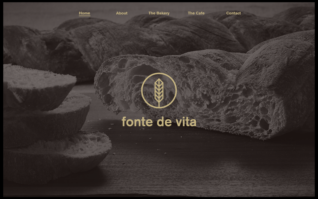
Following the research I did, I was confident in what I wanted the general design to be. I really want to make this website look sophisticated and professional, a step away from the previous websites I have proposed in the second year. I have taken on board a lot of the features in the websites I looked at and will apply these when necessary.

I started with the general design and the home page.
The things I was sure about are the following:
  • Full image for background - dark & monotone
  • Navigation bar at the top and central
  • Minimal text - only what the customer would need/want to know
I decided on the dimensions of 1280x800 and created a grid of 16 columns and 14 rows.


Following this I went over the images that I had collected for this brief and turned them greyscale and added a 40% black filter to make them darker so white text can be seen over the top.


I then started with the first page. I decided to start with white type over the greyscale image.


I thought that this looked a bit dull so tried a few different colour variations.


The last one is my favourite one because it is a subtle colour and the image can still be seen well. The third one is too dark and I don't like the colour tone in the second one. I also think that the use of the brown is good because I haven't used it so much up to this point, and it stays within the brown monotone images in the menus.

 I then decided to change the white to gold to fit in with the branding more.


At this point I am happy with what I've done and the colour choices I have made, however I don't think that it isn't quite right or sophisticated enough at this point.

The first thing I tried was making the type in the navigation bar to a smaller point size. 


With the smaller point size it means there is more space between each word, so I moved them closer together and decided on adding a line under the page which is selected. This is subtle but needed.


I then moved the logo down so it was halfway between the bottom of the navigation bar and bottom of the page.


As it is the homepage I decided that there needs to be a bit more of an indication for what the website is for. With this in mind I added 'Italian Bakery & Cafe' underneath the logo.


At this point I looked back over my research and decided that I quite liked the idea of the pages flicking onto one another from left and right, so added arrows and a page indicator at the bottom.


I made both of these much smaller and repositioned them until I was happy with them.


As I was happy with the front page I moved onto the other four pages.


For the menu pages I decided on keeping with the same format as the menus with having the text in boxes. I arranged them on the page so they all fit onto one page. As the menus are both very similar I kept them at the same height on the page instead of having it all centred as there would have been a small difference in their heights.


For the contact page I decided on keeping it very simple and having the google map and all the information that would be needed. The information measured out to be about the same height as the google map so it worked well.


Final Pages:


I am really happy with the end product of the website. I think the simplicity and consistency keeps it quite high end and luxurious. I really like the way the menu pages worked out, and how well the imagery works as well.

Following this I mocked the website up onto a mac screen.

I also mocked it up onto an iPad as it fits and works well on this screen size. The only difference is that the arrows aren't there as they wouldn't be needed on a touch screen device.

I am really happy with the overall look of the website at this point. I think for the portrait iPad and the iPhone I need to rework a few things to work on the dimensions.