Saturday 28 February 2015
Friday 27 February 2015
Brief 7 - Collateral Recap
Today I looked over the work I had up to this point and found that while it was all strong, I couldn't help but feel that it was all very similar and there wasn't much differentiation in it. All the covers are similar in being completely image based with the branding and document name on them.
Initially I had wanted to incorporate a variety of appearances for the outcomes as this would show a strong and versatile application of the identity. This is definitely still something that I wanted to do and incorporate into the overall identity. However now I am at the point where I will need to keep it consistent or change everything completely otherwise it won't match up and will leave pieces looking out of place.
At this point, I can say that everything is quite dark due to the imagery, so a bit of light colour or white will be good to get in the mix. With the identity being a red and orange gradient, and text being white, these colours would be good to incorporate in a stronger way so there can be a variety in the logo colours as well.
I started by deciding on creating a secondary poster which is brighter, using a hick white boarder around the edges, and still have it being image based with a large image in the centre of the page. I also experimented with the 'one giant leap for Syfy' text as I think it could be developed a bit more.
Poster:


I also wanted to incorporate the red stock into more collateral, so decided on creating the convention book cover in the same style as the A5 leaflet above.


Initially I had wanted to incorporate a variety of appearances for the outcomes as this would show a strong and versatile application of the identity. This is definitely still something that I wanted to do and incorporate into the overall identity. However now I am at the point where I will need to keep it consistent or change everything completely otherwise it won't match up and will leave pieces looking out of place.
At this point, I can say that everything is quite dark due to the imagery, so a bit of light colour or white will be good to get in the mix. With the identity being a red and orange gradient, and text being white, these colours would be good to incorporate in a stronger way so there can be a variety in the logo colours as well.
I started by deciding on creating a secondary poster which is brighter, using a hick white boarder around the edges, and still have it being image based with a large image in the centre of the page. I also experimented with the 'one giant leap for Syfy' text as I think it could be developed a bit more.
Poster:
Overall I think the direction of this is good, and I definitely like the new text layout of the 'one giant leap for Syfy', however while it contains the same elements as the other designs, it is largely difference in the appearance.
While it was good to experiment, I won't be using this style as it didn't fit well with the other content when placed next to it. I will definitely be using that text layout for the 'one giant leap for Syfy' though. I had tried it in the initial ideas stage of the branding but it didn't seem to work right, but now I think it definitely will work well with this leading and size.
I then considered the idea of using a different coloured stock. I had a large number of dark red sheets which happened to be the same colour as the red in the identity, so this is potentially something to use, especially as it would mean I would have to print just black and white onto it. I mocked up an idea for this as an A5 leaflet.
It is clearly still quite different from the collateral I have at the minute, but it is more similar than the previous idea. I also like the use of the fade and with it just being black on red.
With the success of this, I decided on editing the collateral so it would incorporate the red more and would work well if designs on the red stock were included.
Also with the decision to use the red stock, I decided on changing the branding colour to just the red instead of the red to orange gradient. While the gradient works well in the logo, it isn't really used anywhere else so losing this as a colour won't make much difference and will keep everything simpler.
Logo colour change:
I then went about incorporating this into the designs. I also went about including more red into the designs, so changed all the text to red instead of white, as show below.
I also wanted to incorporate the red stock into more collateral, so decided on creating the convention book cover in the same style as the A5 leaflet above.
As well as this, I created a few extras on the red stock to incorporate this a bit more. I started by changing the front cover of the Ralph McQuarrie exhibition book. I did like the original cover, but it is the one thing that looks out of place. I created a simple cover with the text and the convention logo.
I also created a series of coasters with famous and favourite sci-fi quotes from a variety of films and v shows. This is just a bit of an extra to be included in the goody bag, and adds a bit more of a fun element to the branding, which up to this point has been lacking a bit.
I also created a VIP pass which someone would receive if won.
At this point I can say that the move in the designs has definitely created a much stronger and consistent approach. I think the inclusion of a colour stock has aided in this and creates a more varied and realistic approach to the identity.
Brief 12 - Train Exterior Development
Following the finishing of our posters and the train livery work that I did individually, I decided on mocking up the train side and doors as this was an idea we had discussed but hadn't got round to doing yet. As I had completed my individual work, I took it upon myself to do this as I felt it was definitely worth including.
The idea behind the doors is that when they are open, the message is unclear, but when they are closed, the message becomes clear - linking to the idea of better together to create that strength and unity.
I found a couple of images of very similar trains, one with the doors open and the second with them closed.


From the work we had done for the posters, I took these designs and adapted them to create a bespoke design for the train, once again showing the versatility of our designs.
Finished mock ups:


I am really pleased with these mock ups because they are quite realistic. Creating these really pushed my skills in mocking up designs in photoshop. Putting a design onto a train isn't something I've ever done, but I definitely think I did a good job and it definitely helped develop my skills in this.
Brief 12 - Finished Posters
Once all the illustrations were finished, we discussed the direction of the posters and agreed on the concept of the landscape with small icons falling down onto each of the cities. This is to represent that the joining of the cities will fill each city with the benefits of travel, culture, opportunities and innovation. Instead of having text explaining this, we decided on a pictorial response as it is something a bit different and links in well with the style of illustration we had chosen.
Completed Landscape

Brief 12 - Alternative Poster Development
While Sam put together the main posters for our deliverables, Ewan and myself worked on alternative posers to broaden the printed promotional material and to show how versatile the design is.
Something that we didn't put in the four posters was the four statements that we had previously come up with relating to the four areas which improve in the joining together of the cities. I wanted to use these because I felt that they showed another side to the concept and shows that we have thought about the benefits. While these are four small statements, I do feel they are worth including.
Much like the main poster series, I followed the format of a landscape built by the four together. The overall design was the same as the main posters, however instead of the falling icons, I went with the four statements.

Following this I decided on a couple of changes. The first was to use one long train instead of four small ones. I find it looks a bit odd when they're placed next to each other. Another thing I decided on changing was the size of the bottom colour. I think that it's too big for the amount of text there, and the focus of these posters should be on the statements. Another thing I liked about our previous poser development was having the text in a colour a tone lighter or darker than the colour. I think it worked really well, however this was a split opinion in the group so wasn't used in the four main posters.

I think this works much better than the previous design as its more fluid and the focus is on the four statements.
Following this I created a couple of other variations which would work as one long poster instead of four separate.


I then took these ideas and mocked them up into different situations to show how they can be applied.


Thursday 26 February 2015
Brief 7 - Website
On the digital side to this brief, I want to create both a website and an App which work independently from one another.
The website will be linked to from the Syfy homepage and will allow users to purchase tickets, see the schedule, take part in competitions and get all the information needed about the convention. It will be the link between the user, Syfy and the convention.
I started by mocking up a link onto the Syfy homepage, following the format and design which they use to give it a more realistic look.
I think that this works really well and looks realistic. I mocked this up onto a mac screen and then began to work on the pages of the website.
For the main page, I had a very clear idea of what I wanted to do in creating a simple and contemporary style.
Taking inspiration from this webpage designed for Sweden by Söderhavet, I took the general look and applied it to the main page.
I thought that this style would work well on the main page as there is a large number of events and this grid format could be played around with, creating larger spaces for certain events and incorporating imagery instead of flat colour for all buttons.
I also really liked the idea of the menu bar being along the side as it means that it doesn't have to fit into a specific space and can drop down to reveal more.
At this point I am quite happy with the overall appearance, however I don't think that it is as refined as it could be. One issue is the text in black over the imagery, it is quite hard to read so white might be better suited. I also think the navigation bar needs rethinking and potentially making smaller.
I also had quite a bit of trouble placing the venue and date, and still am not convinced by where it is now, so this also needs to be rethought. I am also unsure about the use of the block coloured boxes. These don't work as well as I thought they might.
Things that I think work well are the background, placing of the two logos and the use of purple imagery. The image background gives a bit more of an interesting look than just black. The purple imagery works really well in keeping the imagery consistent and contrasts against the background really well.
Overall it will need a bit more development and I will create a couple of additional pages so I can show how it works properly in the submission boards.
Brief 7 - Event Guide
As well as an Event Programme, I wanted to create an Event Guide, which is a brief rundown of each of the events and what to expect at these. Each event page would also display the times of all of its events, making a point for the holder to be able to see he times of one specific event they are interesting in, instead of going through the programme to find them amongst the other events.
Event Guide
Brief 12 - Illustrations
When it was found that the illustrations were taking much longer than anticipated, I agreed to create the illustrations for Manchester.
The idea we had for the illustrations was to do them in the three other colours from the branding. As Manchester's colour is red, all the illustrations would be in the blue, turquoise and gold. It was also agreed that it would be well known and iconic buildings.
The three buildings I decided on doing are:
- Manchester Town Hall
- Manchester Library
- Manchester Art Gallery
Town Hall:

Library:

Gallery:

The gallery is quite long so I decided on cutting it down so it would be more manageable on the posters.
Cut down gallery:

The feedback on these illustrations was very positive and they will be used in the poster design.
Following this I agreed to take one of Ewan's designs and make it a bit more detailed as the illustrations done by me and Sam were similar in this. Ewan's designs worked really well as supporting imagery, as he had created housing and a landscape mountain/hill range, however the cathedral was quite different to the the style in which me and Sam had done it, so for consistency purposes, and just for use on the posters, I added to it.

I then tried a few colour variations. As the cathedral is in Liverpool, the red must be used instead of the navy blue. This made the design quite striking and hard to look at in some combinations.

We decided on the bottom left design as it had the least amount of red, so was easier to look at. We have found that the red in the illustrations is very bold and makes the designs quite hard to look at so will use it in a minimal.
Overall I am quite surprised at the illustrations I have done. I didn't expect to create illustrations as well as I have. I have never done anything like this before so I was unsure that I would do them well, which is why I didn't want to do them in the first place, however now I am glad I have done some and I hope to experiment further with this in the future.
Tuesday 24 February 2015
Brief 7 - Floor Plan Guide & Map
When looking over the collateral, I felt that I was missing something and thought about the different areas which the collateral currently cover. I decided on creating a floor plan map would be a good edition because it is way finding for the convention and this isn't actually something I had thought about up to this point. It is also realistic to assume that a convention/event at a venue would provide this or something similar for guests who had never been to the location before.
With the location being real, I looked into the existing floor plans and found very clear imagery had been created for the six floors of the venue.

I then researched into the capacity for each of the rooms as this realistic approach is definitely something to consider, especially as it isn't a venue I had any knowledge of previously. Looking into the capacity for each of the rooms allows me to realistically assign events to different rooms, which is obviously the point to a floor plan map for an event like this.
After this research I found that the venue was more than acceptable for the convention and I fit all the events in very well and with reasonable space into each of the floors.
I then recreated each of the floors in the same style of floor plan, but adapted to the convention branding and content. Moving with the brand colours, I decided on having the floors in red as they would be sitting against a black background to work with the rest of the collateral. The rooms that were going to be used in the convention would be in full red, with the other rooms in a lighter tone to show clear difference to the reader.

To present this I decided on an A3 sheet which folded into eight. This gives me the correct space for six floors, one key and a front cover.
Finished floor plan map:

The simple approach to the product works really well and I think it will work perfectly well when printed and folded up. The red against the white and black works really well, and the addition of the purple at the bottom of the pages also works well in incorporating Syfy's presence on each of the pages instead of just the front cover.
As this would be something received free at the convention, I thought about the fact that the other side to the map was blank, and that it would be good to include something there for the reader to keep. With this idea I decided on creating an alternative A3 poster to the one initially designed. I kept the same format and design for it, just changing the imagery.

I think this addition really works and adds that bit more to the product for whoever will have it. It gives them something to be able to take home instead of use just at the convention.
Brief 12 - Train Station Interior Development
As my individual job was to create the interior way finding for the train station, I decided on creating what I thought best suited the context.
he main thing I wanted to focus on was obviously the two tramlines - the HS2 and the HS3. I did research into the HS3, looking at the timings it would take between each of the cities, and decided to use this as a focus.
Timings:

I also looked into the HS2, and found that there are two routes for this train - one from Manchester to London, and the second from Leeds to Birmingham.
The first thing I did was create some designs to go on the platform/service board to show the stops. I decided on using the crosses to indicate the stops. I decided on using a 15% opacity of the gold as a background. It just keeps a bit more interesting than having white. It also supports the colour scheme a bit better.
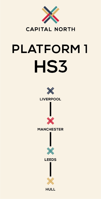


I then mocked these up into a train station setting.


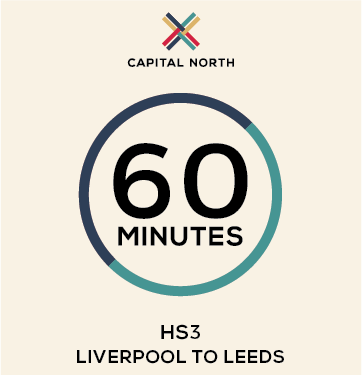
Following these I started working with the timings of each journey. I wanted to have a simple design which reflected the journey and cities.
I came up with the idea of creating a circle and having two halves, one for each destination, with the timing in the middle. The circle indicates both the cities and that the journey can be both ways.
I started with creating a design for each of the one-city journey's.


I think the design works well and is effective in the simplicity. It is straight to the point. I then duplicated the same design for journeys which included three cities.

I also created one for the full journey across from Liverpool to Hull.

The only issue I have with this is that this is clearly the full journey, and that isn't illustrated clearly. I tried out a couple of different variations to show this better.


The second is definitely better aesthetically, and the point is illustrated with the colour changes. I then transferred this idea to the designs which incorporate three cities.


I then mocked it up in two different contexts to show how these simple designs can be adapted to any space and placing.


Following the success of the timing posters, I combined this and the stop posters to create some more posters which could be placed on the platform or around the station. These show all the stops and the new quick times.


I also created a full map of the train journeys and their timings to create an overarching poster design. This is something that shows the new train journey times.


Following this I created a couple of ideas from way finding in the train station. I created some arrow signage for print as well as some vinyl stickers which would be on the floor around the station to direct the passengers towards the platform. I also thought about the platform itself, with the idea that a platform will be dedicated to this train only. I mocked up the idea of having the colour and logo along the platform.


Overall I think the work I have done is good and consistent and applies the brand well. The feedback from the others was positive.
Subscribe to:
Posts (Atom)