Thursday 30 April 2015

Brief 2 - Packaging Mockups

Following the completion of the chocolate box nets, we decided on creating a mock up to see exactly how well the chocolate bar would fit in and if there needed to be any changes.

Charlie printed it and created the mock up.


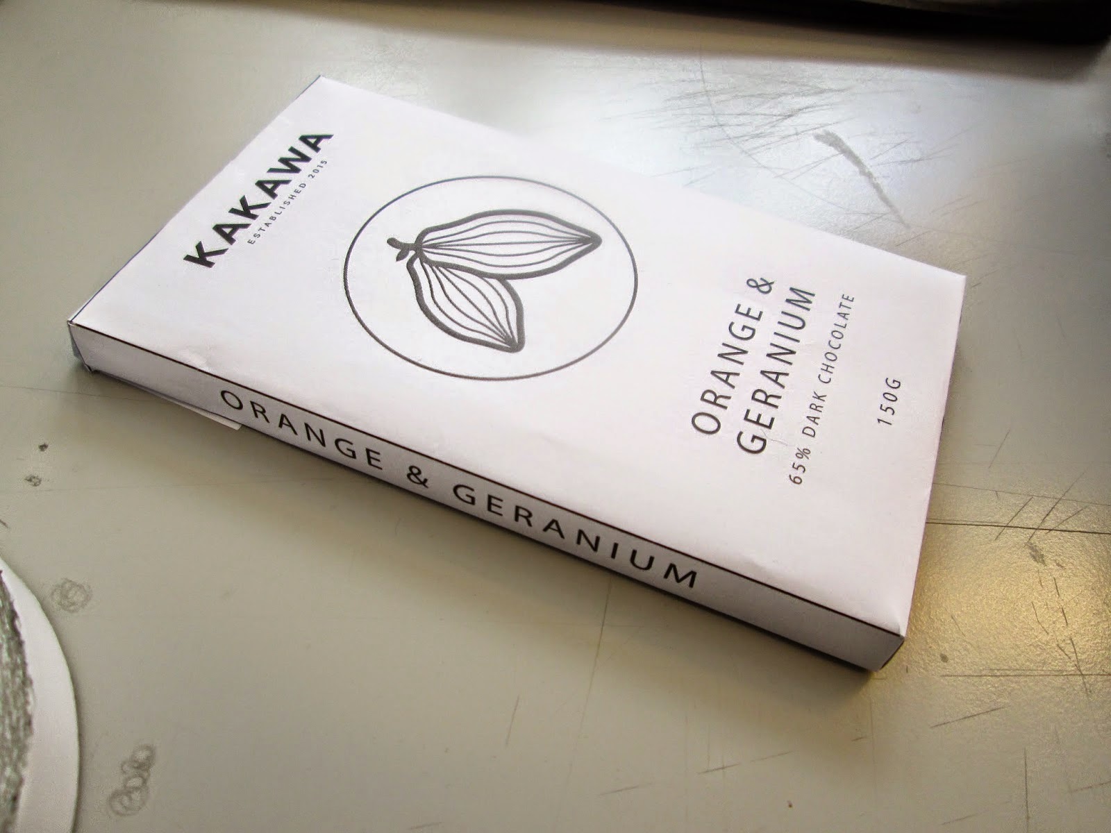
Overall we are really pleased with the way the mock up has turned out. The chocolate bar fits in perfectly while still packaged, meaning that we are confident that with foil around it, it will fit in perfectly. Everything has printed at a good size, including the body copy at the bottom of the back which we had been a little concerned about being too small, however it was the perfect size. The only thing we didn't get to see was our typeface work due to the computer printing it not having it installed, however we are confident it will work well.

The only adjustment we decided on making was to the top flap. I personally felt that the straight lines were a bit shabby and not considered, and that we could come up with something which looked a bit more sophisticated and flowed better with the circle tab.

I suggested we turn it from a rectangle to a curve, curving from the edges of the top to the edges of the circle where it slots it.


We tried this and found that it worked much better in creating a fluid and more professional design. I then applied this change to the nets.


Gift Boxes

Following the success of the bar boxes, we moved onto the gift boxes themselves. As we now how all the correct measurements for the bar boxes it is just a case of creating boxes which fit the number we want.

For the packaging in general we were really inspired by the Intrigue Chocolate packaging in the way the packaging is constructed.


We really liked the large margin that the packaging has around the products and would really like to include this in our designs as it is something a bit different and would ultimately create a more sturdy box.

With this in mind, we set about creating the box net for the 9 bar box.

The bottom part to this box will have a 2cm margin around the bars, as well as a window on the front. At the front, there will be and extra 2cm across so the bars won't slip out. The top will be solid, so when it's lifted it will reveal the window and all 9 flavours.

To add a bit more of a luxurious feel to the box, we had the idea of creating a thick base to the box, keeping with the idea of the margin. We also thought about doing the same on the top of the box so the customer would lift this out before seeing the top of the bars.

We mocked this up onto an A3 sheet.


The mock up measurements were a little wrong, however the main idea was there and we could see how it worked.

While it worked well, the unfortunate fact is that this net is larger than the A2 stock that we are planning on using. While we could create separate elements to the packaging, we think that maybe simplifying the design down will be much more manageable.

We decided on just creating the same style of box with no margin around the bars.


We initially decided on a square window, however with the new box measurements, I thought the top and bottom may be a bit flimsy so suggested a circle instead. This still does what we wanted in a window, and also incorporates the use of the circle on the bar boxes as well.

I then created this new net digitally, which Charlie then mocked up.


We are happy with this packaging now and feel that the circle works well. While it doesn't incorporate the margin idea which we had wanted, we still have the overall design that we wanted, so that's what's important.

We then started with the 3 bar gift box. We drew out the initial net design, which I then created digitally. We decided on using a thick base on this box as well.


To create a more seamless design, this box design is one that folds in on itself. This means that all the corners will be perfect and there won't be any cutting/sticking mistakes


Mock up:


At this point we have two mock ups which we are happy with. The boxes are quite different in design, but through the same use of stock and aesthetic appearance, we are confident that it will work well. A difference in format and style will give each gift box its own identity and shows a bit of bespoke design specifically fit for that one purpose.

Brief 15 - Completed Type Specimen Book

Wednesday 29 April 2015

Brief 15 - Type Specimen Book Planning

For the specimen book, I wanted to continue with the contemporary style of the typeface and create something that follows this and is interesting in its layout of the content.

After looking over a few specimen books out there, I decided that what I really didn't want was just pages and pages of the typefaces saying the same sentences, in different point sizes, styles and weights.

In a sense, I didn't really want to create a traditional specimen book. I want it to be a publication about the typeface and showing what it can do in a variety of different ways. I also wanted to utilise the page spaces and have inserts throughout to have extra pieces of information on which perhaps applied to a double spread but there is not enough room for it to be on there comfortably.

I had a pretty good idea of the content that I wanted to include and how it would be laid out. I have decided on showing the sans serif as the base typeface, so showing all the technical information, such as the way the letters are designed/structured, and then the Slab and Rounded variations will have smaller sections which show off the variations and how they have been constructed from the Sans Serif.

Simplex - the aim


First Page

I wanted to start the first page filled with all the characters and variations. This is to show the typeface as an entirety to begin with.


Consistent Spreads

There were a couple of pages which I wanted to apply to each style as these are quite general and will make a consistency through the book.

The first is a simple layout of the weights, and the opposite page with the alphabet in these weights.


The second is a page with the body copy sizes laid out. While I don't want the whole book to be like this, I do think showing how the typeface works in body copy is important, so it is an important image to have.


I wanted to have some more creative/visually interesting ways of presenting the typeface over spreads and while experimenting I created this page spread with the numerals.


I had previously been looking at Josef Muller-Brockmann and Jan Tschichold and decided to try text on an angle and found that it worked really well, especially with the inclusions of the lines and the lines of text saying the weight and point size.

With the success of this layout, I applied across all three variations as I thought it was definitely strong enough to be a consistency through the book. I also think it is something quite different from what is classically used in a specimen book, which is what I wanted to go for - showing the typeface working in different situations, not just line after line.


Structure

For the Sans Serif section of the publication, the majority of the content is about the structure of the typeface, so stared by creating two elements of this - the grid, and the anatomy lines for each variation


With these lines being quite small to fit on the page together, I decided on creating a larger one and having it on an insert so it can be seen a lot closer and in more detail. As the insert is double sided, I did the Light version on the front side, and the Bold on the back.


Looking at the structure, there are a few letters which are slightly different and these should be displayed. I chose to show the 't' and 'g'.

I wanted to make the variation obvious, so tried a couple of different ideas to make it obvious, before deciding on using a red circle behind the bit of the letterform which is different. This works with the red colour scheme throughout, and is bold so it makes for obvious viewing.


Another element to the structure that I needed to display was the use of perfect circles throughout. I chose four letterforms which were different in structure and overlaid circles over the top to show how these are integrated into the design.


Another thing I wanted to show was the flourish in the 'Q', so I did this in the same way as the 't' and 'g'.

Another technical aspect that I wanted to show was the difference in serif sizes in the Slab serif variation. This was a subtle difference done to create a more consistent appearance.


To display the way the Rounded variation was formed, I decided on following the same form as the way I showed the circles above, by overlying the shapes over the letterforms. I overlaid the sans version with the rounded to create a very simple visual.


Following these technical images that needed to be shown, all that is left to do is to do a range of visuals showing the typeface working in all the variations. For these, I don't want to go overboard with them as I don't think it's necessary to show hundreds of the same thing over and over again. I want to do just a few really effective examples which get the typeface across properly and completely.

Tuesday 28 April 2015

Brief 2 - Packaging Plans

Today Charlie & I met to begin the practical work on this brief. As previously discussed, we finalised our products and packaging.

Notes previously made on packaging:


Finalised Packaging
  • Truffle Jar - Glass & vinyl label
  • Gift box 1 - 3 bars of chocolate - white, milk, dark - foil & wrap + box
  • Gift box 2 - 9 flavoured bars - foil & wrap + box
  • Hot chocolate Jar - Glass & vinyl label/tin + wrap

We then discussed the format of the packaging for the boxes as these will be a big part of the brief. At this point we have two ideas for them. We want a consistent design, but like the idea of having two different styles of packaging.

For the first gift box of three, we are wanting to move forward with having a wide box where the bars are side by side.

For the second gift box of nine, we liked the idea of them being stacked and a window in the front so you are able to see all the flavours. The top will be solid and lift up to reveal the window in the bottom half of the box.

We want to do these boxes in dark brown card to follow the branding colours. We want the packaging to be very plain and simple with the logo foiled onto the top. We will use a wrap around each of the boxes to display the product information.


Packaging format initial ideas:


Following this we decided to start with the chocolate bars themselves and went through the different flavours we could have.

We settled on the following twelve:


For the 9 bar gift box we thought it would be good to have three bars from each of the three chocolate types so it creates a good range.

A big discussion we had was about the differentiation between the different flavours. We wanted them all to have their own individual colour, but showing this on the packaging is something that we took a long time to decide on.

Our original idea was to maybe foil the flavour name onto the wrap, however we felt this might not work too well as we might not be able to find the range in foils that we want. With this, we also though we could have the foil wrapped around the chocolate in this colour as well. This would create a very obvious visual differentiation between the flavours.

Our second idea was built on the back of the first, where instead of foil, we would just print each colour. It is simpler and would mean that we would be able to have the exact colours we wanted.

When it came to the actual packaging for the bars our original idea was to use foil and a contrasting wrap with all the information. When we went to the shops to look for the bars which we wanted to use, we found a wide range of packaging ideas, which sparked another conversation about how we wanted to move forward.

From this, we decided that instead of foil and a wrap, we wanted to create a full box for each bar. Seeing it in the shops showed us how good this could look, and it definitely stood out from all of those wrapped in plastic or in wraps. We think that it will work well with our brand as it shows a bit of care into each bar with them all being boxed individually. Within these boxes, each chocolate bar would be wrapped in foil as well.

As shown in the image above, the chocolate bar size we decided to go on was 160x90mm. We felt that this was a really good sized bar as it's not huge, but not too small, and would be a good size for a gift box.

Colours

Following the decision on the packaging, we moved onto choosing the colours for each of the flavours. Individually we chose colours we thought best suited the flavours, and then regrouped to look at what we had come up with.

We agreed that the colours needed a clear difference from one another, and definitely had to have a sophisticated look, so nothing too bright. They had to work as a set as well.

Overall we had very similar colours and went about editing them down to the twelve which we decided were the best ones.

Final Colours:


Overall we are really happy with the twelve colours. They're a range, but also work well together in terms of the tone of them all.


Packaging

While doing the colours we also started working on the packaging for the bars. The whole brand image is to be sophisticated and simple, with nothing unnecessary.

We decided that the best way to move forward on this was to work individually so we got a range of ideas and designs before editing these down to the final designs. Before doing this we discussed the general appearance that we wanted - the logo at the top, flavour in the middle, and weight at the bottom.


We presented our designs to one another and found that our designs were very similar and moving in the same direction. We decided that my fifth design was the idea we wanted to move forward with.

We were initially a little wary due to the fact that the logo was broken up, however we felt that the ones with the full logo just weren't working as well, and we really liked the idea of having the large bean that changed colour depending on the flavour. Having the full logo on as well as this is something that we decided against because it seemed like a bit of an overkill.


With this decided design, we then went about creating the net for the entire box. To keep the front looking perfect, the tabs are connected to be glued ono the back.

When I started to produce the net, we spoke about what we wanted on the back, and we agreed that we wanted it quite plain with little information aside from the product name and information. In creating the net, I placed the coloured cocoa bean circle on the back at a smaller scale with the intention of having it there to show the colour and flavour reference, however we liked the idea of the top half the circle being cut along so the top flap would slot in there.


Once the net was created we one again spoke about the content to go on the back. We decided on two sections - the first a small description about the product, and the second being a bit about the brand and our dedication to the customers. We felt that this was a small element that added a bit more care and consideration into how the brand would be put across and perceived by the customers.


While I continued to work on the design and create the variations for each flavour, Charlie wrote a short product description for each flavour, as well as the brand statement to be put on the back.

Completed body copy:


Completed package: