This module has been the one which I have enjoyed the most, and feel like I have learnt the most about myself as a practicing designer. The progress in my skills and design aesthetic has increased a huge amount from the end of second year. I feel that this module has really helped me in becoming a professional practicing designer, and not just a student, with confidence in my work and ability to apply my skills to any given brief and style.
My interest in areas of design has changed throughout the year as well, and while some things such as Typography have remained constant, I have found that I have a much larger interest in design for Web and Packaging than I previously did. While I do not have any incline to continue with Packaging design, I did find working on briefs with this element in enjoyable.
The main reason I enjoyed this module was because of the completely self-driven briefs and work ethic of this module. Being self-directed it meant I could do the briefs that I wanted and not have to create to the same brief as everyone else. I also liked the fact that it meant I could pick my brief time scales, creating as many small or substantial briefs as I wanted. I think that in the first two years of this course, the structure of it was beneficial, but something that I didn't always enjoy. Though this independence I think the main thing that I have developed this year is my consideration when it comes to design and how I approach briefs. My design has become much more refined and sophisticated - something which I set out to do at the beginning of the year, and I believe I have succeeded. There is a clear improvement from the projects at the beginning of the year to the ones which were completed near the end.
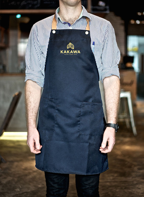
One example of this is 'Kakawa' - my collaborative project with Charlie Rotherham. This brief was initially supposed to have been completed in the first term, however we decided to leave it until the end so we could execute it better, which we definitely did. We also managed a huge amount of work within three weeks, something that would have definitely not happened in the first term. This project just showed me how far I really have come as a designer in design and in organisation. Setting out a clear plan for exactly what we wanted to do and when definitely helped in moving the project forward and developing it to something we were happy with.
A second project which I thoroughly enjoyed was the last brief I completed - Brief 14 'Visit'. At the beginning of the year I had set out to develop my skills in all areas of design, and in particular web and App design. This was reinforced even more when I completed my placement and enjoyed working on Apps and websites all day. This brief had originally started off as a branding, editorial and promotional project in creating a holiday pack for people visiting New York, however with a better insight into what I wanted to create, I found that an App was just so much more suited to what I actually wanted to do. I found it enjoyable in working through a brands identity through the App and having to think about elements which would not be thought of if the branding was for just print. I also enjoyed working on the same format and size continuously. I think that the final designs definitely reflect my bettered skills in this area and my love for working on this format.
The brief which I feel I accomplished the most in was Brief 15 - Simplex. It has always been my aim to create a full typeface which is usable as well. Setting out to do this at the beginning of the year, I didn't think I would be able to do it as well as I quite liked, however through extensive learning of the principles in COP, I felt I had much more technical insight into typeface design and how to construct a successful typeface. This brief definitely left me feeling extremely accomplished when I finished it and was able to type text in it, and for it work reasonably well. This is definitely the brief which I did the most work for, from creating the initial designs by hand to creating the variations.
While I enjoyed the majority of the module, I do feel that there are a couple of projects which were weaker and definitely did not do my design skills justice. The first is the yearbook pitch, and the second is DSM. For the yearbook, while I don't necessarily have anything against the pitched idea, I don't think it was as strong as it could have been, and it is definitely not the kind of direction which I would usually move towards or excel at. I don't think that I excelled in this brief at all like I would have if it were something a bit more in my comfort zone. In terms of DSM, I don't think I ever really got on board with this brief since getting the subject for it, and this is what stopped me from getting really involved with it and coming up with something I was proud of. I think the main thing to take away from this brief is that as a designer you won't always get a brief you like, but you have to work on it anyway.
Another brief which I was a bit disappointed at was Brief 5 - The Woodshop. While I am happy with what I produced for it, as it was a client brief which never really got off the ground, I do think there was a lot to be desired, and there was a huge potential for the branding, which just wasn't put into practice in the end. I think this is something that I would really like to expand on in the future and create the brief that I wanted it to be. In contrast, my other client brief - Wheatless & More - became enjoyable and a large amount of various bits and pieces were created.
Something I also learnt this year was to enjoy collaborations and appreciate other people skills. I particularly enjoyed my collaboration with Charlie, and DBA with Sam W, Ant & Ewan. I think both of these projects have a good split in terms of responsibilities and work produced, and the concepts for both of these are strong and refined, with some really good work produced from it. Doing these collaboratives successfully has definitely shown me that I can work in collaborations and do so very well with good outcomes.
Overall I think that there are definitely positives and negatives from this year, but definitely more positives. It has definitely been a huge learning curve and has helped me refine exactly what kind of design it is that I enjoy doing and why I enjoy this. It has also taught me that while I like a certain style of design, I can apply my skills and create something completely outside that, and do it well.
Thursday 21 May 2015
Wednesday 20 May 2015
Brief 14 - Advertising
As I do not have much time left, I decided on doing a very quick look into the possible advertising for the App.
In these, I wanted to incorporate the same elements as in the App, and be very simple as it goes with the brand idea of planning a trip easy and simply.
I had quite a clear idea of the design that I wanted to go with, having half colour, half photographic imagery, the App over the top with a bit of text, and along the bottom the branding.
The idea of the branding across the bottom is to have the brand logo and then a line of city names, with the chosen city in red, as explored in the branding when I was doing this.
For the case of this advertisement, I will be doing New York, as the App is mocked up to support this.


I really like the way this advertisement turned out. I think that it flows nicely and incorporates elements from both of the previous advertisements - the branding element from the poster - and the imagery to the side of the phone from the bus. I think the symmetry of it works really well and is simple and execution and shows quite a lot of what the App can do.
I'm pleased with the way the advertising looks. I think that if I had more time I could explore this more thoroughly, but I think that I have done is good and definitely puts the App in the best light possible. I think the use of the colours works really well and the good photography pushes the professionalism side of it.
In these, I wanted to incorporate the same elements as in the App, and be very simple as it goes with the brand idea of planning a trip easy and simply.
I had quite a clear idea of the design that I wanted to go with, having half colour, half photographic imagery, the App over the top with a bit of text, and along the bottom the branding.
The idea of the branding across the bottom is to have the brand logo and then a line of city names, with the chosen city in red, as explored in the branding when I was doing this.
For the case of this advertisement, I will be doing New York, as the App is mocked up to support this.
I decided on the small line of 'plan your trip easy' as it's quick and simple, and gets the point across. I was unsure of the App image to use, but I think the list of activities gets the point across of planning a trip. I tried both red and green for the bottom half, and found that the rest just sat much better for this particular design, however I do want to incorporate the green into the advertising somewhere.
I think the bottom branding works really well. It's simple and effective. The idea is that if this were a digital ad, the city list would move across and different cities would go red to indicate the fact that this can apply to any city.
I also added the App Store icon to the top right to give it a bit more of a realistic feel. I think it works really well and actually sits really nicely against the photographic imagery.
I mocked this up into two possible situations.

Following this I wanted to create an advertisement to a different format, so decided on a red bus mock up. It has quite an interesting space to fill, so it will really make me think about the placing of all the elements. There is a low dip in one side which will fit a mocked up phone perfectly, so I have to work around this.
I also decided that I'd mock up a different city for this, choosing Melbourne. I also think this is a good place to incorporate the green colour as it will be going on a red bus.
I initially found the layout a bit tricky to get right, but found that the final layout I had worked really well. With the placing of the phone definite from the beginning, it was jus a case or working all the information around it. I think the green really works in this too.
For a final advertisement I found a mock up which had two sides, so I thought it would be good to do two ads that work together - one side red and the other side green.
On the first side it would be what I've used in the other ads - the 'plan your trip easy', and on the second side it would be something else about the app.
I wasn't quite sure what to do for this, but decided on showing the Map and having 'map your day easy'. It works with the other line and is four words again, so will fill the exact same space.

I really like the way this advertisement turned out. I think that it flows nicely and incorporates elements from both of the previous advertisements - the branding element from the poster - and the imagery to the side of the phone from the bus. I think the symmetry of it works really well and is simple and execution and shows quite a lot of what the App can do.
I'm pleased with the way the advertising looks. I think that if I had more time I could explore this more thoroughly, but I think that I have done is good and definitely puts the App in the best light possible. I think the use of the colours works really well and the good photography pushes the professionalism side of it.
Tuesday 19 May 2015
Brief 1 - Final Evaluation/Reflection
I started this brief at the beginning of the year with the intention of completing it relatively quickly, however it ended up lasting the full duration of the year, and looking back at it, I am definitely glad it did. Working on it at various points during the year gave me the ability to continue to develop designs and make them more successful and professional.
I think that the diversity of packaging and printed elements also helped in the development of the branding, and made me think about how I would apply the branding to a variety of media, for example, the glass jars and the plates. The varying sizes and shapes meant that a lot of consideration had to go into how the branding was applied and what would work well. This diversity in packaging also worked very well in the final photographs.
The simplicity of the branding allowed for successful extension across a retail environment, showing how the interior of the establishment would look if it were created. This made me think about how the branding would be applied across an interior design situation, and meant that I could incorporate more than just the logo, such as photographic imagery as well.
The changes made to the website following the completion of Brief 11 definitely improve the overall image of the brand and create a much more consistent approach to all aspects. The previous design did work well, however with the development made in Brief 11, it was inconsistent and obviously so. The changes made were simple and following the same structure, also with skills that I did not have at the beginning of the year when I previously made the website, so I feel that it looks much more professional.
I think the project was very successful and I did what I set out to do in creating collateral which spoke to a high-end audience and was luxurious and sophisticated in appearance. The most successful part of the project was the putting together of it all, where all the elements came together to show a fully rounded brand.
Monday 18 May 2015
Methodology Publication
Methodology Publication - The Concept
Following the two crits, I decided on creating a publication which followed my method through creating a typeface, focussing on one typeface which I had created recently - Simplex. This method is how I have been creating typefaces since I started my first one, and this has obviously been refined down to the point where I can apply it completely and come out with a good outcome.
I was originally going to show all the typefaces created using this method, however I think a more in depth look at the most recent typeface will allow me to be more specific and keep the read simple and easy to follow.
For this publication I have decided to split this down to two books. The first is the main publication, detailing the method from beginning to end. This will be called 'Construct'. This is because the publication looks through my method of constructing and creating a typeface. The second publication will be a short one just showing the finished typeface.
The design of these two publications will be identical to keep consistency. The overall approach will be simple layouts with chapters. Each chapter will have a narrative, and then a more in-depth explanation of how it applies to the typeface being constructed throughout the publication.
Interactive PDFs
Construct Methodology Publication
Simplex - Typeface Publication
Final Photos


Evaluation
I am really pleased with the way my publication turned out in the end. I feel that it was definitely the right thing for me to do. I think the final printed books works really well together, and I particularly like the use of the yellow stock. It worked out really well, as did the screw binding. The binding works a bit better on the larger book, due to the size of the smaller one being a bit too small for the screws, but nonetheless, I think it works well and you can't really tell.
I think the most successful part of this publication is the layout. I think that the layout is simple and clean with everything spaced out well so there's not too much information on every page. Creating a typeface is a huge amount of work, and it was a struggle to keep the pages from being too overwhelming with information, but I think I did a good job in making the content easily readable and easy to follow. The also think the inserts in work really well in displaying the written information without taking up space on the pages where it shows the initial digital development.
I think the smaller publication worked out well too. I initially had this content in the back of the larger publication, but I thought that having it separate would be better because it is the completed typeface, whereas the larger publication is the method and building of it.
For a short amount of time, I managed to create quite a substantial publication, so I am really pleased at my work ethic and the amount of effort I put into the publication. I wish I had decided on the content and design earlier so I had more time to refine it, but I think that overall it is consistent and the approach is reflective of the typeface created throughout the publication.
The only negative I have to say about the publication is that it was quite hard to photograph the interior pages because of the thickness of the book. Looking back at it, perhaps it would have been better to score/fold every page so they would open easier for this task. However they book opens fine when reading, so that's what's important.


Brief 1 - Updating The Website
Following the update of the collateral and overall design of the brand, I looked back to the website design. As I now have a much clearer identity for the brand in completing its branding and the App in Brief 11, I know that this website definitely needs a revamp and changes to the design to be much more cohesive.
Previous Website:


I've gone for a completely difference approach from the previous design, with a very clear link to the App design in the layout and use of colours. I think it works much better and is much more contemporary.
Following this I mocked these screens up onto macs and added the imagery to be reflective of those used in the App and menu.
Mocked up:


Previous Website:
The first obvious thing to say about the website is that it is very dark, and while it does play to the luxurious side of the brand, it doesn't work with the brand look anymore with the wide use of gold and really dark backgrounds.
I decided that the best way to create the website was to work off the appearance of the app and how that had been put together using a lot of white space and large imagery which touched the edges of the page. The icons are also something that I can incorporate now into the design, which might make things a little more interesting.
I wanted to keep the layout following the style of the app with having text central and large imagery at the top of each page. Looking over the pages I already had, I decided to keep the same content, and add another section - News. This is something that could be updated regularly and keep customers aware of changes or the latest goings on.
Website wireframes:


I've gone for a completely difference approach from the previous design, with a very clear link to the App design in the layout and use of colours. I think it works much better and is much more contemporary.
Following this I mocked these screens up onto macs and added the imagery to be reflective of those used in the App and menu.
Mocked up:


Overall I think that the website looks much better because of the revamp to the appearance of it. The use of white creates a much more contemporary feel and makes for a brighter and friendlier appearance.
Thursday 14 May 2015
Brief 14 - Evaluation/Reflection
The aim of this brief changed a fair few times from the original writing, however I think that the final outcome has proven that I made the right decision in creating an App design instead of going down the route of branding and collateral.
My interest in App design has increased greatly throughout the year, and I felt confident enough to be able to do a full App brief. My skills have improved a huge amount and I think that I was able to apply these to this outcome to create a successful and professional looking App.
I think the strongest part to this App is the overall layout and use of colour to indicate buttons or separate sections. The use of photographic imagery with flat design created a strong visual aesthetic and gave each page depth. Particularly, I think the illustrated iconography worked really well across the App as they were simple, but detailed enough to be bespoke.
Choosing a subject like travel was a good thing to do as it is not a subject I have created work around before. It gave me a new subject area to look into and think about how the App would work in the situation where it would be needed, and what features are necessary for it to be successful and useful, not just look nice.
The main thing that this brief has done is make me think about the necessary elements to an App and how necessary an App actually in for a task. An App should be created to be helpful and useful, not just because it can be created and be there. There must be a purpose to it. Another important thing that I have had to consider through this brief is the appearance and usability. Something may look good, but if it takes a long time for the user to reach a certain part of the App, they are never going to keep it. Creating a simple interface and navigation which links well and as minimal as possible is what is important, and this has been shown in the simplicity of the App’s navigation.
Overall I enjoyed this brief and would have liked to extend it out to more formats and avenues, but with time restraints this was not possible. However, what I have done up to this point has been successful and I think it is a strong design with a good purpose.
Wednesday 13 May 2015
Brief 2 - Final Evaluation/Reflection
The initial idea for this brief was to do it at the beginning of the year, however I definitely think it is a positive that we waited until the end as both of our design skills and organisation skills are much improved and more professional.
I found this brief to be very enjoyable, and as we were working in a collaborative, it was very productive as we wanted to move forward with it at a good pace and be able to put a lot of work and effort into it to create something that we are both proud of. When we initially decided on the brief, we did want to do a wide selection of elements to it and turn it into a substantial brief, however in the narrowing down and considerations we made, it definitely helped turn the brief into what it is in a thorough and well thought through concept and execution.
I think that we worked well in a collaboration and played to each others strengths. Working on it over a short period of time definitely kept us moving forward with it and meant we were very productive in what we did produce, making decisions based on initial guidelines we set out when the brief commenced. Choosing this guidelines at the beginning definitely helped in the realisation of the brief as it kept us on target and kept us from moving too far away from what we wanted to achieve - a strong concept of a luxurious and sophisticated chocolatier brand.
Our collaborative also allowed for ideas to be suggested and considered in a much quicker way, meaning that we chose a resolution quicker. Another plus to this collaboration was that both of us work and think in completely opposite ways, which gave us both two completely different points of view on the brief. Initially this had been a bit of a hinderance as we both had our own ideas as to what the brand should be, however through the development of the brief we did join these two points of view together and create compromise when needed for the best decisions for the brief.
One thing that I would have liked to do was expand this brief to include a web-based solution and potentially a promotional solution as well. Including these elements is something I enjoy doing and would really give a fully realistic view of the brand and products. Despite this, I think that the brand vision is clear through the products and final photographs.
Overall I think that the finished products are strong and do fulfil our want to do a sophisticated and luxurious brand and packaging. I enjoyed creating the packaging much more than I thought I would, and the work and effort gone into the products is clear, with the strengths from both of our working practices clear in the work as well.
Tuesday 12 May 2015
Brief 2 - Proposed Extension
To complete this brief, I created some mockups to show how this brand could be expanded.


Subscribe to:
Posts (Atom)