
Saturday, 29 November 2014
Brief 1- Packaging
After considering the packaging design for a good while, I decided the easiest thing to do was to create two different sized paper bags, like those seen in regular bakeries. This means that whatever a customer purchases, there is a bag acceptable to use. I will also consider creating boxes for products such as cakes and tarts.
Bag nets:

The smaller bag is for bags of biscuits, which come in 12. The larger bag is for bread, however obviously these would be used when appropriate.
As well as these nets, I created some stickers to be used to seal the bags. There are two kinds, the first is a simple circle with the brand identity, and the second is the full logo on a rectangle. The first would be for closing greaseproof paper/food paper that could be wrapped around products. The larger sticker is to close up the actual bag.

These will be printed on white as the gold wouldn't been seen well on a see-through sticker over the brown bag.
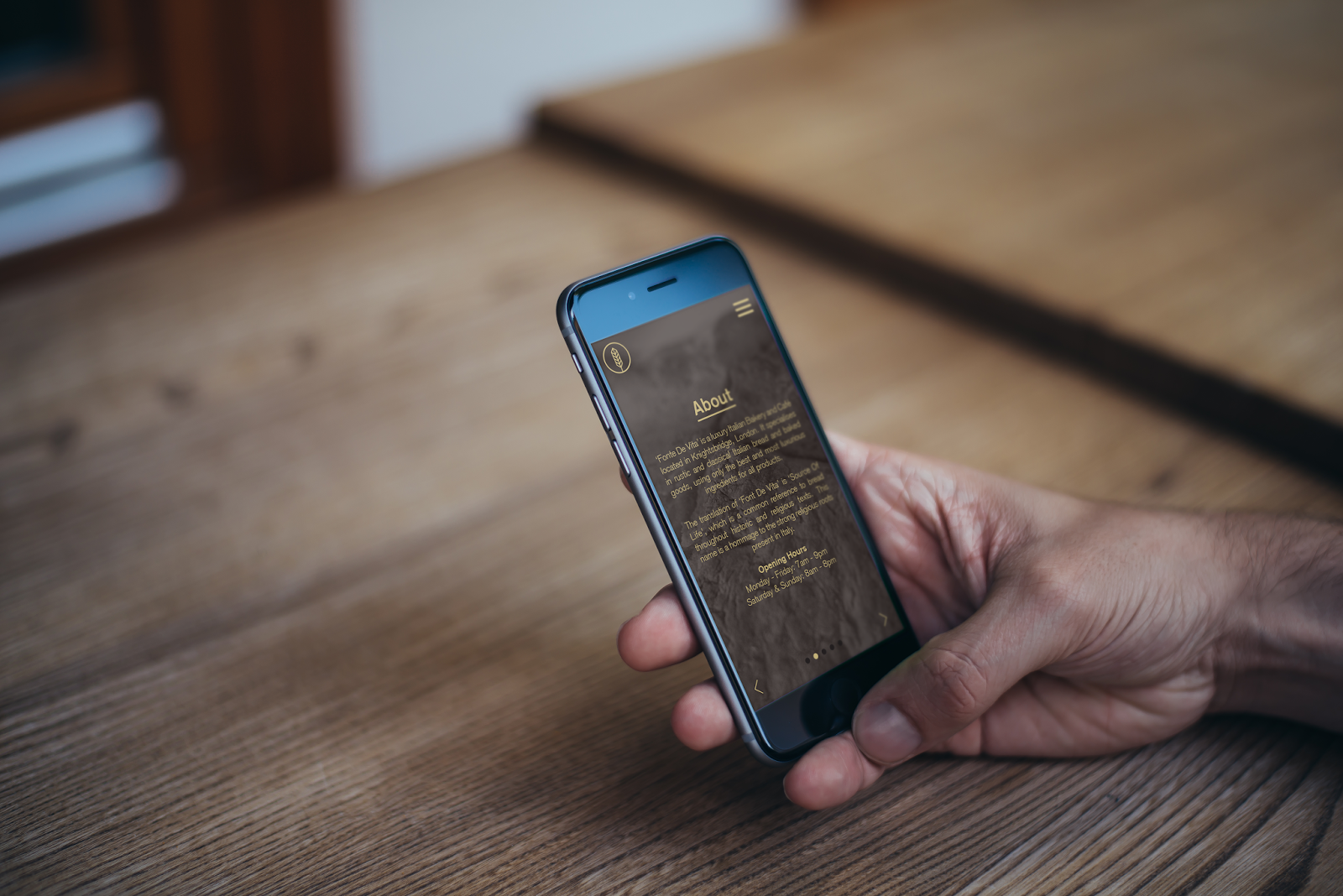
Brief 1 - Promotion Mock ups
Following the completion of the menus and corporate identity, I created some mock ups of what promotional material could look like. I first adapted the website design to the App, followed by mocking up some advertisements, and finally some exterior signage.


Brief 4: Wheatless & More - Extension
Following the last bits of work the client asked me to do, I decided to look over everything and think about what was missing in terms of handing this in as a completed brief. While the clients needs have been met, there are a couple of things that I wanted to do.
The first thing I did was create some brand guidelines. I felt that this is a necessary tool in bringing the branding of the brief together. While I had obviously been sticking to this across all the media throughout, it is good practice to create guidelines and ensure that the branding is clear and consistent.
Brand Guidelines
Promotional Material
It would be something someone could pick up and keep instead of looking at a poster and trying to remember all the products. It also suggests that the client has an investment in all of the products equally as they each have their own piece of media and will get the same amount of attention.
I wanted to keep the layout very simple as the entire branding is simple. The one thing that I liked about the original poster was the headings for each of the sections - 'morning glories', 'lunch & dinner delights' and 'sweets & treats'. I though that these were quite quirky and would be good to include on each of the cards.
Looking back over the other material I had created, I liked the layout of the sticker which was a circle. It is very similar to one of the original logos that I pitched to the client. Taking this design, I adapted it to fit the headings in. I also added a couple of thicker outlines to the sign so it would be like a stamp.
Headings:


Keeping in form with the rest of the branding, I kept the front side of the card very simple with just the information on the rest of the promotional material - logo, small slogan and contact details.
For the back, keeping with the simple format, I initially tried the stamp down in the right hand corner but it didn't work very well because of the difference in product shapes. It was hard to get the product to work well with it, so I decided on putting it at the top central, with the product underneath. I also added a small bit of type to the bottom of the brand name.


Happy with these, I decided to expand this idea into a small A5 leaflet with all of the products in one place. The individual cards are good for someone who wants just one of the products, but a leaflet with them all in is good for someone who wants to know the selection. I kept the layout identical and just adapted the size and shape to the page side.
I then decided to look back at the A6 Postcards and how the back sides of these could be image based instead of have text. It makes them quite striking and bold with the use of images instead of text. I also think that the imagery is really nice but isn't actually being used a lot apart from on social media.
Following the success of the stamp on the product media, I decided to use this format and add the small slogan that is used across a lot of the promotional material 'where freefrom meets healthy & delicious'.
Stamp:

In contrast to the blue, I decided to use a grey background and have the text in blue. I decided that because the backs were going to be images, the lighter colour on the front will contrast against this and work much better than the blue.
I created four variations of four images, using a slightly dark filter over the top so the stamp stood out a bit better against the images.


The first thing I did was create some brand guidelines. I felt that this is a necessary tool in bringing the branding of the brief together. While I had obviously been sticking to this across all the media throughout, it is good practice to create guidelines and ensure that the branding is clear and consistent.
Brand Guidelines
Promotional Material
I also looked back at the other promotional material that was created for the brand, in particularly, the large poster. This went to the specifications of the client as it was used for a trade show, so it needed to be as it was, however I do think that there are a couple of ways to present the information on a small scale. I decided that it might be nice to create some small A6 postcards/flyers for each of the individual products on the poster.
It would be something someone could pick up and keep instead of looking at a poster and trying to remember all the products. It also suggests that the client has an investment in all of the products equally as they each have their own piece of media and will get the same amount of attention.
I wanted to keep the layout very simple as the entire branding is simple. The one thing that I liked about the original poster was the headings for each of the sections - 'morning glories', 'lunch & dinner delights' and 'sweets & treats'. I though that these were quite quirky and would be good to include on each of the cards.
Looking back over the other material I had created, I liked the layout of the sticker which was a circle. It is very similar to one of the original logos that I pitched to the client. Taking this design, I adapted it to fit the headings in. I also added a couple of thicker outlines to the sign so it would be like a stamp.
Headings:
Keeping in form with the rest of the branding, I kept the front side of the card very simple with just the information on the rest of the promotional material - logo, small slogan and contact details.
 |
| Front side |
For the back, keeping with the simple format, I initially tried the stamp down in the right hand corner but it didn't work very well because of the difference in product shapes. It was hard to get the product to work well with it, so I decided on putting it at the top central, with the product underneath. I also added a small bit of type to the bottom of the brand name.
Happy with these, I decided to expand this idea into a small A5 leaflet with all of the products in one place. The individual cards are good for someone who wants just one of the products, but a leaflet with them all in is good for someone who wants to know the selection. I kept the layout identical and just adapted the size and shape to the page side.
 |
| Front |
 |
| Inside |
 |
| Back |
I am pleased with the way these turned out and think that they look much better than the original poster I designed. I think the stamps bring it all together and make it all that bit more branded and consistent.
Following the success of the stamp on the product media, I decided to use this format and add the small slogan that is used across a lot of the promotional material 'where freefrom meets healthy & delicious'.
Stamp:
In contrast to the blue, I decided to use a grey background and have the text in blue. I decided that because the backs were going to be images, the lighter colour on the front will contrast against this and work much better than the blue.
 |
| Front Side |
I created four variations of four images, using a slightly dark filter over the top so the stamp stood out a bit better against the images.
Friday, 28 November 2014

Thursday, 27 November 2014

Brief 6 - Binding
I looked over a few different binding methods and decided on coptic binding. This is because it is something that I haven't had a chance to do yet, and I really want to have a go at it. From what I've seen, it is quite smart when its finished, which is something that I want.

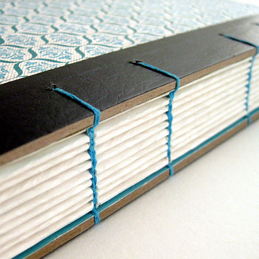
This type of binding also means I have the option to be able to use hard back cover, such as wood or thick board, and bind it easily without a lot of hassle. I just have to stitch it in while doing the book as a whole, whereas something like case binding requires a lot more work and patience.
Wednesday, 26 November 2014

Tuesday, 25 November 2014

Monday, 24 November 2014

Sunday, 23 November 2014

Saturday, 22 November 2014
Brief 9 - Final Evaluation/Reflection
As I enjoy creating publications I was looking forward to this brief. While I don’t hugely enjoy collaborative projects, I did find that doing a collaboration on this brief was enjoyable as it was only a short and conceptual one day brief where we all worked together in a very quick fashion.
I think our decision to create something light hearted for the day was a good one as it meant we could have fun with it and play around with ideas a lot more than we would have if we were creating a magazine for a much more popular and refined subject. It also meant that our research was interesting and amusing at times.
I enjoyed working in an environment where there was time pressure as it meant we had to make definitive decisions quickly, moving forward with the best ideas straight away instead of speaking at length about other ideas. While this is beneficial in some cases, I don’t think it was in this brief, and found that making quick decisions kept every in the group productive and on track with our concept.
The kickstarter campaign addition to the brief was interesting as it was never anything I had even considered for something like this before. It showed insight into how some magazines/brands get themselves started and get a following.
Overall I enjoyed this brief and think that our magazine concept was creative and fun. While it may not have been the most sophisticated magazine concept, it was light hearted and kept us all working productively and enthusiastically throughout the day.


Friday, 21 November 2014
Brief 9: Intern Magazine
Today we have been given a one day live brief from Alec Dudson of Intern Magazine to produce an idea for a crowd-funded magazine.
Alec started by giving a presentation on how he got to set up his own magazine:
Part 1 - Create a concept for a magazine & create supporting media including a front cover of the first issue, layout designs, etc.
Part 2 - Produce a crowd-funding campaign & propose how it would be used on Kick-starter.
I was in a group with Charlie, Anna and Jane.
Immediately I made the suggestion that we should consider keeping it light-hearted and fun as it was a fast-paced brief and if we enjoy it we will get a better result. I suggested the idea of obscure sports as it is quite a fun subject and is quite off beat.
We started by brain storming some ideas of routes we wanted to go down. We agreed that we needed a subject that we were interested in, but also something that wasn't in a saturated market.
Some of the areas we brainstormed:


I tried both black and white mastheads and found that the white worked better on this image. At this point we did share and discuss what we had. We decided that while we liked the image, it wasn't typically as action-shot like as we initially thought. It doesn't completely reflect the subject either. It is quite ambiguous because of the overall image - it could have been a holiday magazine etc.
Following this we started looking into the second part of this brief - creating the campaign for Kickstarter.
Charlie and Jane focussed on this while Anna and myself continued work on creating a front cover. It was important for the image to be full scale because then it would be immersive of the sport so it would get the audience to dive into the magazine and feel a part of the action.
Front cover:

Alec started by giving a presentation on how he got to set up his own magazine:
- Internship in Milan at DOMUS - an architecture and design magazine - for 2 months
- Not formally trained in Magazine Design
- Started work at BOAT travel magazine for 7 months as an intern - BOAT magazine has each issue revolving around a different city
- As an intern, didn't feel like any place would give him a chance. Wanted to make a magazine that was by and for the people
- Issue 0 of Intern Magazine was used for show for the Kickstarter fund
- Issue 1 was funded by Kickstarter
- A mixture of illustration, photography and writers is used to make up Intern Magazine
- Sponsorship are designed in-house with a uniformed look to work with the magazines aesthetic.
Part 1 - Create a concept for a magazine & create supporting media including a front cover of the first issue, layout designs, etc.
Part 2 - Produce a crowd-funding campaign & propose how it would be used on Kick-starter.
I was in a group with Charlie, Anna and Jane.
Immediately I made the suggestion that we should consider keeping it light-hearted and fun as it was a fast-paced brief and if we enjoy it we will get a better result. I suggested the idea of obscure sports as it is quite a fun subject and is quite off beat.
We started by brain storming some ideas of routes we wanted to go down. We agreed that we needed a subject that we were interested in, but also something that wasn't in a saturated market.
Some of the areas we brainstormed:
- Food
- Obscure Sport
- Cultural
- Comedy & comedians
- Random word - conceptual (lifestyle magazine)
The two ideas that were the strongest were the conceptual magazine and obscure sports. We felt that these were quite different and weren't in a saturated market, giving us a USP and a niche market to work in.
At this point we had a brief talk with Alec about the direction we were heading in. He mentioned that the conceptual magazine was already being done by Colors by United Colors of Benetton - something which we didn't realise. He was enthusiastic about the obscure sport direction because it was different and not something regularly known about. With not much time to choose a concept we decided to go with this one as we felt the most positive about it.
The next thing we did was brainstorm content, audience and names. In the magazine content, we felt that it was important to have first hand accounts of the different sports, where we could have the writers try the sport out as well as interview and talk to people who are fans or take part in the sport for fun.
We felt it was important to have a large feature on 1 person or a team within the sport as well as include the rules of the sport so it is easier to follow the information. We thought that looking at the culture of the sports origins would allow for us to take a documentary approach to the magazine.
I also suggested the idea of having each issue focus on a couple or few sports instead of try do all of them in one go. While this would would driven by the content we found, the other three agreed with the idea.
At this point we split into pairs and started working on different areas. Charlie and Jane worked on finding a name suitable for the subject, while Anna and myself started researching into the different obscure sports.
After creating a list of a wide variety of sports we discussed how we would choose the content. Some are taken very seriously, whereas others are much more comical or light-hearted. We decided that we wanted to keep a good mix throughout the issues, having at least one serious sport, cultural sport, and comical sport.
We went through the list and decided on the sports we wanted to use for the first issue. We decided on four sports: Ultimate Frisbee, Roller Derby, Belly Flopping and Dog Surfboarding.
We thought this was quite an even spread in terms of serious to comical. Roller Derby is both serious and cultural as it has quite a large following in America. Ultimate Frisbee is something that is popular at university, with teams and leagues similar to the likes of football and hockey. Belly Flopping is quite cultural, but is comical as well. Dog Surfboarding is something which is comical but is taken quite seriously, with championships being held in places such as Hawaii.
Charlie mentioned that we could do special editions every now and again as there were sports we found which weren't just one event - such as the Highland Games or the Mud Olympics. This idea gives the magazine a bit more scope in terms of variety in issues.
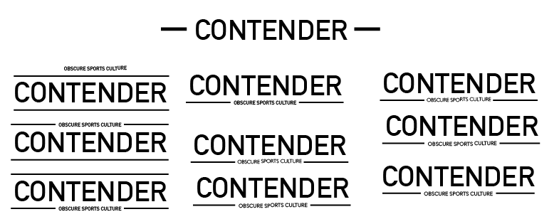
Jane and Charlie brainstormed names for the magazine, looking at words that would be similar to obscure, with their suggested names being Peculiar, Kooky and Off-beat. We decided on Off-beat due to the fact that the sports were off-beat and the cultures that they would be from would be off-beat so we would be working off the beaten track.
At this point we spoke to Alec again. He liked that we had a very focused, niche audience and clear content of the magazine. However, he mentioned that the name made him think of music rather than sports and suggested that we changed the name so it was more specific to the subject matter.
Following this Charlie looked at more possible names, with possibilities being Adversary, Team, Result, Athlete, Contender. After a short discussion we agreed that Contender was the best name as it was specific to competition which sport is all about, and wasn't narrowed down to just one sport.
After this we started working on the masthead for the magazine. Charlie started with a few visual ideas for the font to use. She showed us a selection which she had come up.
We agreed that we liked a sans serif typeface with all uppercase as it was bold and striking.
Charlie did a few variations with this direction.
Following this I did a few myself, taking the ideas that Charlie had with the use of the lines.
We discussed the designs which we felt were the best, which were the bottom three on the right hand side, and the top right design. However we weren't sure which would work until we worked it with a front cover. We decided that we wanted the logo to be just one colour, so it could be changed to suit the front cover of any issue.
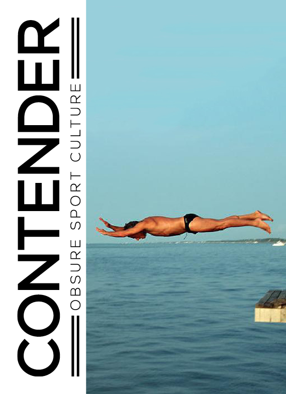
While Charlie and myself had been designing the masthead, Jane had been collecting images which were striking and action-shots to work on the front cover. We went through these and decided that we liked the image of the man belly flopping because it was striking and quite amusing, and was in general a nice photograph.
I shared this masthead with the other three and we individually worked on ideas for the cover.
My front cover variations:
I tried both black and white mastheads and found that the white worked better on this image. At this point we did share and discuss what we had. We decided that while we liked the image, it wasn't typically as action-shot like as we initially thought. It doesn't completely reflect the subject either. It is quite ambiguous because of the overall image - it could have been a holiday magazine etc.
Following this we started looking into the second part of this brief - creating the campaign for Kickstarter.
Charlie and Jane focussed on this while Anna and myself continued work on creating a front cover. It was important for the image to be full scale because then it would be immersive of the sport so it would get the audience to dive into the magazine and feel a part of the action.
Front cover:
For the campaign, it was important for us to be able to connect to our niche audience. It isn't the everyday topic so we needed to be able to attract an audience and keep them interested immediately.
Charlie and Jane felt like the video content for Kickstarter would show the sports within the first issue being done, and it would link to the ideas of the audience being immersed within the action. We would have us filming on location and behind the scenes of the production of the magazine, with some double spreads of the magazine for reference.
At this point Alec had another chat with us about the direction of the Kickstarter and how we could get attention. He spoke about how involving the people and giving them the feeling of making an investment instead of just giving money away.
Following this Charlie and Jane came us with some incentives which were unique to our magazine.
- Allowing for the audience to pick their own front cover based on the sport they liked
- If they were already involved in the sport, having themselves or their team featured and interviewed within the magazine.
- A one-off lesson on one of the 4 chosen sports alongside us and get to review it for the magazine with us.
- A standard cover but the option to choose an alternative from the featured sports of the issue.
I created a further three covers, following the same layout design as the initial one above.
Final 4 covers:
We decided that we liked the Roller Derby image the most and that this would be the standard front cover, with the other three being ones that could be specially chosen.
Following this Charlie, Jane and Anna presented these covers and the whole concept to the rest of the year.
Overall I enjoyed the day and felt that we worked well as a group. I liked that we chose an off-beat topic and ran with it. I think it shows that even though we might be given a subject we don't necessarily know a huge amount about, we can create a concept behind it and come up with the starting of a campaign.
Subscribe to:
Posts (Atom)