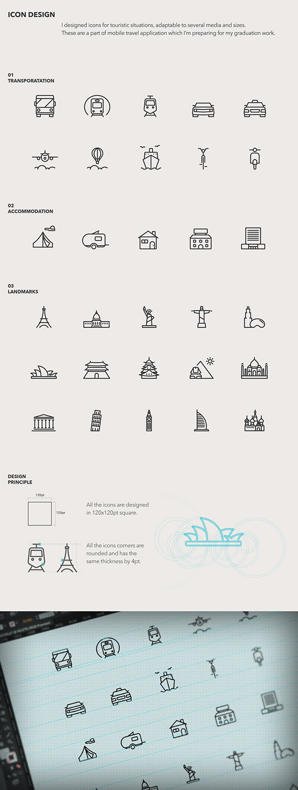
I looked into some icon designs which were similar to the style that I wanted to move forward with.
I chose these three to follow the same style of aesthetic as the three above because they are simple, but clear and easy to understand.
I wanted to create simple, but individual icons with a bit more detail on, like the top icons. I really like that the icons can be small and still have detail to them.
The main icons that I need to create are the ones for the City home page for the following:
- About
- City Map/View Map
- Sight Seeing
- Food
- Culture
- Entertainment
- Sports
- Popular
I had a few ideas for these already. But I won't be sure until I start creating these.
About - A outlined version of the logo
Map - an unfolded map with points and lines joining them together
Sight seeing - A camera, binoculars, a small icon of a famous sight e.g. statue of liberty
Food - plate & knife and fork, ice-cream cone, dinner bib, reserved sign
Culture - Tickets, a small icon of a famous cultural spot e.g. Sydney Opera House
Entertainment - Tv, microphone & stars, drama masks, tickets
Sports - basketball hoop, baseball bat & ball, tennis racket
Popular - star, thumbs up, bar getting larger at the top
I think that hardest icon to think about was the 'Culture' section. It's very hard to sum up culture in one icon, which is why I had so very little ideas for it.
I feel that its stereotypical to go for the Statue of Liberty for sight seeing, so I want to go with something that can be more general and apply to everything, so the camera or binoculars
Final Icons
I kept a very simple aesthetic for them, the most complicated being the culture icon. It is more complicated, but I still think it works well, especially because of the detail on the Sports and City Map icons.
Overall I'm happy with the icons I've created. I think that they are consistent and are visually simple and self explanatory, while not being too obvious/generic. I'm not too sure about the Entertainment icon of the tickets, but I think that it works over a wider category and applies to more than a microphone or tv set would.


No comments:
Post a Comment