Today we were given the Yearbook brief. It is optional, and must be a collaborative of at least 3 people.
Printing will be done by Evolution Print.
All groups will pitch for the Graphic Design book, and then will be distributed another course's yearbook depending on the concept.
A presentation must be produced to show the concept - 10th February, 12pm.
Avoid square formats, or anything too similar to last years yearbook.
Consider layouts & different formats, binding & stock.
Think about how this could be extended into the end of year show.
Think about the audience and the experience of reading the yearbook.
I am working with Sam Walker & Grace Buckley on this brief.
Wednesday, 4 February 2015
Tuesday, 3 February 2015
Brief 2 - Rationale
With the initial research done, we decided on a concept and rationale for the brand. This is for us to refer back to and keep the brand moving with this concept consistently and effectively.
Brief Rationale
This brief is done in collaboration with Charlie Rotherham. The brief is to create a high-end and luxurious chocolate brand and bespoke store.
The concept behind the brief is to create a luxurious brand of chocolate. ‘Kakawa’ means ‘food of the gods’ - the original name for chocolate given by the Mayans on their discovery of the cocoa bean. Using this as the concept, the brand reflects the origins of chocolate and the place it held among the Mayans, being that of luxury and from the gods.
With this, the ethos of the brand is authentic, artisan and luxurious chocolate. With this ethos, the overall approach will be simplicity and clarity. The aim is to represent the products in a professional and luxurious, not overcrowding the branding and packaging with unnecessary information. The brand is a celebration of chocolate.
The brand will have a range of products. These will each have their own individual packaging, specially tailored to the product. This shows a diversity of products possible with chocolate, and how each is individual.
Brief 7 - Ideas Development
I have decided to move forward with the campaign concept as this is the one that I am most confident in at this moment in time. It is the one which I feel I will be able to do best.
The first thing I did was look into the Syfy branding. For the branding, Syfy employed Proud Creative, a London based design studio.
Proud Creative for Syfy


Brand Guidelines have been developed, and while I can't see them, I can see the colours, and I think that it'd be good to incorporate these into the campaign. They have quite a variety and are bold, so I think they would work well. The typeface developed is bespoke to Syfy, and is not available to have in this project, so I will have to try find something similar.
Brand colours:

In terms of visuals, I wanted to make it quite fun and interesting, and perhaps create a campaign identity through the use of these secondary colours and how they work.
Initial Idea
My initial idea is to create a footer design to go at the bottom of all the promotional material. This would be the identity, and would be made up of colours strips, using two or three of the brand colours, shown above.

The image above is my initial thoughts into this footer. It's bold and eye catching, and would contrast against imagery. The colours could potentially switch, depending on the content.
The main point that Syfy wants to get across is their passion of sic-fi and greatness. With this, I had the idea of putting a quote or saying about greatness, as it's something everyone will recognise and relate to.
In terms of imagery, I was a bit unsure what to do, but for the moment I settled on imagery of a program featured on Syfy. I decided on a purple monotone image to get the brand colour across a bit more obviously.


While I like the banner at the bottom, I'm not too sure about the use of large imagery or the quote. I think it's quite a small concept and will get old very quickly, so something with a bit more room and diversity is needed.
I had a second idea which follows the same format with the colour banner, but experiments on it more. Instead of having quotes about greatness, I thought about the use of just a few words to put across the message that Syfy want the audience to know, and having more of a focus on them than having to involve imagery of a program featured on the channel.


The concept to this idea is simple. The black indicates where imagery would go. I'm not too sure what this would be, but it would be something abstract and representative of sci-fi. I think that this is a stronger concept in terms of what the brief is asking for, and is going in the right direction, however I think that the design needs developing to something more sophisticated and professional.
I added the small tagline 'passionate programming for passionate fans'. At the minute it's a bit of a filler text as it isn't necessarily what I want to be on the final posters, however it is along the same lines of what I would want. I am a bit concerned about the overuse of 'passion' in this poster. It is there three times and perhaps is a bit too strong. In the concept the brands passion for sci-fi shouldn't be written so obviously, but shown clearly and meaningfully.
In terms of the design, I do like the footer still. I think it works better without the logo there. Before it had to be quite large to fit the logo in, but if I make the logo the main centre of the design instead of in the footer, it allows for the footer to be more subtle and look much better.
While I like this concept, as said the execution needs to be refined. I think trying the large text was important, but I definitely think it isn't needed and I can put the message across without it, or at least without it at that scale.
I took this idea and simplified it down to what was really needed in the design - the logo and tagline. I also decided to include the channel numbers as this explains to the viewer where to go to view it. I also decided on simplifying the layout design again, moving back to the initial idea of just having a footer.
I created two variations of this simplification.


The black indicates where there would be imagery - some abstract kind to represent the brand, not imagery of a program cast or something that directly relates to a program.
I think the second design works better with the information more spaced out and with less in the footer. I also like the addition of the Syfy logo in a triangle in the corner. I think this is something that I could use across all material, keeping this the consistent identity across the campaign.
I changed the tagline to 'the beating heart of sci-fi' - this is something a lot simpler and effective.

Happy with this design, I moved forward with choosing imagery. I thought what might look good is if I look at the NASA website etc and find imagery to do with space and true science fiction - this is something that everyone knows immediately and can relate to.
I looked on the NASA website and found imagery of a solar flare with UV rays, creating some really bold colours. I thought that it was a good start to choosing some imagery and would be good in seeing how it worked with the text and footer. I also think this kind of imagery works really well with Syfy's line of 'Imagine Greater'.
Again, I did two variations, one with a more zoomed in version of the imagery.


Once I had the imagery in place I moved the logo and type around to fit it better. I also added a drop shadow to the text to make it stand out against the imagery a bit more and give it a bit more of a raised look as vectors can sometime look a bit too flat.
I think that these work quite well, the zoomed in imagery worked a bit better. Working with the different areas shown on the channel - such as space, vampires etc. I could use imagery representative of each of these genres to create more material for the campaign.
Happy with the portrait version, I created a landscape version as there will be a variety of shapes and spaces where these posters could be placed.
Landscape version:


Overall I am quite happy with the way these posters look. I think the addition of the branding in the bottom right corner is something I can definitely move forward with and continue to use. I want to move forward by experimenting more with imagery and potentially using more drop shadows etc on the logo and text. I am also considering using different colours in the footer for each of the genres, creating a bit more of a colour palette to work with and fully utilise the brand colours. Doing this will keep the campaign a bit more interesting for the viewers.
Brief 2 - Initial Logo Ideas & Development
Following our meeting, I started with a few ideas for logos. We had agreed on a sans serif font, particularly Gotham and Pier, so I experimented in both of these.
At this point we don't have a particularly strong concept in terms of how it will influence the logo, so I decided to just go with a simple design of a coco bean at this point, and work on the name and typography.
At this point the name I have chosen to go with is 'savour'
I started by creating a single coco bean design, however on its own I didn't feel it was particularly strong, so I duplicated it twice and angled them, adding a bit of a tree stem to the top to help make it clearer.
I first tried out the same design but with the typefaces variated. We had a very clear idea of the kind of logo we wanted, with an emblem of sorts and the text underneath, so this is what I started with. I also tried out a dark brown as the colour.
Initial idea:

I much prefer the one on the right, with Gotham Bold as the brand name. It balances against the image much better. I also much prefer the smaller copy in Pier than in Gotham. It is slightly thicker and a bit more of a thinner font.
I sent this to Charlie for her opinion, and she agreed that the logo on the right was better. I then went about creating a few different variations using these elements.

I sent these to Charlie again and she agreed with the logo designs that I preferred - the original, and the two in the boxes towards the bottom in the centre.
Following this, Charlie and I met up again and exchanged ideas. At the moment we are still preferring the original design and the box design over the others, and Charlie says she quite likes the name as it sits well with the imagery.
We discussed the smaller copy in the design, coming up with three possibilities: 'Est. 2015', 'Established 2015' and 'Bespoke Chocolatiers'.
We tried out the last two with the square logo design as the 'Est.2015' would have been too small for it.

We preferred the 'established 2015' in the smaller text, however weren't sure about it as the direction for the logo.
Charlie suggested trying just one or two cocoa beans to have a few variations for us to be able to decide from.
I took the three cocoa beans and created two other variations, one with two beans where one was smaller than the other, and a single bean at an angle.

We both agreed that we liked the look of the one with two cocoa beans as it is clear they're cocoa beans and the size difference makes it a bit more realistic and interesting to look at.
We then tried this with the original logo. We tried two variations, one with just the cocoa beans, and a second with a shadow beneath it.

We agreed that the shadow was nice but it didn't work so well on a smaller scale, so we decided to scrap that idea.
We also tried the one cocoa bean against the two cocoa beans.

We both agreed that the two beans work better than the one. The one on its own seems a bit lost and out of place, whereas the second one looks like it has a place.
We tried the two beans against the three beans in the same logo design

We decided that we liked the two beans as it worked much better than the three. It's simpler and can be larger.
We then decided to look over the names we had for the brand again, trying to find something which was a bit better and worked to help with with a concept.
We decided on 'Kakawa' - the Mayan word for chocolate which translates to 'food of the gods'.

Happy with the name and image, we decided between using 'est' and 'established.

We decided on the 'established' as it fit in more with creating a sophisticated and luxurious approach.

Following this, we looked into possible colour schemes, deciding on three definite colours, and a gold and silver - which will be replaced with foiling when printed.

We haven't decided on whether we want gold or silver foiling yet as we have seen examples done with both which are successful.
Monday, 2 February 2015
Brief 7 - Initial Ideas
To start this brief off I went through the brief and picked out the important things that the brand wanted to have in the concept.
Points
The most important point to focus on is the promotion of the brand, and not just the programming. A lot of the programs shown on the channel are well known, however the audience is not tuning into Syfy. What needs doing is something that will encourage the audience to watch Syfy and see its passion for all sci-fi.
Points
- Promote the brand - not just the programs
- Passion for sci-fi - not just their programs shown
- Want consumers to engage & connect
- Open brief - No set deliverables - Anything can be done
- Logo & tagline are fixed
The most important point to focus on is the promotion of the brand, and not just the programming. A lot of the programs shown on the channel are well known, however the audience is not tuning into Syfy. What needs doing is something that will encourage the audience to watch Syfy and see its passion for all sci-fi.
Initial Concept Ideas
As this is such an open brief, I have quite a few initial ideas which are very different in terms of deliverables.
Promotional campaign
A promotional campaign aimed at getting the audience to see the passion in Syfy - deliverables would include large outdoor promotion, as well as small printed material and possibilities of an integrated App.
App Design
One thing to note about Syfy is that while they have a full website and App in the USA, in the UK they just have a website, which isn't as interactive or interesting as the American version. Developing the website and creating an App to allow the audience to engage more and keep up to date with Syfy's schedule.
Convention
A sci-fi convention in a large arena in a well known location. Much like comic-con in aspects of having program cast Q&A's, signings etc. A much more engaging an hands on approach. Deliverables would include event branding, collateral & promotion.
At the minute I am unsure as to what direction to go in. I think that they all play to my different strengths, however I did a campaign for the YCN Domino's last year and really enjoyed it, so I am leaning towards doing a promotional campaign.
Brief 12 - DBA Capital North
Today five creative directors from businesses is Leeds came and presented a brief set by DBA to create an identity for the 'Northern Powerhouse' - Capital North.
Brief:
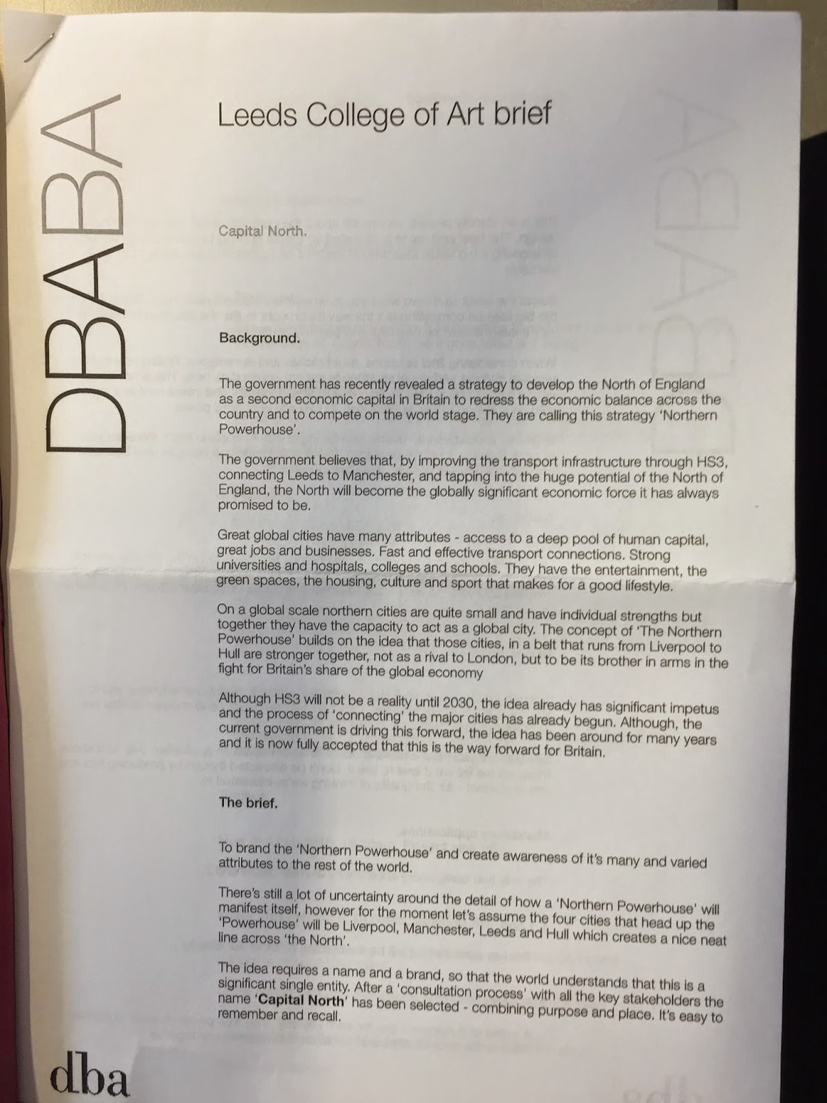


Brief breakdown
Name
Capital North
Cities
Leeds, Manchester, Liverpool, Hull
Deliverables
Identity & concept
4 posters - one for each city
+ 2 of the following - Train livery, Train staff uniform, Taxi livery, Environmental, App
Dates
Today - briefing
11th - full day workshop/crit
27th - final presentation
Groups
Groups of 4 - 5 people
My group
I am in a group with Sam Walker, Ant White & Ewan North. We will be meeting up on Thursday 5th. Until then we will be doing our own individual possible ideas/research as a starting point.
Brief 2 - Initial Ideas
Today Charlie and I officially started our collaborative brief. As we had both spent some time gathering visuals of the kinds of aesthetic and style we wanted to go for, it gave us a good starting point for our discussion.
With this discussion we drew out two mind maps showing exactly what we wanted to achieve in doing the project.


The main idea was to create a luxurious chocolate brand, and potentially a store. This is still what we want to do, and with the research we have both conducted, we can definitely do this in a productive and informed way, knowing what we want to do.
The first thing we both agreed on was that a simple, but effective logo design is something that we wanted. We wanted this to be one colour and something that would be flexible in terms of production, so we could potentially foil it or vinyl cut it. In terms of typography, we agreed on something contemporary like a sans serif, however we might explore the idea of a serif or slightly more decorative font.
We made a start on the colour scheme that we wanted, agreeing that we wanted dark brown to be the main colour, as we would like to do packaging in this. It definitively represents chocolate, and being a darker shade of brown, it will link into the luxurious side which we want to put across. To contrast against this we would like o use a slightly off white instead of white. This adds a bit more of the luxury side to it, and is something we can experiment with in terms of stock choices. We like the idea of looking for stock instead of just printing the colour.
As well as this, we have discussed gold and silver, however these would be foiled, not printed. We haven't decided which colour yet, but this will be informed when we get further into the overall design visuals for the brand.
Packaging is the main element of this brief, and is something we want to explore in terms of variety and suitability for the products. The products we have decided on are:
- Bar
- Truffles
- Cocoa Powder
- Chips/Buttons
- Spread
- Eclairs
With these products, we want each to have their own individual packaging. We want to use jars for products such as the truffles, powder and spread, foil wrapping for the bars, and bags for the chips/buttons and eclairs.
For the jars, we both liked the idea of having white vinyl on the glass, and then a sticker on the lid, perhaps explaining the product etc.
For the bars we would like to use both foil and paper, however we are not sure how this will be done yet - if the paper will be a slip with the foil visible, or go around the full product with the foil beneath it.
We have also considered the use of gift boxes/bags/wrapping that would be necessary in having a chocolate shop. Something will be needed for customers to be able to take the goods away. Gift boxes will be good for potentially creating a pack of one product, or mix of products, much like a hamper of some kind. We have also spoken about the idea of customers creating their own jars of truffles etc. so that needs to be thought about as well.
We will also be doing the corporate branding side to the brief - letterheads, stationary etc, and include brand guidelines. As well as this, we will be doing the shop ephemera - such as assistant aprons, tags, etc.
We also explored possible routes to go down after completing the main part of this brief, such as the promotional side, creating a website and product book which would be sent out to potential customers etc.
Following these decisions we moved onto choosing a name. We thought about the idea of potentially making the brand Swiss or Belgian as these are two very prominent nations in Chocolate. With this, we thought about the different words associated with chocolate, ranging from the taste to a more literal meaning of the word. We tried these in English, French and Dutch.
At the minute we've got a few names which we are leaning towards:
- Doux - french for 'sweet'
- Luxe - frech for 'luxury'
- Coco
- Cacao
We have decided that this is a good point to conclude our meeting and will each come up with a few ideas for logos and names individually before our next meeting.
Subscribe to:
Posts (Atom)