Specimen Rokel
I like the colour use and the smaller inserted books inside, but I do think the larger page looks extremely condensed, as does the majority of the publication. I do think there are some good layout ideas and content to include, but I definitely want to go for a more spaced out layout.
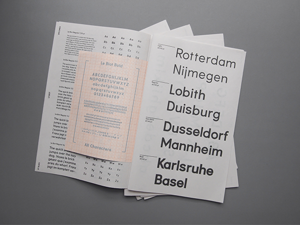
Specimen Le Biot
I really like the overall layout of this publication and how it shows the typeface working in the different weights and sizes in interesting layouts instead of just the whole publication being pages and pages of columns and rows. I particularly like the second to last image, with that layout of the text and how the page has different weights shown in different sizes and with different words. Overall the layout is really clean and simple, which I like, but I definitely don't want to include photographic imagery like this one. I don't think it's necessary in mine.
Type Book Design - Helvetica
I think that this is a more creative approach to creating a specimen book. I think that its got some good ideas, but overall it isn't particularly what I'm want to do in mine. The colours are extremely bright, and it is almost cartoonish in the way it is presenting the typeface. That said, there are some good layouts and it does show me that type specimen publications don't have to be boring and dull.
After looking at a few examples, and the three chosen above, I do feel a bit more confident in the ideas that I have for my publication. I don't want it to be boring, but I do want an overarching consistency throughout it, with the use of colour in there somewhere. My typeface in contemporary, so I want to get this across in the publication design as well and make it all join together and be integrated.


No comments:
Post a Comment