The typeface used in the branding is Montserrat, so this is what I decided to use across the whole of the App to keep consistency. It is also a typeface which works really well on screen, and it has a few variations in style which I can play around with.
I had a pretty clear idea of the kind of design that I wanted to do for each page, so started by creating some initial wireframes, incorporating the colours where I could.
Login/sign up
I want this page to be really simple and self explanatory in terms of what the user has to click. I think the whole background image would work well - something faded and maybe light so the logo is visible.
New Trip pages
I started by deciding on the two tabs at the bottom. I wanted something quite subtle, but clear in showing which tab is open. I didn't want it to be a full colour button, so a thin line across the top seems to work well. I also incorporate the light grey here because it keeps it light. Overall I want the App to be light, so the backgrounds for everything will be white. The light grey creates a contrast and clear buttons, but stays with this lightness. The blue circles indicate where imagery/icons will go.
City homepage
The city homepage is something that I wanted to be simple, but informative and easy to use. When the user has clicked onto this page, there needed to be tabs for them to be able to flick between 'activities' and 'my planner', however I did not want to replace the tabs at the bottom with these. I decided on putting the table to the top instead, keeping them in the same style, but clearly thinner so they're 'sub-tabs' as it were.
I want each small section to have it's own icon, and I want this to be integrated into the individual activity page as well, shown on there somewhere to signify what section the activity is part of.
I also thought it would be useful for the user to be able to see what day of their trip they are on, and a small weather note as well.
Category/My Planner
To create consistency across the App, I wanted these two pages to be identical in design. When one of the icons on the City page is clicked on, they will be taken to the category page, which lists all the activities in this section. This will be scrollable. I also added arrows to the bar at the top so the user can easily flick through the categories as well.
The My Planner page follows the same structure, but instead of flicking through the categories, they can flick through each day of their trip and see all the activities they have planned. I also added a 'map my route' button to the bottom of this page. This is what the user will click to map their activities together and show them how to get from one to another.
Activity Page
In keeping consistency, this is the same general layout as the city homepage. This is what comes up when a user clicks on the event from the categories list. They have the change to be able to flick through the other activities in the same list as well.
There were only two options that were needed on this page - view on map, and add to planner. When the add to planner button is clicked, a calendar will appear and allow them to book it into a day and time to their trip. I also thought a short description would be useful so the user knows exactly wha they're look at.
The white circle indicates where the category icon will be.
Another idea I had for this page was the bit at the bottom which shows other activities close by. This is useful because users might want to spend a full day in one specific area of the city, so they are able to see everything available near where they are.
Map Route Page
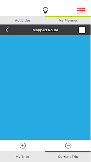
The map route page is what will appear when the user clicks this button on the my planner page. I decided on having two variations of this page as each can do different things. The first is a visual map, which will be similar to the 'view city map' - it will be a full flat designed map of the city with the day activities and route shown. The second is the listed version, which is visual, but it is basic information, just showing the points of the day. The white button in the top right corner is to allow them to flick back and forth between them.
Something that I want to do on this page is have the route lines in a variety of colours to show the type of travelling involved, for example, water travel would be in blue, etc.
At this point I am quite happy with the progress of the app and how it is all looking. I think that style of design works well, and when I create the icons and flat map, it will look even better. I was a little unsure about the white background initially, however I think that it keeps everything bright and clean. What I want to do is maybe incorporate the green and red a bit more into some of the buttons. They're all grey at the minute, so adding the brighter colours should make it look better.


No comments:
Post a Comment