Alec started by giving a presentation on how he got to set up his own magazine:
- Internship in Milan at DOMUS - an architecture and design magazine - for 2 months
- Not formally trained in Magazine Design
- Started work at BOAT travel magazine for 7 months as an intern - BOAT magazine has each issue revolving around a different city
- As an intern, didn't feel like any place would give him a chance. Wanted to make a magazine that was by and for the people
- Issue 0 of Intern Magazine was used for show for the Kickstarter fund
- Issue 1 was funded by Kickstarter
- A mixture of illustration, photography and writers is used to make up Intern Magazine
- Sponsorship are designed in-house with a uniformed look to work with the magazines aesthetic.
Part 1 - Create a concept for a magazine & create supporting media including a front cover of the first issue, layout designs, etc.
Part 2 - Produce a crowd-funding campaign & propose how it would be used on Kick-starter.
I was in a group with Charlie, Anna and Jane.
Immediately I made the suggestion that we should consider keeping it light-hearted and fun as it was a fast-paced brief and if we enjoy it we will get a better result. I suggested the idea of obscure sports as it is quite a fun subject and is quite off beat.
We started by brain storming some ideas of routes we wanted to go down. We agreed that we needed a subject that we were interested in, but also something that wasn't in a saturated market.
Some of the areas we brainstormed:
- Food
- Obscure Sport
- Cultural
- Comedy & comedians
- Random word - conceptual (lifestyle magazine)
The two ideas that were the strongest were the conceptual magazine and obscure sports. We felt that these were quite different and weren't in a saturated market, giving us a USP and a niche market to work in.
At this point we had a brief talk with Alec about the direction we were heading in. He mentioned that the conceptual magazine was already being done by Colors by United Colors of Benetton - something which we didn't realise. He was enthusiastic about the obscure sport direction because it was different and not something regularly known about. With not much time to choose a concept we decided to go with this one as we felt the most positive about it.
The next thing we did was brainstorm content, audience and names. In the magazine content, we felt that it was important to have first hand accounts of the different sports, where we could have the writers try the sport out as well as interview and talk to people who are fans or take part in the sport for fun.
We felt it was important to have a large feature on 1 person or a team within the sport as well as include the rules of the sport so it is easier to follow the information. We thought that looking at the culture of the sports origins would allow for us to take a documentary approach to the magazine.
I also suggested the idea of having each issue focus on a couple or few sports instead of try do all of them in one go. While this would would driven by the content we found, the other three agreed with the idea.
At this point we split into pairs and started working on different areas. Charlie and Jane worked on finding a name suitable for the subject, while Anna and myself started researching into the different obscure sports.
After creating a list of a wide variety of sports we discussed how we would choose the content. Some are taken very seriously, whereas others are much more comical or light-hearted. We decided that we wanted to keep a good mix throughout the issues, having at least one serious sport, cultural sport, and comical sport.
We went through the list and decided on the sports we wanted to use for the first issue. We decided on four sports: Ultimate Frisbee, Roller Derby, Belly Flopping and Dog Surfboarding.
We thought this was quite an even spread in terms of serious to comical. Roller Derby is both serious and cultural as it has quite a large following in America. Ultimate Frisbee is something that is popular at university, with teams and leagues similar to the likes of football and hockey. Belly Flopping is quite cultural, but is comical as well. Dog Surfboarding is something which is comical but is taken quite seriously, with championships being held in places such as Hawaii.
Charlie mentioned that we could do special editions every now and again as there were sports we found which weren't just one event - such as the Highland Games or the Mud Olympics. This idea gives the magazine a bit more scope in terms of variety in issues.
Jane and Charlie brainstormed names for the magazine, looking at words that would be similar to obscure, with their suggested names being Peculiar, Kooky and Off-beat. We decided on Off-beat due to the fact that the sports were off-beat and the cultures that they would be from would be off-beat so we would be working off the beaten track.
At this point we spoke to Alec again. He liked that we had a very focused, niche audience and clear content of the magazine. However, he mentioned that the name made him think of music rather than sports and suggested that we changed the name so it was more specific to the subject matter.
Following this Charlie looked at more possible names, with possibilities being Adversary, Team, Result, Athlete, Contender. After a short discussion we agreed that Contender was the best name as it was specific to competition which sport is all about, and wasn't narrowed down to just one sport.
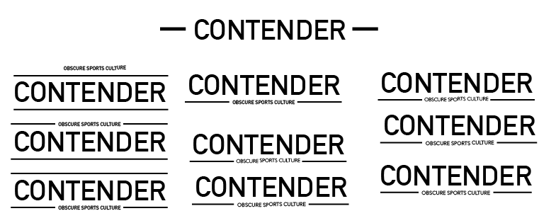
After this we started working on the masthead for the magazine. Charlie started with a few visual ideas for the font to use. She showed us a selection which she had come up.
We agreed that we liked a sans serif typeface with all uppercase as it was bold and striking.
Charlie did a few variations with this direction.
Following this I did a few myself, taking the ideas that Charlie had with the use of the lines.
We discussed the designs which we felt were the best, which were the bottom three on the right hand side, and the top right design. However we weren't sure which would work until we worked it with a front cover. We decided that we wanted the logo to be just one colour, so it could be changed to suit the front cover of any issue.
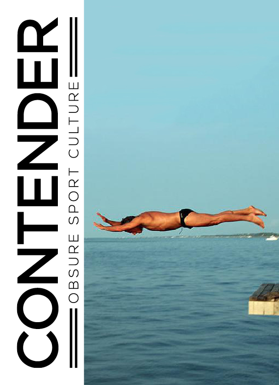
While Charlie and myself had been designing the masthead, Jane had been collecting images which were striking and action-shots to work on the front cover. We went through these and decided that we liked the image of the man belly flopping because it was striking and quite amusing, and was in general a nice photograph.
I shared this masthead with the other three and we individually worked on ideas for the cover.
My front cover variations:
I tried both black and white mastheads and found that the white worked better on this image. At this point we did share and discuss what we had. We decided that while we liked the image, it wasn't typically as action-shot like as we initially thought. It doesn't completely reflect the subject either. It is quite ambiguous because of the overall image - it could have been a holiday magazine etc.
Following this we started looking into the second part of this brief - creating the campaign for Kickstarter.
Charlie and Jane focussed on this while Anna and myself continued work on creating a front cover. It was important for the image to be full scale because then it would be immersive of the sport so it would get the audience to dive into the magazine and feel a part of the action.
Front cover:
For the campaign, it was important for us to be able to connect to our niche audience. It isn't the everyday topic so we needed to be able to attract an audience and keep them interested immediately.
Charlie and Jane felt like the video content for Kickstarter would show the sports within the first issue being done, and it would link to the ideas of the audience being immersed within the action. We would have us filming on location and behind the scenes of the production of the magazine, with some double spreads of the magazine for reference.
At this point Alec had another chat with us about the direction of the Kickstarter and how we could get attention. He spoke about how involving the people and giving them the feeling of making an investment instead of just giving money away.
Following this Charlie and Jane came us with some incentives which were unique to our magazine.
- Allowing for the audience to pick their own front cover based on the sport they liked
- If they were already involved in the sport, having themselves or their team featured and interviewed within the magazine.
- A one-off lesson on one of the 4 chosen sports alongside us and get to review it for the magazine with us.
- A standard cover but the option to choose an alternative from the featured sports of the issue.
I created a further three covers, following the same layout design as the initial one above.
Final 4 covers:
We decided that we liked the Roller Derby image the most and that this would be the standard front cover, with the other three being ones that could be specially chosen.
Following this Charlie, Jane and Anna presented these covers and the whole concept to the rest of the year.
Overall I enjoyed the day and felt that we worked well as a group. I liked that we chose an off-beat topic and ran with it. I think it shows that even though we might be given a subject we don't necessarily know a huge amount about, we can create a concept behind it and come up with the starting of a campaign.


No comments:
Post a Comment