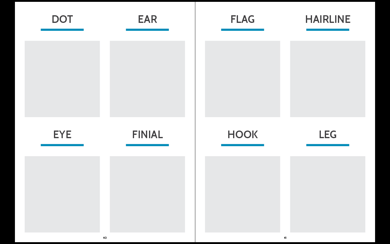
In reflection of this simplicity, I wanted to use a sans serif typeface which had a couple of different weights so I could use just that for all the headings and body copy. I wanted to do this because all of the imagery would be type based itself, so I didn't want to have too many different typefaces appearing on one page at a time.
I went through a selection of sans serif typefaces and decided on the following six as possible ones to use.
Typefaces such as Avenir Next, Brixton and Cabin have at least four variations, not including italics, so these have a wide range. Nexa, Montserrat and Young only have two variations each - bold and regular. This makes these three a bit limited in the difference in the weights.
I decided on writing all the letters of Avenir, Brixton and Cabin out to decide which one I liked.
I decided on Cabin. I like the letters and how they sit together. I have always had a bit of an issue with some of the letters in Avenir, so wouldn't feel happy using it if I thought about that every time I typed with it. Brixton is quite similar to Gill Sans, and overall I just much prefer Cabin. Cabin has four weights.
At this point I am leaning towards using Semibold and Medium for headings and body copy. While there isn't a huge difference in weight, I think that with a difference in size, these will still work well together. Having the body copy in medium also assures that it will be printed well and readable at a small size. I did have a problem in a previous project where the body copy had been thin and printed quite badly and made it hard to read.
Moving onto the colour scheme, I came across a really nice one which worked well.
I like that the colours aren't typical, they're quite off, but work well together. I do like the use of the dark grey instead of just a typical black. The blue, red and yellow are good as well. I think the green might be a bit dark, but it is something I could play around with.
I wanted to go with simple layouts which followed the same format with the text, and made everything very simple and straight forward to understand exactly what it was. I also didn't want to have a huge amount of text, just what is necessary.


No comments:
Post a Comment