I think that this brief never really reached the full potential of what it could have, mainly due to the lack of client response in the expansion. I did enjoy creating the logo and icons for this, but I do feel that they only go so far, and much more could have been developed and created.
Initially I had been quite excited by this brief because it was something that I found enjoyable in branding a restaurant. The brief was also something very up my street in terms of the deliverables asked for in the logo design - a typographically based design with an integrated icon. Creating a bespoke icon for this is something that interested me as I had not done much work on icon to the point of the start of this brief.
The lack of client response following the logo design made the brief lack direction and enthusiasm. With it being a client brief, I did not want to finish the brief the way I would have seen it because this may not have been what the client wanted, and would have ultimately meant I would be doing things twice over. Looking back at it now, and still with a lack of client response, I realise that I could have completed the brief to my vision and still got something out of it in creating work that I was proud of.
I did enjoy doing the initial parts to this brief and creating the logo, however afterwards it was not enjoyable and was a lost brief as there was no direction to move in. I think that this brief has shown me that in a client brief, they may want you to complete a brief quickly, but it is their response time that is important too in creating a project as it is a two way system.
Thursday, 12 March 2015

Wednesday, 11 March 2015
Brief 5 - Extension
While I have just decided to cancel this brief due to lack of client contact, I have decided to complete the brief on my own time and finish it in the way I would see fit. This is down to a number of reasons, the first being that I have included it in my portfolio and have had good feedback for it, so it would be great for me if I could actually talk about it a bit more and expand on it.
Right now I had the logo and three icons. The client had asked for a number of other icons, however, I don't think including these will make any difference to the end products. Keeping the three that are there are more linked to the brand as they are of the three specialties. Adding more might dull down the importance of these three icons.
As this was initially meant to be quite a short brief, I will not be spending a huge amount of time on it as I already have the majority of the work for it. It's just a case of applying this branding to the necessary products. I also created mockups to show how the interior of the restaurant could look.
Product Mock ups


Right now I had the logo and three icons. The client had asked for a number of other icons, however, I don't think including these will make any difference to the end products. Keeping the three that are there are more linked to the brand as they are of the three specialties. Adding more might dull down the importance of these three icons.
As this was initially meant to be quite a short brief, I will not be spending a huge amount of time on it as I already have the majority of the work for it. It's just a case of applying this branding to the necessary products. I also created mockups to show how the interior of the restaurant could look.
Product Mock ups


Saturday, 7 March 2015
Brief 7 - Website Development
As I had all the printed collateral completed, my attention on this brief has turned to the digital side, starting with the website. While I have some initial designs for this, I did comment previously that they needed some refinement and changes made to improve them.
Now the branding has been defined completely and overall appearance of the collateral and convention is very clear to me, I felt able to make the changes to the website to reflect this.
I started by deciding to change the navigation bar placement. Initially I had it along the left hand side, however I do now feel that a bar along the top would be better suited to the content of the website. I also decided that I didn't need the venue and date in the header at all times and that this would only appear on the pages necessary.
With these changes, I started on refining the events page of the website. With the navigation bar now along the top, the content boxes can now full the entire width of the page. I continued with the idea of some boxes being larger than others, adapting these to fit in with the new grid and only expanding width ways instead of height as well. I also decided on changing all the text to white to contrast against the purple imagery, which all boxes would be after the use of block colours didn't work well.
New grid:

I think this design works much better, especially the navigation bar. Following this I moved onto creating the initial page to the website.
Since I created the first poster I had a very clear idea of how this page would be, with the same image spanning the width of the page and all the content around it. With this in mind, I created a simple design which would fit with this. I also included a large button for users to be able to click to purchase tickets immediately.

I also created one the general pages - About - in case I wanted to show this in the presentation boards. While it isn't such a large page, it really helped me in being able to write down the concept and reasoning for the convention in the first place and really come up with a defined concept.

I then mocked the three of these pages up to include the imagery.


Overall I am really pleased with the pages and think they work really well together and individually. I think that they definitely fit in with the printed collateral and reflect the convention well as well as being easy to use and navigate. While there are obviously other pages of the website, at this point, the creation of these pages aren't important as the reason for the website is put across in these three pages, and it is unlikely that I will use any other page apart from these three in the submission boards for the brief.
Friday, 6 March 2015
Brief 12 - Final Evaluation/Reflection
Initially I was quite apprehensive about this brief as it was group work and a live brief. The previous live brief I did, I didn’t enjoy much at all due to the subject I was given, however I decided to keep an open mind about this as it was quite an open brief in terms of what the deliverables are and seemed like an interesting subject to work wih.
I wanted to work with people I hadn’t before, and I went through with this in the group I worked in. I found that this was a really good experience as it was good to see other people’s ideas and concept approaches. I think that we worked well together as a group as we had a variety of skills and each could put in our own individual contribution.
The final outcomes we produced were very different to how the brief started and to how I usually work, but I was very happy with this as this brief gave me a chance to really push my skills in vector illustrations and mocking up designs from scratch instead of using a downloadable file from the internet. This brief pushed my technical skills to a more professional level in this aspect.
The biggest surprise for me in this brief was my ability to create some strong and consistent illustrations. I had initially said I didn’t want to do the illustrations as I had not ever really worked in this style before and wouldn’t want to pull the standard of the project down, however when time became an issue and I helped in this, I found that it was much easier than I thought and I was much better at it than I thought, creating some illustrations that I was proud of and matched up to the standard of the others created.
Something I think we found hard as a group was creating a solid concept. Every time we thought we had one, we found the holes in it and ended up back where we started. However, when we finally did reach a certain and solid concept, it was strong and was definitely worth all of the hard work for. Once this was sorted I think we found it quite easy to create designs for it and expand this over the collateral that was asked for.
In terms of our outcomes, I think what we did was good and was very different to all the other groups, something that I think we were happy and proud to do. While we necessarily didn’t have enough time to fully explore what we could have done and push this far, I do think we did a good job and can be proud of what we did.
In reflection, I can say that I did enjoy the brief in terms of the design work. I think we can all agree that we found it hard up until that point, but keeping in constant communication and making time for meetings really aided in the development of this brief, which did result in a strong concept and strong visuals.
I wanted to work with people I hadn’t before, and I went through with this in the group I worked in. I found that this was a really good experience as it was good to see other people’s ideas and concept approaches. I think that we worked well together as a group as we had a variety of skills and each could put in our own individual contribution.
The final outcomes we produced were very different to how the brief started and to how I usually work, but I was very happy with this as this brief gave me a chance to really push my skills in vector illustrations and mocking up designs from scratch instead of using a downloadable file from the internet. This brief pushed my technical skills to a more professional level in this aspect.
The biggest surprise for me in this brief was my ability to create some strong and consistent illustrations. I had initially said I didn’t want to do the illustrations as I had not ever really worked in this style before and wouldn’t want to pull the standard of the project down, however when time became an issue and I helped in this, I found that it was much easier than I thought and I was much better at it than I thought, creating some illustrations that I was proud of and matched up to the standard of the others created.
Something I think we found hard as a group was creating a solid concept. Every time we thought we had one, we found the holes in it and ended up back where we started. However, when we finally did reach a certain and solid concept, it was strong and was definitely worth all of the hard work for. Once this was sorted I think we found it quite easy to create designs for it and expand this over the collateral that was asked for.
In terms of our outcomes, I think what we did was good and was very different to all the other groups, something that I think we were happy and proud to do. While we necessarily didn’t have enough time to fully explore what we could have done and push this far, I do think we did a good job and can be proud of what we did.
In reflection, I can say that I did enjoy the brief in terms of the design work. I think we can all agree that we found it hard up until that point, but keeping in constant communication and making time for meetings really aided in the development of this brief, which did result in a strong concept and strong visuals.
Brief 7 - Collateral Photography
Today I brought all my printed collateral together and photographed it to be included in my submission boards for the brief. I decided on photographing against the chipboard in the studio as it has a contrast against both the black and red.
Photos


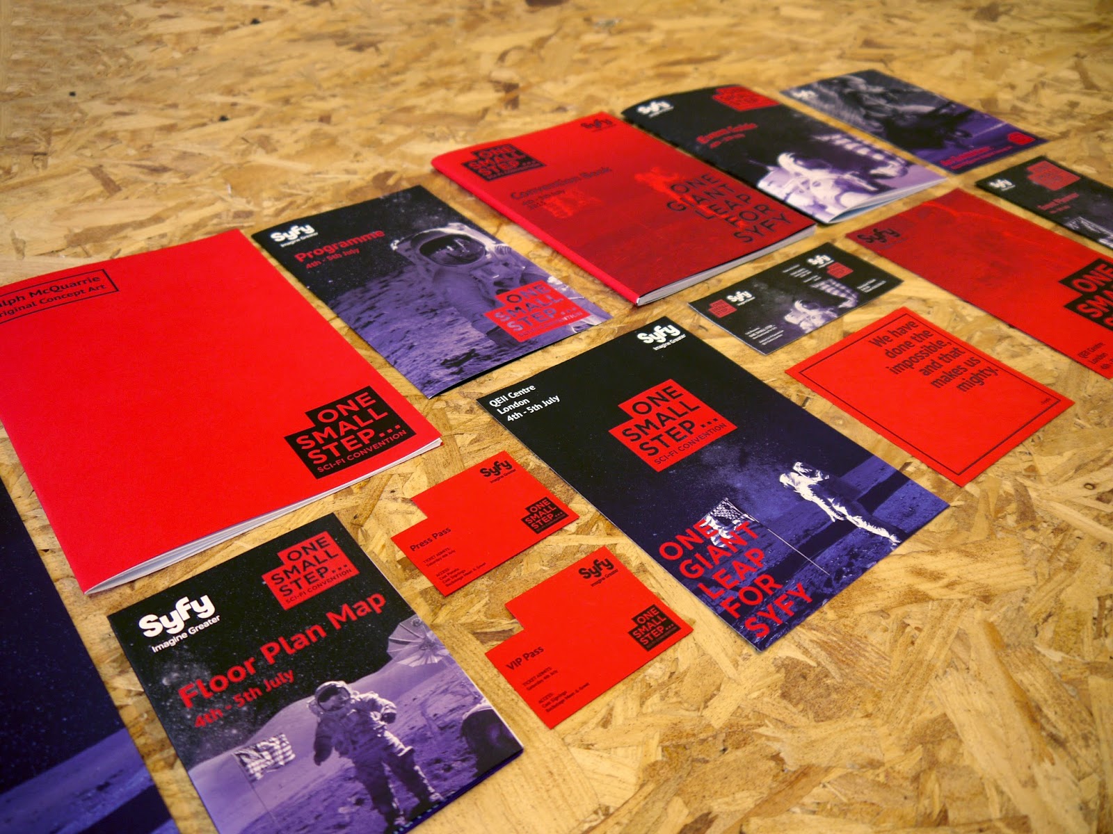


Overall I am very pleased with the photographs taken. Generally there is a bit of editing needing doing in the lighting of some of the images, however I think the general layout and photography of the collateral is strong and hopefully this will be improved when the editing is done. Some elements have photographed much better than initially thought, like the last image for example. That was a surprise, which has worked out really well and could be a leading image for the project.
Tuesday, 3 March 2015
Subscribe to:
Posts (Atom)