Saturday, 25 April 2015

Brief 15 - Kerning

Now all of the characters have been input into Glyphs, the last thing to do is to get the kerning right. This is definitely going to be a long and tedious task, but it is necessary if I am wanting to type with it otherwise words will look disjointed.

When I input the characters, I did set the spacing on each side of every letter to 40. This is so that when it came to the kerning, I could see the spaces clearly and all the letters would be at an equal distance from one another.

I started with Sans Bold. I started by typing out words to see how the letters worked together.


The image above shows some of the clear problem areas. While the letters such as 'p' and 'i' work well, it is the letters like 'T' or 'y' which don't. This is due to the amount of white space in their letterform space.


This image shows the obvious issues with 'r' and 'v'. I was quite surprised with the bad kerning on the 'r' , but considering how far out the further point on the right is, it's understandable.

I also wrote a few words out in the slab serif versions as this is where the worst spacing would be due to the addition of the serif widths.


The issues are very clear here, especially with the 'Y' and 'V'. The 'T' doesn't look quite as bad as the sans versions due to the serifs, but it is still bad.

I also typed out in the rounded version, but found that it was identical to the sans.


To start the kerning, I found that the program does kerning partners, so I can kern every letter individually to every other letter. This is obviously good, but will be a very long winded process as there are 12 variations, and 124 characters for each.

However, through a bit of experimentation I found that I can copy and paste a full set of kerning from one variation to another. This will make it slightly easier as the Sans and Rounded versions are the same.

Kerning Letters


The list below shows how the kerning works, creating a list for every letter.


After a very long process of almost two days solid of just kerning these letters, I think I am finally at a stage where it is acceptable. While it probably isn't perfect, I think it looks pretty good and in typing out a lot of different words or character variations, I have covered quite a lot of bases.

It definitely gives me a sense of achievement to know that I am at this point where I am finishing with the last touches to a typeface, actually taking it through the process of being created and turned useable.

Friday, 24 April 2015

Brief 15 - Glyphs & Foreign Letters

Following the inputting of the letters and numerals, I started with the glyphs. I decided that I would do just one variation for the glyphs, but do them in all four of the weights.


Inputting glyphs:


Following this I moved onto creating the foreign letters to create a bit more of a finished and rounded typeface which is international. I am doing these now as I have the elements already to create these, I just need to put these together to create the letterforms.

I decided on doing European foreign characters as these are quite simple and the ones that I know best, and I have the majority of the elements for already. I just need to create a couple of the accents, but the majority are there.

Foreign letters created:


Overall I am pleased with the way these have turned out in the light version, so will be continuing to create these in the thicker weights. I think the accents all work well and the letters look great with them included, so I think overall they definitely add to the existing typeface and show a new level of application.

Brief 15 - Type Specimen Book Research

Before starting my typeface specimen book, I had a brief look at a few different ones to get an idea of the kinds of content that I could include and get some ideas of some good layouts for displaying type in this way.

Specimen Rokel

I like the colour use and the smaller inserted books inside, but I do think the larger page looks extremely condensed, as does the majority of the publication. I do think there are some good layout ideas and content to include, but I definitely want to go for a more spaced out layout.


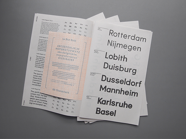
Specimen Le Biot

I really like the overall layout of this publication and how it shows the typeface working in the different weights and sizes in interesting layouts instead of just the whole publication being pages and pages of columns and rows. I particularly like the second to last image, with that layout of the text and how the page has different weights shown in different sizes and with different words. Overall the layout is really clean and simple, which I like, but I definitely don't want to include photographic imagery like this one. I don't think it's necessary in mine.


Type Book Design - Helvetica


I think that this is a more creative approach to creating a specimen book. I think that its got some good ideas, but overall it isn't particularly what I'm want to do in mine. The colours are extremely bright, and it is almost cartoonish in the way it is presenting the typeface. That said, there are some good layouts and it does show me that type specimen publications don't have to be boring and dull.


After looking at a few examples, and the three chosen above, I do feel a bit more confident in the ideas that I have for my publication. I don't want it to be boring, but I do want an overarching consistency throughout it, with the use of colour in there somewhere. My typeface in contemporary, so I want to get this across in the publication design as well and make it all join together and be integrated.

Thursday, 23 April 2015

Methodology Publication - Crit

Today I took part in the first crit about the methodology/context publication that we have to produce as part of this module. In preparation I had come up with the idea that I was thinking of moving forward with.

I want to create a publication based around typography, and looking at my typographical experimentation and journey through the three years on the course, looking at things/people who have influenced my typographical design. Throughout this I want to show my own typefaces and their progress, from the very first one I did in first year, to the most recent one I have done to date. I also thought it would be a good idea to create a typeface specifically for the book, to be used in the headings.

The working title I have so far is Construct. This is because the publication looks into research and my own experimentation to how I construct a typeface.


The Crit

I presented this idea to the group I was with, and it was immediately said that I should definitely narrow it down further from looking at the huge range, to looking at something specific.

It was also suggested that if I look at something specific, I should look into the way I create a typeface more than looking at what other people have done. I should focus more on my own work and have all the content be completely my own. It was also said that I should look to focus more into the technical side of creating a typeface, as it is a very technical skill which needs a lot of time and patience.


Overall I think the feedback was helpful as it showed me that perhaps I was looking at quite a range of stuff when I should focus it down to one particular subject within Typography. While I have a bit of an idea of what to do, I still think I need a lot of refinement and direction in terms of how to go about it.

Brief 15 - Creating The Typeface

Now that all the characters have been completed, it is just a case of inputting them into the program I am using to turn the typeface from vectors into being useable.

I decided on using Glyphs as there is a free trial for it for 30 days, so it means I can do this on my mac instead of having to do it on one of the university ones. It means I can continue it on an evening and weekend and not have to sit in the studio doing it all day.

Its a very simple process of copying and pasting the vectors into their correct boxes.

The first thing I did was create all the variations that were needed. This is done through an option in the program that allows you to create all the settings for each variation, from the weight to the structure heights.


Getting the right heights is useful to do at the start as it means I will be able to place the letters exactly in the correct place, for example, if the heights aren't correct, I could have trouble placing a 'j' or 'p'.

It took a while to get these heights correct on all of the variations, but once I did, it makes everything much simpler.

It was just a case of inputting all the characters.


Something useful that the program has is a 'clean up paths' button, which will take away all the unnecessary points, creating a completely smooth shape. This was useful for some of the serifed letters which had more points than was needed.

Once I had input all the characters I tried typing in a few different words to see how the letters worked together.

I found a couple of immediate problems in the 'i' and 't'. The top of the 'i' and bar of the 't' were too high. I had originally designed it like this, however when placed next to the other letters, they looked a bit silly, so I moved these down to be in line, and instantly they looked much better. I changed this on all variations.


Another issue I found was with the 'f'. The crossbar for this was set at the same as the 't', and it just looked strange as well so I moved this down. I then changed this on all variations.

Following this, I typed out the basic alphabet in the boldest setting to see if there were any other issues with the letters, and make sure I had all the letters complete.


Overall I am pleased with the progress I have made to this point. It was quite a long task inputting all of the characters, but I knew that the creating of the typeface would be quite dry and long as a task. I think all the variations work well and I look forward to this being useable in the end.