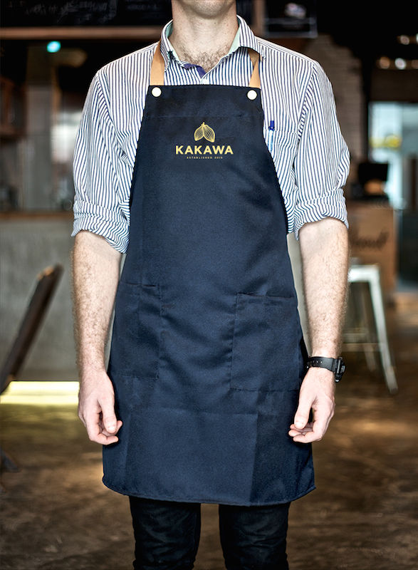
Monday, 18 May 2015
Brief 1 - Updating The Website
Following the update of the collateral and overall design of the brand, I looked back to the website design. As I now have a much clearer identity for the brand in completing its branding and the App in Brief 11, I know that this website definitely needs a revamp and changes to the design to be much more cohesive.
Previous Website:
I've gone for a completely difference approach from the previous design, with a very clear link to the App design in the layout and use of colours. I think it works much better and is much more contemporary.
Following this I mocked these screens up onto macs and added the imagery to be reflective of those used in the App and menu.
Mocked up:
Previous Website:
The first obvious thing to say about the website is that it is very dark, and while it does play to the luxurious side of the brand, it doesn't work with the brand look anymore with the wide use of gold and really dark backgrounds.
I decided that the best way to create the website was to work off the appearance of the app and how that had been put together using a lot of white space and large imagery which touched the edges of the page. The icons are also something that I can incorporate now into the design, which might make things a little more interesting.
I wanted to keep the layout following the style of the app with having text central and large imagery at the top of each page. Looking over the pages I already had, I decided to keep the same content, and add another section - News. This is something that could be updated regularly and keep customers aware of changes or the latest goings on.
Website wireframes:
I've gone for a completely difference approach from the previous design, with a very clear link to the App design in the layout and use of colours. I think it works much better and is much more contemporary.
Following this I mocked these screens up onto macs and added the imagery to be reflective of those used in the App and menu.
Mocked up:
Overall I think that the website looks much better because of the revamp to the appearance of it. The use of white creates a much more contemporary feel and makes for a brighter and friendlier appearance.
Thursday, 14 May 2015
Brief 14 - Evaluation/Reflection
The aim of this brief changed a fair few times from the original writing, however I think that the final outcome has proven that I made the right decision in creating an App design instead of going down the route of branding and collateral.
My interest in App design has increased greatly throughout the year, and I felt confident enough to be able to do a full App brief. My skills have improved a huge amount and I think that I was able to apply these to this outcome to create a successful and professional looking App.
I think the strongest part to this App is the overall layout and use of colour to indicate buttons or separate sections. The use of photographic imagery with flat design created a strong visual aesthetic and gave each page depth. Particularly, I think the illustrated iconography worked really well across the App as they were simple, but detailed enough to be bespoke.
Choosing a subject like travel was a good thing to do as it is not a subject I have created work around before. It gave me a new subject area to look into and think about how the App would work in the situation where it would be needed, and what features are necessary for it to be successful and useful, not just look nice.
The main thing that this brief has done is make me think about the necessary elements to an App and how necessary an App actually in for a task. An App should be created to be helpful and useful, not just because it can be created and be there. There must be a purpose to it. Another important thing that I have had to consider through this brief is the appearance and usability. Something may look good, but if it takes a long time for the user to reach a certain part of the App, they are never going to keep it. Creating a simple interface and navigation which links well and as minimal as possible is what is important, and this has been shown in the simplicity of the App’s navigation.
Overall I enjoyed this brief and would have liked to extend it out to more formats and avenues, but with time restraints this was not possible. However, what I have done up to this point has been successful and I think it is a strong design with a good purpose.
My interest in App design has increased greatly throughout the year, and I felt confident enough to be able to do a full App brief. My skills have improved a huge amount and I think that I was able to apply these to this outcome to create a successful and professional looking App.
I think the strongest part to this App is the overall layout and use of colour to indicate buttons or separate sections. The use of photographic imagery with flat design created a strong visual aesthetic and gave each page depth. Particularly, I think the illustrated iconography worked really well across the App as they were simple, but detailed enough to be bespoke.
Choosing a subject like travel was a good thing to do as it is not a subject I have created work around before. It gave me a new subject area to look into and think about how the App would work in the situation where it would be needed, and what features are necessary for it to be successful and useful, not just look nice.
The main thing that this brief has done is make me think about the necessary elements to an App and how necessary an App actually in for a task. An App should be created to be helpful and useful, not just because it can be created and be there. There must be a purpose to it. Another important thing that I have had to consider through this brief is the appearance and usability. Something may look good, but if it takes a long time for the user to reach a certain part of the App, they are never going to keep it. Creating a simple interface and navigation which links well and as minimal as possible is what is important, and this has been shown in the simplicity of the App’s navigation.
Overall I enjoyed this brief and would have liked to extend it out to more formats and avenues, but with time restraints this was not possible. However, what I have done up to this point has been successful and I think it is a strong design with a good purpose.
Wednesday, 13 May 2015
Brief 2 - Final Evaluation/Reflection
The initial idea for this brief was to do it at the beginning of the year, however I definitely think it is a positive that we waited until the end as both of our design skills and organisation skills are much improved and more professional.
I found this brief to be very enjoyable, and as we were working in a collaborative, it was very productive as we wanted to move forward with it at a good pace and be able to put a lot of work and effort into it to create something that we are both proud of. When we initially decided on the brief, we did want to do a wide selection of elements to it and turn it into a substantial brief, however in the narrowing down and considerations we made, it definitely helped turn the brief into what it is in a thorough and well thought through concept and execution.
I think that we worked well in a collaboration and played to each others strengths. Working on it over a short period of time definitely kept us moving forward with it and meant we were very productive in what we did produce, making decisions based on initial guidelines we set out when the brief commenced. Choosing this guidelines at the beginning definitely helped in the realisation of the brief as it kept us on target and kept us from moving too far away from what we wanted to achieve - a strong concept of a luxurious and sophisticated chocolatier brand.
Our collaborative also allowed for ideas to be suggested and considered in a much quicker way, meaning that we chose a resolution quicker. Another plus to this collaboration was that both of us work and think in completely opposite ways, which gave us both two completely different points of view on the brief. Initially this had been a bit of a hinderance as we both had our own ideas as to what the brand should be, however through the development of the brief we did join these two points of view together and create compromise when needed for the best decisions for the brief.
One thing that I would have liked to do was expand this brief to include a web-based solution and potentially a promotional solution as well. Including these elements is something I enjoy doing and would really give a fully realistic view of the brand and products. Despite this, I think that the brand vision is clear through the products and final photographs.
Overall I think that the finished products are strong and do fulfil our want to do a sophisticated and luxurious brand and packaging. I enjoyed creating the packaging much more than I thought I would, and the work and effort gone into the products is clear, with the strengths from both of our working practices clear in the work as well.
I found this brief to be very enjoyable, and as we were working in a collaborative, it was very productive as we wanted to move forward with it at a good pace and be able to put a lot of work and effort into it to create something that we are both proud of. When we initially decided on the brief, we did want to do a wide selection of elements to it and turn it into a substantial brief, however in the narrowing down and considerations we made, it definitely helped turn the brief into what it is in a thorough and well thought through concept and execution.
I think that we worked well in a collaboration and played to each others strengths. Working on it over a short period of time definitely kept us moving forward with it and meant we were very productive in what we did produce, making decisions based on initial guidelines we set out when the brief commenced. Choosing this guidelines at the beginning definitely helped in the realisation of the brief as it kept us on target and kept us from moving too far away from what we wanted to achieve - a strong concept of a luxurious and sophisticated chocolatier brand.
Our collaborative also allowed for ideas to be suggested and considered in a much quicker way, meaning that we chose a resolution quicker. Another plus to this collaboration was that both of us work and think in completely opposite ways, which gave us both two completely different points of view on the brief. Initially this had been a bit of a hinderance as we both had our own ideas as to what the brand should be, however through the development of the brief we did join these two points of view together and create compromise when needed for the best decisions for the brief.
One thing that I would have liked to do was expand this brief to include a web-based solution and potentially a promotional solution as well. Including these elements is something I enjoy doing and would really give a fully realistic view of the brand and products. Despite this, I think that the brand vision is clear through the products and final photographs.
Overall I think that the finished products are strong and do fulfil our want to do a sophisticated and luxurious brand and packaging. I enjoyed creating the packaging much more than I thought I would, and the work and effort gone into the products is clear, with the strengths from both of our working practices clear in the work as well.
Tuesday, 12 May 2015
Subscribe to:
Posts (Atom)