Thursday, 7 May 2015

Pre-Submission Tutorial

Today I had my pre-submission tutorial where we looked over my design boards that I had completed up to this point.

I have been creating the design boards as I go along the projects, so I was prepared for this in terms of having consistent boards with all the content on that I thought they needed at this point.

Boards completed

  • Brief 3 - 30 Days
  • Brief 4 - Wheatless & More
  • Brief 5 - Woodshop
  • Brief 6 - Type Principles
  • Brief 7 - Syfy
  • Brief 8 - Dr Me
  • Brief 9 - Intern
  • Brief 10 - DSM
  • Brief 11 - Fonte de Vita App
  • Brief 12 - DBA
I also took along some quickly put together boards to show the progress of Brief 14 - Visit, and Brief 1 - Fonte De Vita. I also had the physical products for Brief 2 - Kakawa and Brief 15 - Simplex. I did not take anything for Brief 13 -Yearbook pitch.


Overall the tutorial went well, with very positive feedback for the boards and the layout of them. The feedback given was that while the content on them was good on the most part, all projects could benefit from more contextualised research, not just aesthetic, and brief analysis into this should be displayed as well. Projects with branding in should show the branding development, as done in Wheatless & More, and they should all have the brand board as well which displays the final logo, colours and typefaces etc.

I felt really positive after this tutorial and felt that the changes that were needed were small, which was great news since I still have to make five sets of boards for the five projects I did not have them for. It was a confidence boost that they liked the layout and that it was the same over all the projects.

Wednesday, 6 May 2015

Brief 14 - Completed Digital Wireframes

Following the creation of the iconography, I implemented these into the designs, and also worked on incorporating the green and red a bit more into the design instead of having all the buttons grey.

Login/sign up

This page hasn't changed at all, apart from the green and red being included for the two buttons.

Create a trip


I added the plus sign icon into place. I also decided on having the header bar in a slightly off white as to create a contrast from the white of the page. I think it works relatively well beneath the logo and red menu icon.

I also created an extra page to show what would happen when the menu button is pressed. It cuts off at the top as above this is where the iPhone information would be - the time/battery charge etc. It looked a bit strange covering this in a mock up I did, so I decided on just cutting it off below.

City homepage


Here I have added all the icons into their places. I think they work really well and the spacing between each icon is good. I wasn't too sure on the sizing that I should go with, but this seems to work well and all the icons are easily visible which is what I wanted. I also put in some mocked up information for a trip to New York City.

Category/My Planner page


These pages have not changed much apart from mock up text being put in place to follow the idea of it being a trip to New York City.

For the Planner page, I looked on a map and found a few activities that were close by so it would work well and simply for the map side to this app. I also changed the 'map my route' button to green.

Activity Page


This page has had quite a bit done to it. The main thing that I wanted to do was show that it was a different section of the App to the Category pages, so changed the header bar to red instead of grey. It is a clear contrast. I also added the icons to the middle right buttons, as well as the Category icon to the image space. I put in mock up text again for the activity name and opening times, with the intention of getting some more text to fill the description area soon.

Map My Route Pages

As said on the previous post, I wanted two different map pages which the user can flick between.


The first is the simple visual list. I decided on using bright red markers with numbers for the points the user has to visit. This makes it very clear that these are the main points. I also had to think about secondary markers. This is because to get to the Statue of liberty, the user must walk to the docks, then get a boat across. This was a good activity to include as it means I can show all the information and variation for if this happens.

Next to each point is all the information they need about the activity as well as a marker which indicates where the user currently is, using location services on the phone.

As stated previously, the different coloured lines indicate different modes of transport. The green represents on land/walking. The blue indicates water travel.

The final thing I did to this page was add the small map icon to the heading bar. This is what the user will click to view the map view.


For the second map page, it is to be a flat style map of the city, showing the route between the activities.

As I am only showing these four activities, I screenshot this area on google maps.


I then went about tracing around it in the style of the App. I stuck to the brand colours as much as possible, using lighter tones for the green due to the route colours being those of the brand colours. I also needed to get another blue because of this reason, so went for a lighter blue which worked with the brand colours. I included the orange for the main roads as google maps had, because displaying accurately is important.


Point 3 is the Statue of Liberty. This is a way away from these three activities, and the map would have had to be quite zoomed out to view it as well. Because of this, I decided that I would zoom in to the other three and say that this is the set zoom for the route mapping, so all the destinations and routes can be seen clearly.

Like the list route, I used the same numbered markers for all of the destinations. The final thing I did was add a small marker to indicate where the user was, which would move as the user does.


Now that these wireframes are all complete I have to say that I think they are all looking quite good and I am excited to create the actual mock ups and use the photographic imagery in these. At this point I think that it is looking strong and consistent.

Tuesday, 5 May 2015

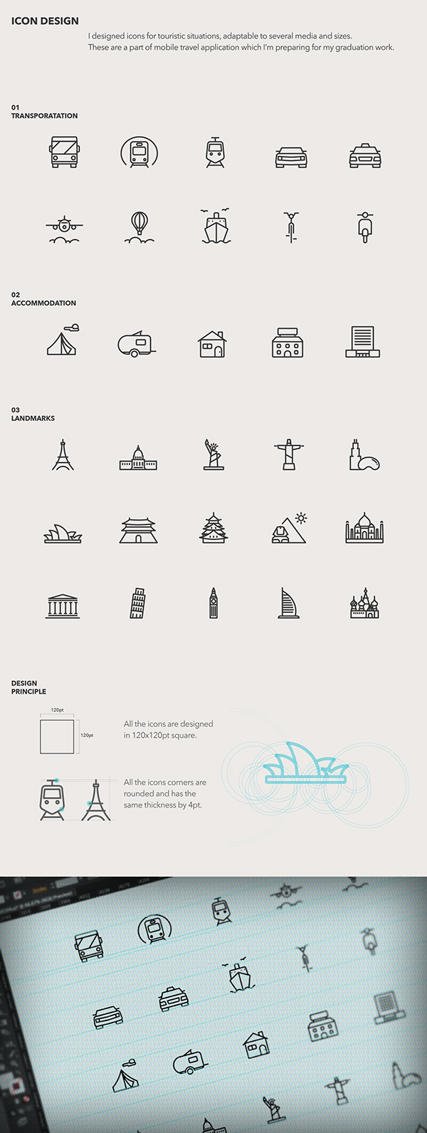
Brief 14 - Iconography

For the categories I wanted each to have their own individual icons. I really want these to be consistent and be simple, but detailed.

I looked into some icon designs which were similar to the style that I wanted to move forward with.


I chose these three to follow the same style of aesthetic as the three above because they are simple, but clear and easy to understand.

I wanted to create simple, but individual icons with a bit more detail on, like the top icons. I really like that the icons can be small and still have detail to them.

The main icons that I need to create are the ones for the City home page for the following:
  • About
  • City Map/View Map
  • Sight Seeing
  • Food
  • Culture
  • Entertainment
  • Sports
  • Popular
I had a few ideas for these already. But I won't be sure until I start creating these.

About - A outlined version of the logo
Map - an unfolded map with points and lines joining them together
Sight seeing - A camera, binoculars, a small icon of a famous sight e.g. statue of liberty
Food - plate & knife and fork, ice-cream cone, dinner bib, reserved sign
Culture - Tickets, a small icon of a famous cultural spot e.g. Sydney Opera House
Entertainment - Tv, microphone & stars, drama masks, tickets
Sports - basketball hoop, baseball bat & ball, tennis racket
Popular - star, thumbs up, bar getting larger at the top


I think that hardest icon to think about was the 'Culture' section. It's very hard to sum up culture in one icon, which is why I had so very little ideas for it.

I feel that its stereotypical to go for the Statue of Liberty for sight seeing, so I want to go with something that can be more general and apply to everything, so the camera or binoculars

Final Icons


I kept a very simple aesthetic for them, the most complicated being the culture icon. It is more complicated, but I still think it works well, especially because of the detail on the Sports and City Map icons.

Overall I'm happy with the icons I've created. I think that they are consistent and are visually simple and self explanatory, while not being too obvious/generic. I'm not too sure about the Entertainment icon of the tickets, but I think that it works over a wider category and applies to more than a microphone or tv set would.

Sunday, 3 May 2015

Brief 1 - Updating Collateral

The first thing I decided to update was the menu. I was not overly convinced with the design when I first did it, and I definitely feel that there is a better approach to it.

Original Design:


I like the overall approach, with the image on the left hand page and the layout of the text, however it is the gold border which I am unconvinced about. I think the use of a line is a subtle element in my branding and I do want to keep that, however I do not like it done in this way. I don't think the gold colour is working either.

I decided on reworking what I liked about the page and decided on keeping it very similar, but changing the gold to a black and having only a line across the top between the heading and text. I also left aligned the heading so it flowed better with the text. This is something that I previously did on the letterhead and it worked well.

Something that I have also decided is that I will just have one menu instead of two. This is partly because I have got a really nice brown stock which I want to use across everything for consistency and I think if all gold were to be foiled on this it would work really well. With the use of foil, there obviously wouldn't be al alternative to it to be able to find gold stock which matched, so the use of just gold foil on brown will keep consistency.

I also think because the majority of the products are available at both the bakery and cafe, it seems a waste to put them in both instead of just having one, with small notes to show the reader where this product is available.

New page design:


Another thing I decided is that the binding needed to be improved. Originally I had the intention of just stapling this, however this doesn't really work to the luxury side of things. Instead I have decided on screw binding the pages together. This adds a little more detail and consideration to the design. With this I have to consider the margin. I have increased this to 2.5cm so there is a good amount of room for the screws and the text.

With the new appearance of the text page, I also looked at editing the image page. I felt it was quite dark and overpowering next to the white page. I decided on changing this from a full page image to one with margins. It adds a it more light to the page, and I think the margins add a bit of sophistication to the overall page design. It looks a lot more considered over.

Final spread:


The grey indicates the margin which will be hidden when screw are placed in it. I think that overall this design is might brighter and cleaner. It is definitely a huge improvement on the previous design, and considering the changes were only small, it shows that a bit of refinement can go a long way.

Following the success of this design, I decided to apply it to the business card.

Previous design:


Like the menu, I have decided on using brown stock and foiling gold onto it, so the gold card is not necessary. I also changed the layout to include the opening times as this is something that is important.

New business card:


Following this I made a sheet of branding to be cut out in vinyl to be put on the physical pieces that I had. These are:
  • A large jar - for bread buns - a large vinyl of the brand emblem will be put on this. - black
  • Two glasses - one small and one large - either the full logo or just the emblem. - black
  • A glass jar - for breadsticks - the full brand identity - black
  • A plate - a small emblem to be placed in the centre - black
  • A bag - the full brand identity - in gold
Sheets for vinyl:


Black:

Gold:

Following this I looked over the entirety of the collateral that I had and decided that there were a couple more elements that could be included.

The first is coasters. These are obviously a small element but having branded coasters applies the brand that little bit more and shows the amount of detail.

I kept these very simple and decided to go with the circle shape like used in the emblem.

Coasts:


I also decided on creating a small pad which would be used for waiters in the cafe to write down table orders. It is another small detail but I think its something quite interesting to have as its very individual to a restaurant/cafe setting.

I kept this design very simple, deciding on just the brand emblem at the top and a number of lines for writing. I want this to follow the same design as the menu in terms of how it is bound with a screw, however this will be bound by the top corner so the pages will slide across to open. I will also perforate the corner so the pages can be pulled out easily. The cover will follow the same as the other designs in being brown with a foiled logo on the front.


The final piece of collateral that I wanted to add was a small thank you note. I think something like this is just something nice that can be added in and applies to both the bakery and cafe. It's just a little extra for the brand to thank the customer for their purchase.

I decided on just a simple black and white design which will be double sided, with the brand identity on the front and the thank you on the back. I kept the text simple and so it could apply to both sides of the brand.


Overall I am really pleased with the progress I have made on this brief now. I feel that it has all come together much more and the branding is now consistent. I think the use of gold foil will work well and definitely give it a luxury feel, especially with the brown stock I have, which is slightly textured and is thick. Combined with the screw binding I think it really improves the overall appearance of the brand and will have a much better visual look.

Saturday, 2 May 2015

Brief 15 - Design Boards

Brief 15 - Final Evaluation/Reflection

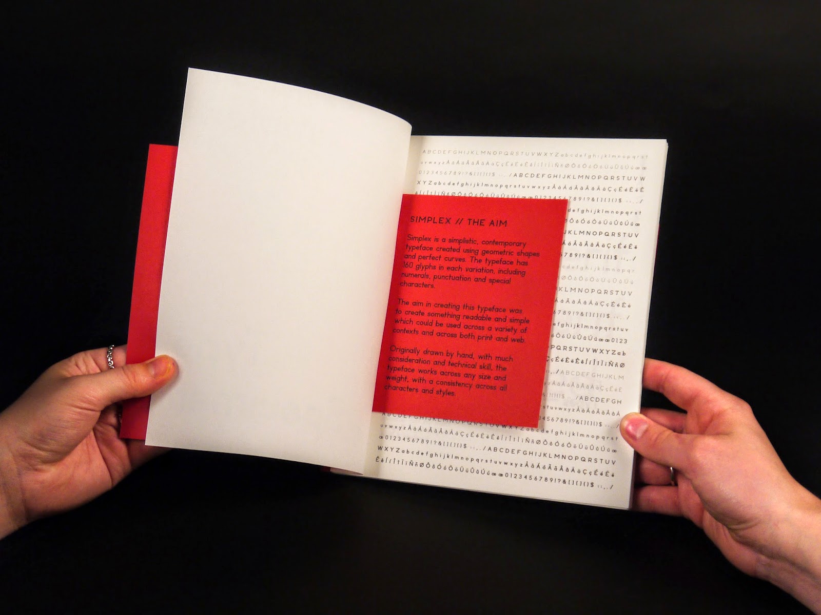
I found this brief to be particularly enjoyable and a learning experience. It has definitely been the brief which has pushed my exploration in typography and typeface design to a much more technical level, meaning I have had to be extremely precise and careful with every element of this brief.

When I created the initial typeface in January, I had been quite convinced that it was as good as it was going to get, however through learning much more about typeface design since then I found that I was confidently able to take the original typeface and edit it to create a much more sophisticated and consistent design across all characters. This resulted in a typeface which I am actually extremely happy with in the fact that all letters work together well and it can be used for body copy. Previously my typeface designs have not been quite up to the standard of being able to use for anything other than their original intention or just laid out in A - Z, however this typeface is something that can be used.

This brief has also showed me a good way to work through creating a typeface as it has shown me the right way about going about creating characters and how to create a consistent appearance instead of just thinking about how an individual character will look. Building on this and creating weight and style variations is something I enjoyed as it allowed me to push the design and consider more about the appearance than just creating one variation would.

The part of this brief which I enjoyed the least was actually turning it into a useable typeface. This is a long and tedious process in inputting all the characters before having to kern each letter and numerous pairs. However this has definitely aided my skills in this area of typeface design. I was previously quite inexperienced at this, having only done it a couple of times before to a very mediocre level. As I wanted to actually use the typeface in creating the specimen book, I knew I had to spend the time to kern properly and set up the documents properly so it could be useable.

Creating the typeface specimen publication was a bit more of a task than I initially thought it would be. I had to spent time considering how I wanted it all to be presented and what the key elements were. A big issue I found was that because I had three different styles and four weights, it created a lot of content that needed to be shown with twelve different variations. This made is tricky, however I am happy with how I edited this down to show the key points and aesthetic decisions in each variation. Overall I think that the specimen really does show the typeface off well.

The original aim of this brief was to create a useable, readable contemporary typeface, and I do feel that I have done this. I was initially very skeptical that I could manage to do it, but through hard work and a lot of time I do think the typeface is something to be proud of. This is definitely the brief where I feel I have accomplished the most as I have learnt so much through the whole process. It has given me the confidence and skills to be able to move forward and create more typefaces, and make them fully useable.