Of the design research I did in a previous post, the work that I liked and wanted to take influence from were all quite simple and sparse, but each used different elements, whether it be colour or stock, to make the branding stand out and be different. This is definitely something that I would like to do, while keeping a very simple approach.
I find that usually in my design work I perhaps make things a bit too complicated and overthink the amount of things that are going on at one time. I don't want to fall into this trap on this brief, so researching into Modernism itself should help me get some basic ideas into how I should work in this area of design, and how I can apply these and know when I can break certain rules.
Modernism
Function should always dictate form
Modernism especially changed the thinking process for communications, graphic design and typography, the style of design shifted drastically from the prior 19th century approach. Before the concept of Modernism, graphic design and typography was 'overly decorated' and elaborate, every possible inch of a typical poster would be filled with imagery and type.
Designers of the era of Modernism abided to strict, structured grid system with emphasis on negative space, just as important was the use of clean sans-serif type. The idea was to create strong graphics that were against commercialism, greed and cheapness. Typical typefaces used in the Modernism era include Franklin Gothic, Monotype Grotesque, Futura, and Helvetica Neue.
With modernism I decided to look into a few designers who are related to this style of design.
Experimental Jetset
Experimental Jetset is a studio that I have followed for a while now, and while their work is modernist, it still can be quite interesting and contemporary in areas.
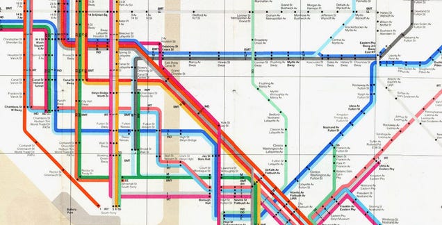
Massimo Vignelli
Massimo Vignelli was an Italian designer who worked in a number of areas ranging from package design through houseware design and furniture design to public signage and showroom design. His ethos was, "If you can design one thing, you can design everything," and this was reflected in the broad range of his work.
A strong influence of modernist design was the Swiss Style Design. Researching into this a bit is something that I think will be useful in understanding the elements that make up modernist design.
Swiss Style Design
The International Typographic Style, also known as the Swiss Style, is a graphic design style developed in Switzerland in the 1950s that emphasizes cleanliness, readability and objectivity. Hallmarks of the style are asymmetric layouts, use of a grid, sans-serif typefaces like Akzidenz Grotesk, and flush left, ragged right text.Josef Müller Brockmann
"Order was always wishful thinking for me. For 60 years I have produced disorder in files, correspondence and books. In my work, however, I have always aspired to a distinct arrangement of typographic and pictorial elements, the clear identification of priorities. The formal organisation of the surface by means of the grid, a knowledge of the rules that govern legibility (line length, word and letter spacing and so on) and the meaningful use of colour are among the tools a designer must master in order to complete his or her task in a rational and economic matter."
While researching this, I came across a website 'swissted', which is a design project created by Mike Joyce of Stereotype Design, based in New York City. The website is dedicated to his works in taking his love for music and creating posters in a swiss modernist style.
Mike Joyce of Stereotype Design - Swissted
I find this quite interesting as it shows how modernist design can be applied to culture today, and applied to a number of things in the same industry and still all be very different in appearance, while using the same typeface, Berthold Akzidenz-Grotesk Medium - the original modernist typeface before Helvetica.
While I have found this research interesting and fundamental to my development in this brief, I don't think that a truly modernist approach is the correct way to go. Instead, I think that taking some of the elements from this design movement and applying them to a more contemporary design is something that I want to move forward with.
The main things that I am going to take away from this research:
Simple and clear layout is key to a clean design. Having a uniform grid system and layout across all branding and media will create a much more consistent and strong appearance, and in turn show a controlled and sophisticated approach to design.
Typography doesn't have to be complicated. Simple sans serif typefaces, laid out and kerned well are much more effective than multiple typefaces in various sizes, all trying to get attention from the reader.
Image isn't necessary. Design can be created using just typography, and even if this is minimal, the layout of this type is what can make the design sophisticated and show clearly that image is not needed to hold the design.
Colour isn't necessary and should be used to enforce the information that is present. Colour should be used when necessary and not just because it can be used. If there isn't a reason for the colour then it shouldn't be there.
I think that these elements are crucial to creating a strong and considered design, and while I may use some elements more than others throughout this brief, I definitely want to make sure that I am considering all of these elements in all aspects of my designs.
References


.jpg)


No comments:
Post a Comment